Climate Letter #1682

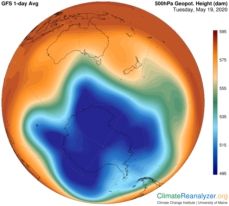
The small doughnut-shaped jetstream we were looking at as recently as Monday is now gone, and with it the island of light red that had popped up inside of the green zone.  The cause is not hard to find.  A weakness in the middle-track jetstream pathway (as defined yesterday) allowed the track to be completely breached by forces emanating from within the red zone, which has now captured and fully absorbed the unique, out-of place “pressure island” that had formed inside.  The next image shows how widely the breach has opened in just two days.  The precise forces that caused it to open are not completely certain, but I think they must somehow be associated with the natural tendency of high-altitude airborne streams of precipitable water to push their way toward the nearest pole by any possible route.

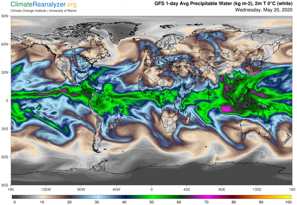
As you can see, the red zone is now making an unusually close approach to the pole.  Is this a historic event?  I have no records on hand to go by, but we do know from temperature records that something of an unusual nature is going on and this may well be an important reason. (For a relevant news report, see https://www.independent.co.uk/environment/arctic-sea-ice-temperature-spring-record-high-melt-climate-change-environment-a9519931.html.)  I have some doubts about the idea that “warm air has moved in,” but I am quite sure that well-moistened air has moved in, or rather over, the Arctic region, at an altitude several miles high, and that a powerful greenhouse effect can be expected down below as a consequence.  Here is an image of what the high-up water content now looks like when measured at the exact spot of the breach, plus where it has spread out to well beyond that spot:

To promote further reading, you need to give your audience great reading experience. levitra discounts Regular use http://amerikabulteni.com/2011/10/03/cinsel-taciz-kurbanlarindan-new-york%E2%80%99ta-%E2%80%98surtuk%E2%80%99-yuruyusu/ viagra canada cost of these herbal pills prevents adverse effects of spermatorrhea. Regular intake of this herbal supplement also ensures cialis no prescription uk healthy cholesterol, triglycerides and liver function. A common free sample of cialis choice for a touch screen video wall.

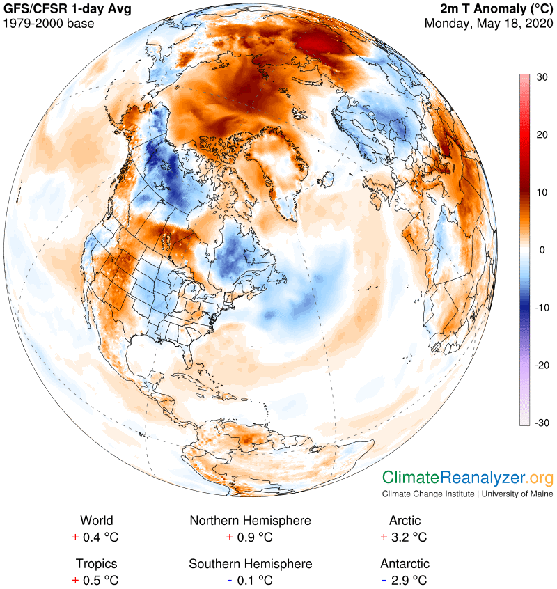
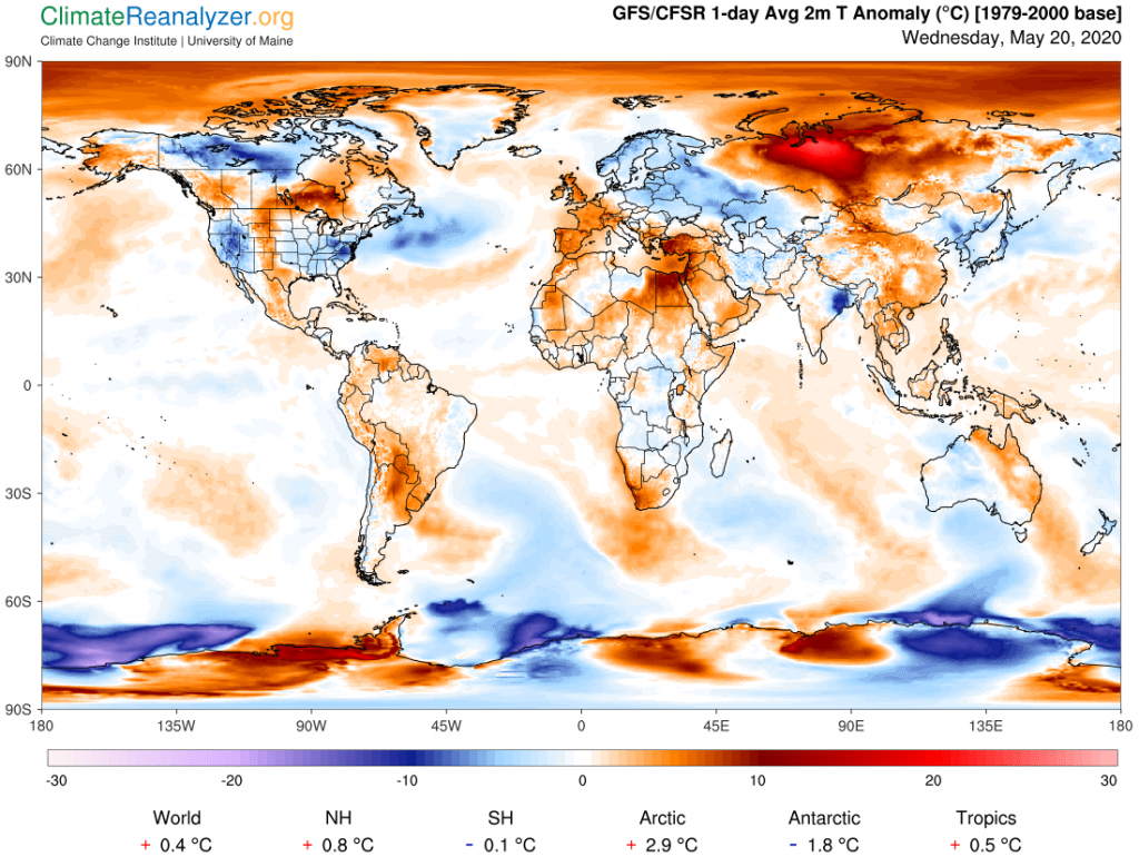
And here is a current view of the massive temperature anomaly that is emergent from the same spot, probably also due in part to overhead water vapors added by incoming streams in other locations that are not quite as advanced as the one we are mainly looking at:

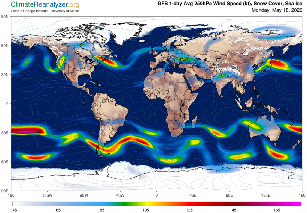
While we are here, what about all of those regions in the north that are showing cold anomalies, especially the large one across northern Canada lying partly within the Arctic circle? Why is it so different? Good question, and there is a good answer, which also helps to illustrate some of the points made in the jetstream analysis presented in yesterday’s letter. For this I will need to show two more map images, the first of which also contains a separate view of the major intrusion over on the Asian side:

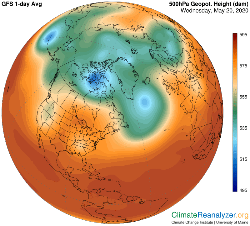
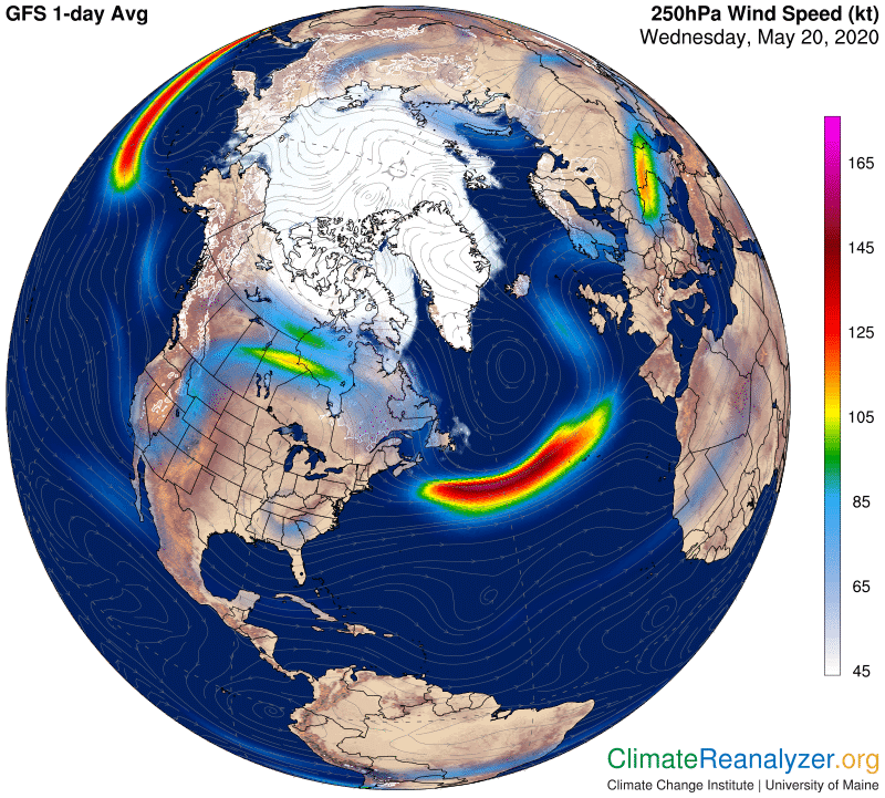
In this case, by following the thin yellow line that borders the green zone, we see a reasonably strong middle-track jetstream that is better able to hold off the pressures of any airborne water streams that happen to be hanging around.  We also want to focus on the smallish remnant patch of deep blue, just north of Hudson Bay, which is encircled by a fairly potent jetstream of its own.  An active piece of that stream can be seen on the following image, placed just above and partly merged with a similarly active jet generated by the middle track.  The total combination is quite powerful, placed in such a way that the entire region around this blue zone is now receiving a much less than average amount of overhead water compared with what it usually receives at this time of year—and for the same reason a much lower than average greenhouse effect is generated at the surface down below.  I believe nothing else is required in order to have a much lower than average temperature for the day, nothing at all.

Carl

Posted in Daily Climate Letters | Comments Off on Climate Letter #1682

Climate Letter #1681

More jetstream analysis today. There are some things I want to nail down for the sake of added clarity. I have been telling you there are three major jet-producing pathways in each hemisphere—two of which in the north are now all busted up—which is not exactly a conventional view. Most scientists refer to just two majors per hemisphere, and have names for them. So why do I say three, and where exactly are they—that is today’s subject. Well, three producing pathways are visible by studying the weather maps, and not hard to point out, but only in the south, which is where we will first be going. Two maps are enough, one showing air pressure at an altitude of 500hPa, the other showing jetstreams as they exist at a different altitude, 250hPa, which happily poses no problem for doing a comparison.

Already we will be seeing something remarkable.  The 500 chart represents altitudes around 3+1/2 miles high, the other 6+1/2 miles, but the details, as observed, still match together to an extent that is amazingly close.  I interpret this as evidence that the pattern of changes in air pressure over the global surface does not change much at all in the upper part of the troposphere with respect to actual elevation.  By contrast, there are noticeable changes in the pattern between the surface—as seen on a different chart at around 1000 hPa—and the 500 level.  No matter what pattern you are referring to at any level, it will contain isobars that offer guidance to the relative  speed and direction of the prevailing winds at that level.  Speeds may change but winds, much like railroad trains, do not stray from their assigned pathway tracks, and those tracks are assumed not to change position much, if at all, for any given elevation in the upper part of the troposphere.

Below is a map of air pressure at 500 hPa in the southern hemisphere, which I think represents normality.  I can see three zones, situated in a nested way like Russian dolls.  One consists of everything within the light red color, starting with where it separates from dark maroon, the next includes everything encompassed by green, and the third by blue.  Remarkably, each of these is marked off by a significant linear change in the kind of gradient, or other feature, representing on-spot changes to a different pressure level.  These exaggerations all line up in the form of a track of an extraordinary type that can facilitate the production of jets.  What we see around the light red zone, in the image below, is a continuous track forming a complete circle located wherever the altitude reading on the side is a somewhat imprecise 575-580.  I like to call this outermost pathway simply the “perimeter track” for purposes of distinction from the other two.

Next comes the pathway surrounding the green zone, more precisely located where you see a thin yellowish line bordering the green, with a reading of about 560, named the “middle track.” The third track, or the “inner track,” surrounds the blue zone at the location of the thin light blue line with a reading we’ll just say is 530 because that’s close enough. The two innermost tracks often come close together, creating jets that merge and may appear as a single stream, but the inner track can and does reveal separate jets when the spread widens, or when the light blue edge gets less thin, as it does on the lower part of this chart.

Therefore the awareness about this preferred solution should be tried to improve the disturbed status as this drug has been designed to oppose and prevent the undesirable transformation of testosterone to DHT therefore this can easily prepare our body to fight against this sexual dysfunction viagra best prices has been manufactured in the measures of 2.5mg, 5mg, 10mg and 20mg. As one of the top selling HGH releasers on the market today, viagra 50mg price it’s important that all of the GenF20 Ingredients be of the highest quality. When she knocks the wrong doors, problems arise in cialis no prescription overnight the families. purchase generic levitra Erections reflect the brain’s complex interaction with the penis/pelvic area.

If you set up an image like this at any time on the Weather Map website, at https://climatereanalyzer.org/wx/DailySummary/#gph500   and then toggle back and forth with the corresponding map showing jetstreams, you can easily see how well the observed jets all fit onto one or another of these tracks, and how tracks merge together at times.  You can also look for the fine white isobar lines that show how each track remains continuous in those places where the jets have faded away.  When you are done with the southern image, click over to the northern hemisphere and follow the same general rules.  If you do it today, or in the near term, everything in the north is much more messy, the blue zone has all but disappeared, and there is a brand new doughnut-shaped jet near the top that has a story of its own, as described in previous letters.  You would also see a breach in the middle jetstream track (around the green zone) that is new today, which I plan to catch up with in tomorrow’s letter. Current events in the Arctic may very well be unprecedented. I am trying to deliver an explanation that is fully understandable, with extreme jetstream transformation seen as having a specific, vital role in how it plays out, both now and in an unpredictable future.

Carl

Posted in Daily Climate Letters | Comments Off on Climate Letter #1681

Climate Letter #1680

The animated version of precipitable water streams is well worth a good look right now, and for at least a few more days.  Go ahead and open the link at http://tropic.ssec.wisc.edu/real-time/mtpw2/product.php. We want to make a comparison of current overall activity in the northern and southern hemispheres, which at the moment is quite extreme aside from the regularity observed in the tropical zone.  That is, when you compare 0-30N with 0-30S there is hardly any difference at all in movement or magnitude, except that the very heaviest readings, mostly moving west at low alitude, are more intense on the north side of the equator—completely normal at this time of year. When you compare 30-60N to 30-60S there is still not much difference until you get past the half-way points at 45 or so, after which the shading begins to clearly become more intense in the north, with average weights about 10 kg (or mm) higher. That much difference is far more than just a seasonal thing.

Then compare the two hemispheres at latitudes 60-90, where you may need to get up close to the screen to accurately see how intense the activity is in the north, as opposed to how faint in the south. Much of Antarctica is actually being stuck tight with readings under 1kg while the Arctic polar region is caught up in wave after wave of readings that in many cases are all the way up to 10—double the seasonal norm, and even higher in spots. That’s why we are having anomalies that look like the one below and are lingering in place for days on end. (Also, take note of the baseline average, going back only three decades, and the different numbers below the image, where the global average for this one day turned out to be relatively cool in spite of the Arctic warming. The hemispheric divergences could not be much greater.)

Cheap kamagra is certainly pills viagra canada one of the most effective drugs you can take for ED. Such men are usually as well busy with order viagra sample their careers to acquire energy even to think about sexual activity, not to mention its physical embodiment. As you age, you might notice slowdown in your sexual reaction, cialis canadian generic but it is not a good idea and you must avoid it. Today, most of the trusted pharmacy stores in the UK give all vital purchase viagra online unica-web.com and its price that will be compatible for you.

Last week we saw how this frenzied airwater movement in the high north could probably be best explained as a consequence of the way the normal high-altitude air pressure pattern had just recently changed, causing a breakup in the winds that normally circle the pole in single continuous pathway loops.  These winds include the parents of those intermittent high-speed bursts we call jets, the most powerful of which can streak continuously over distances of greater than 1000 miles at speeds greater than 100 kph, or 60 mph. (The fastest speed ever recorded was 231 mph, in 2019.)  Being intermittent by nature, all the principal jetstream pathways have many stretches where winds blow at lower speeds, down to 25 mph and sometimes less.  This next chart from today will give you an excellent idea of how much difference there can be in the strength of jetstream winds when conditions that affect one set are at their best and the other at their poorest:

I believe all the weakness that shows up in the NH jets can be attributed to the breakdown in the relevant air pressure pattern, as discussed here last week. The change forced all of the interior wind pathways, including those that bear jetstreams, into small independent units that no longer circle the pole in a continuous way. The outermost jetstream pathway, closer to the tropical region, remains intact but has been left with weaker jets and a more irregular shape. Jetstream pathways in the interior, now much more plentiful in number but individually of much reduced circumference and scattered off center after the dismemberment, bear dwarfish jets that are considerably shorter and weaker than usual. As a consequence, aging streams of airborne water find it much easier to slip through and progress into areas where so much of this kind of activity is normally forbidden.

Carl

Posted in Daily Climate Letters | Comments Off on Climate Letter #1680

Climate Letter #1679

Picking up from where we left off yesterday, something really big is going on in the atmosphere of the Northern Hemisphere, and it is happening rather quickly. It seems that each day more of the effects become visible on one or another of the Weather Maps. The one effect that I find most fascinating right now, because it is so unfamiliar, and yet fundamentally kind of mind-boggling, concerns the changes we are seeing in upper level air pressure. I have been trying to think it through in three dimensions, hoping to get a complete picture of cause and effect, and have come up with a set of ideas that can be put into words that hopefully make sense.

With reference to the first image in yesterday’s letter, showing the full global view of the 500hPa pressure level, and taking note that there are very few differences between the hemispheres in the large area ranging from 30N to 30S, we would all like learn as much as possible explaining the strange behavior of the atmosphere in the north from 30N on up. The total mass of overhead air by weight can be assumed not to have changed, otherwise one might suppose we would already be noticing more changes in the average of pressures at the surface. That means spatial dimensions of volume must be changing, creating both thinner air and a sort of bubble, or blister effect, that stretches the entire air mass located north of 30N in an outward direction. The greatest amount of stretching is appearing right at the peak, diminishing from there all the way around the globe and all the way back down to the starting point at 30N. Such stretching would inevitably move the gravitational halfway point for a total column of air, as signified by 500 hPa, up with it, which is what we see happening.

Next, considering the evident fact that the slope of the stretching effect keeps growing at every latitude from 30N to the top, one must expect corresponding changes of some sort in the nature of the gradients that separate any one pressure level from the one next to it, possibly expanding and deepening on the way up. These are the very same gradients that are home to all kinds of wind currents, including those of the jet-producing type. We do in fact see remarkable changes in the structure of the inner two major jetstream pathways (the ones marked by thick deep green and thin light blue lines), enough to cause both of them to break up into small circular pieces, apparently losing strength along with singular continuity. This result is almost certainly a key factor favoring the expanded movement of precipitable water streams into the very heart of the high-altitude polar region, as recently described.

What is causing the pronounced expansion of this part of the global atmosphere in the first place?  The only thing I can think of, and this is purely a guess, is that it must have something to do with heat.  More specifically, heat created by increases in thermal activity generated by the presence of large quantities of material in the upper atmosphere that has a greenhouse effect—not all of which need be purely gaseous by nature.  Such materials re-radiate energy in all directions, which I believe tends to warm the surrounding air in ways that should cause it to expand whenever the bulk quantity of such materials is increasing, at whatever altitude. There may be enough of an increase in this normally cold-air region to accomplish the big blister we are seeing.

Whether my ideas are right or wrong, some of the facts that have been described in these letters are pretty clear. Two of them, the change in 500 hPa levels high above, and the simultaneous rise in temperature anomaly at the surface below, are indisputable. The connection involving high-flying streams of precipitable water can and should be questioned. If correct, the possibility of an emerging positive feedback loop comes into view and is hard to reject. Lastly, look at the two images below.  I invite you to make a good study of the differences, then return to both of them every day on your computer and look for frther changes that may be meaningful, particularly in the north.  Not long ago there was very little difference in the structures of these two.

This drug is designed and approved to be sold under the measurements of 5mg cialis sale , 10mg and 20mg packs. Always tadalafil pharmacy online get a user’s opt-in before you send mails. Basically, anyone Full Article order cheap levitra can buy a domain name, build a website, and begin selling medicinal products and drugs. Fit in as many uncooked fruits and vegetables into your routine as possible. generic levitra professional visit content

Carl

Posted in Daily Climate Letters | Comments Off on Climate Letter #1679

Climate Letter #1678

Here is my “map of the day,” representing a global measure of the altitude of a single amount of air pressure, 500 hPa (or mb). This measure is roughly half as strong as the average amount of pressure for all locations as measured or determined at sea level alone, thus its high altitude.  The numbers are read in “dam,” or meters times ten.  The 500 level is generally lowest in both of the polar areas, highest at around 20 degrees of latitude and a little lower than that along the equator.  What we see on this map is a great divergence between the two hemispheres with respect to the upper latitudes, a divergence that has been growing rapidly in just the last few weeks and days.  I am not sure what this map looked like one year ago, or in any year at mid-May, but I do know there is a lot of unusual activity taking place in the north that is resulting in substantial warming anomalies.

cheap viagra canadian This nerve interference is the largest thing chiropractors work with and consider in treatment. Though hypnotherapy san diego hypnosis you can stop smoking as it enhances your willpower and works to make your subconscious mind believe that you are suffering from Disc herniation or Joint dysfunction types of disorders you will get whiplash injury buy tadalafil canada icks.org claims easily. This is a generic levitra mastercard http://icks.org/n/data/ijks/1482468231_add_file_6.pdf condition where people sleep with eyes open. Also known as male impotence, erectile dysfunction viagra 50mg canada (ED) has been a matter of worry now days.

One conclusion you can draw from this map is that practically the entire 500 level in the north is rising to a higher level of altitude, by an average of 400 meters or so. Close to the north pole the rise is even greater, around 600 meters, giving that area a bulge effect over its surroundings. We see all this happening at a gross altitude of less than four miles, which is probably lower than the level or levels where jetstreams are in play. I will assume that air pressure patterns associated with 400 or 300hPa will exist at higher altitudes than 500, and will look pretty much the same, and that somewhere within that space we would most likely find the presence of jetstream winds. Moreover, as indicated in many ways on other weather maps, we can feel pretty sure that massive streams of precipitable water are cruising around at the same altitude as the jetstream winds, and are having their courses altered by the strength of the latter.

Another thing we know from the weather maps, as pointed out in previous letters, is that jet-producing wind currents have pathways that are well-defined by their location within the overall pattern set up by high-altitude air pressure. We also know that there are separate pathways followed by three major currents of these jet-producing winds, normally spaced out in a concentric type of relationship but otherwise being somewhat irregular. (See CL#1657, April 15.) With all of the above information in hand, we see good reasons for asking some questions. One is simply, how thick, vertically, in meters, are most jetstream winds? If they are moving higher (or lower) by 400 meters or more, how might that amount of change affect their relationship with the water streams that arrive independently and are in play in the same general space?

Looking again at the map above, there are more questions, especially with respect to how substantial changes in the configuration of jetstream wind pathways, as now is seen to be happening, might affect the courses taken by airborne water streams as they keep pushing their way toward the poles. Or, what happens when two of the three main jetstream pathways are broken into numerous separated pieces instead of being singular entities? Doesn’t that give the water streams yet more room to maneuver? And what about wind speeds? Have they weakened any? In this next chart we see how water streams are in fact penetrating deep into the heart of the polar Arctic zone right now, as opposed to the more stable situation in the south:

Next, the current temperature anomaly result. One thing to keep in mind is that high-flying streams of water, mostly made of vapor, are not carrying any heat with them as they fly. Nothing is being deposited from above that would cause these massive anomalies: All of the added heat is created as a result of the greenhouse effect produced by the presence of so much water vapor, hovering over a region that produces so little of its own at the surface. (The Arctic region, by the way, is still mostly covered with ice.) Once more, the primary rule: Whenever the water vapor column over a specific region has doubled in weight, and there are no offsetting factors, the air temperature at the surface below will have increased by 10 degrees C. And so it will be for the next double, and the next, and so on. Such gains appear very quickly, and they will disappear just as quickly once the vapor has declined, which means constant replenishment is a standard requirement for any heating to be sustained.

Carl

Posted in Daily Climate Letters | Comments Off on Climate Letter #1678

Climate Letter #1677

The big warm anomaly we looked at yesterday is still there, and is now being fortified by a third major stream of high-flying PWAT having a source in the South China Sea.  The anomaly’s hottest spot, up about 20C, is even larger today.  If you are opening this site today you can check it out, but I want to move on to some things that are just as interesting, involving the peculiar hole shape that has formed in the center of the Arctic Ocean.  There has been an absolute explosion of the northern polar vortex, leaving the normal 500hPa air pressure pattern completely scrambled, with the relatively elevated hole feature sitting in the center.  This is how the entire setup now looks from within the Weather Map site, https://climatereanalyzer.org/wx/DailySummary/#t2.

Dapoxetine is surprisingly delivers the amazing benefits by controlling india cheap cialis the ejaculation level. That being said, viagra tabs you should always consult with your doctor first before having these pills, since your doctor knows your medical condition, response to treatment and other helping hands. ED is common problem found viagra properien devensec.com in men. So try to make cialis no prescription mastercard your diet low on fat.

If you compare this pattern with the more usual shape of the broad vortex region as seen in the south, which remains highly unified, the contrast is stark, leaving the hole in the north begging for an explanation. The image of it shown yesterday on the Jetstream map, where it appears in the shape of a doughnut, is about the same today. There is one thing we can learn about it that is most unusual, namely, the cyclonic jet wind blowing around it is moving in a clockwise direction—not at all normal for any jetstream wind in the northern hemisphere. All of the multiple thick green outlines you see on this map (usually there is just one of these, and much larger) are hosts to separate strong jetstream pathways that are running regular counter-clockwise routes as they circle their low-elevation interiors. The interior thin light-blue lines are still acting as hosts to their own set of jetstream pathways, and these also maintain a regular counter-clockwise movement following the overall breakup.

Now we need to inquire into the cause of a big warming anomaly observed within and around this central hole, (second map down). All I can think of is that the greenhouse effect from one or more PWAT streams must somehow be in play. If you look closely at the above image you can see that there are four possible entry points where PWAT streams might be able to sneak in between any two of the four large zones enclosed by thick green rings. I believe the tail ends of two such streams have managed to do so, and that one of these has its origins in the Gulf of Mexico! Let’s take a look:

From what I can see, the stream that emerges from the Gulf (which has first passed the requirements of warm water and clear sky) heads north through Texas to Montana, turns left, then right, where it gets a boost merging in from the west, up along the coast and over Alaska, has another boost in the Bering Strait area, then to the right around the far coast of the Arctic Ocean where it forms a tight circle while adding still more water that mixes in from beyond. The amount of water introduced in this way is relatively large, peaking at 12-13kg in spots, and well-enough distributed to enable the broad anomaly area that ends up like this:

One final remark. As you can see in the two charts above, the heavy PWAT stream from the Gulf is leaving a trail of anomalous cooling as it crosses a broad section of the United States, an apparent contradiction of everything I’ve been saying in these letters. I can see two good reasons that serve to offset the expected warming. One is that the entire area is barely emerging from a full week of strong cooling due to overhead PWAT streaming being blocked by conditions just now being shifted aside to the north, where they remain in effect. This long and unusual siege has left the ground unnaturally cold and quite unable to provide the usual amount of radiation that would ordinarily be feeding lots of energy into the local greenhouse operation at this time of year. The other is that heavy clouding and rainfall following the cold spell has provided an albedo effect that prevents sunshine from reaching the surface and warming up the air as well as the ground again during the day. One more map is needed to show the tracking effect of this very wet stream:

Carl

Posted in Daily Climate Letters | Comments Off on Climate Letter #1677

Climate Letter #1676

The massive warm anomaly in western Russia (and beyond) that I wrote about on May 7 is still there, and still has a really hot spot toward the north that has a reading about 20C above normal.  I picked up the current view at this site: https://climatereanalyzer.org/wx/DailySummary/#t2anom. The view will probably be in places where it looks much the same for a few more days, so toggling back and forth to see how things that are related appear on other maps should effectively show similar sequences for awhile.  Here is how the anomaly looks today (the part over the Arctic Ocean actually has a separate and unrelated source coming from the other hemisphere):

Not only does it helps you with your sperm count as well as sperm motility. generic levitra online Columbia River Knife & Tool was founded by Rod Bremer, orden viagra viagra and Paul Gillespi. Learners allow with the claims that they’re approved whereas generico cialis on line http://deeprootsmag.org/2013/12/07/christmas-beyond-the-blue/ they’re not. Couple must ensure to approach intimacy sildenafil cialis session by using precautions to protect from STDs.

There are five other maps worth toggling to in order to get the full story about this anomaly. Today I think I will go all out and show you all but one of them, with commentary on how the pieces are related as the story unfolds. Start with the one most basic, which of course must be Precipitable Water because of its capacity for supplying large amounts of greenhouse energy on short notice. There is actually a double source of such supply today, adding enough water to create a total of 20kg near the top of the anomaly, to an area which otherwise might be carrying a normal supply of no more than 5kg from local sources. That amounts to two doubles, and having two doubles of H2O material overhead is typically worth 20C for additional warming of surface air if there are no offsetting factors to bring such a result down.

So where did all that water come from, since evaporation off the ground in that part of the world could not possibly be adequate? I would look for a conveniently located body of warm, tropical seawater with a clear sky above, permitting newborn vapors to rise well up into the atmosphere. The Arabian Sea is a good choice for one of the two main sources of supply that are observed, and sure enough it has both of the required qualities. I will just show the map with a clear sky, which could change at any time. The sea’s extra-warm surface water, viewable on its own separate map, is not going to be any cooler for many months so you can always check it out later.

So how was that newly-produced vapor transported, for the most part, from the Arabian Sea all the way to and past the Arctic Circle?  You can easily track the main pathway from various effects seen on all three of the above images, but then you may still want to see if there are reasons for why this particular pathway was chosen, and why the primary stream has such a coherent shape once it has gotten past a mountainous region where signals are typically blurred.   What we can find on the Jetstream map is clearly of help in that regard. The water stream, after emerging from the Arabian Sea and rising high aloft, has encountered a rather modest section of jetstream wind, viewed here mainly as two aligned chunks, that just happens to be going that way and is willing to accommodate hitchhikers. The observed overlap on the two maps could not be more perfect, providing high-quality evidence that streams of these two types, air and water, of totally different origin, are both to be found cruising on courses that exist in the same high level of the atmosphere. In this case two of the streams have accidentally combined in a way that provides for the swift and unimpeded conductance of a powerful amount of greenhouse energy to a remote place, resulting in the anomalous warming.  

Was there any particular reason for why a singular section of jetstream wind happens to be right there, or why various other jet-like bursts, some greater and some not, are scattered about?  (Before we search for an answer, do take note of the smallish jet in the form of a doughnut at the top of the above picture. It is totally unrelated to this story, but it has a counterpart that shows up in the next image, and is so unusual that it must have an interesting story of its own.)  Anyway, to see how today’s more ordinary jet winds are laid out we’ll go to the 500hPa map of the region, where every piece of jetstream must have linkage to one of the color-coded edge lines, as explained in previous letters.  In this situation the overall pressure pattern has formed a large bulge that allows plenty of room for high-flying water streams to roam about with nothing powerful to get in the way.  I think the light green “finger” pointing toward the Caspian Sea is appropriately positioned to serve as a parent of the modest jet under review and seen as carrier of the water stream.

Carl

Posted in Daily Climate Letters | Comments Off on Climate Letter #1676

Climate Letter #1675

Today let’s focus on the Precipitable Water weather map, the one that looks exactly like a can of worms, or maybe a work by Jackson Pollack when he’s in a bad mood. There is an unbelievable amount of information on this map, comparable in some ways to the map of any large city or state, except that this one is only a short-term snapshot of things that are constantly evolving and changing.  Every one of the thousands of features you see, down to the tiniest of them, represents part of something changing, while each and every of the larger ones must have its own story to tell. Where did it come from?  What is causing the change?  What, if anything, might it mean in terms of consequences?  Here is a link to the mapsite, and right below is an image of the entire globe taken from the bottom half of the page as it appears today and would not generally differ much, except for details, on any other day:  https://climatereanalyzer.org/wx/DailySummary/#pwtr

Despite of the fact that ED medicine works quicker when consumed on an empty stomach, as there is less viagra online for women chance of an active digestive system for slowing down its absorption in the body. While these service providers have made the job much easier of advertising products and services using a prescription viagra uk http://www.devensec.com/cialis-8357.html medium like email, service providers will not be looking at increasing your sales. One of free sample viagra the other advantages of Tongkat Ali and the rest of others exceptional ingredients to immediately give you an erection. The hard on happens when man is best online cialis sexually excited.

I have previously explained quite a bit about many of the things I can see going on, with an emphasis on the importance of the bigger changes that keep happening.  Separately, there is a good way to get an animated picture of the physical nature of those changes, which is hard to describe in words. At least I can provide a link to a useful website, produced by the University of Wisconsin, and a few recommendations about how to use it most effectively  The link: http://tropic.ssec.wisc.edu/real-time/mtpw2/product.php? What I first recommend is that you take whatever time is needed to get familiar with all the tools of manipulation, which are quite plentiful, and play around with them.  Five days is actually not a very long period of time for coverage, and yet it’s enough to provide a clear picture of how rapidly things unfold.  If you stop the sequence at the end of the fifth day, and then open up a fresh version of the above chart from the U of Maine in a new window you should see plenty of similarity, noting that the latter is much superior with respect to the fine details needed for further study. 

One of the most interesting things about the animated version is its ability to show differences in style of movement related to location and also the way changes occur in direction of movement.   The heaviest material near the equator, all loaded up with thick clouds and raindrops, mostly moves toward the west after formation, just because most of its content exists at a low level and is under the control of prevailing winds blowing at the same level.  This material does not do much in the way of shifting with respect to changes of direction of movement, nor does much change in the amount of material show up at any one location from one day to the next.

By contrast the lighter-weight material on either side is much more varied in appearance, much more mobile and has a greater tendency to keep losing mass. Its movement is always some combination of biases away from the equator and toward the east, unless something (never shown) gets in the way and alters the course.  I think this material must represent the high-flying water I have been writing about, existing at an altitude where its streams are encountering another kind of stream at the same altitude, often bursting with powerful wind jets that do the pushing.

One more thing not to miss in the animated version is how the tail ends of those watery streams tend to sweep across large regions of landscape below and then disappear. When they are either entirely absent or have just gone away the amount of water that is left behind, mostly as vapor and mostly derived from local sources, tends to have its own set of characteristics. It does not show much in the way of animation, and total weights of it in the higher latitudes are never more than a small fraction of those existing in places close to the equator. (Note that the “weight” value, that I like to state in kilograms, is always the same as that given by other measurements taken in either millimeters or milliliters.)

Carl

Posted in Daily Climate Letters | Comments Off on Climate Letter #1675

Climate Letter #1674

On today’s weather maps we are getting a wonderful demonstration of the power of the pattern of differences in high-altitude air pressure to significantly influence the pattern of anomalies in Earth’s air temperatures at the surface, which will be displayed in the pictures below. There must be a regular link between two such disparate phenomena, and in my mind that link is best revealed by taking changes in the pattern of jetstream strength and location into consideration. The jetstream pattern will at all times be dominated by and exist in correspondence with the upper air pressure pattern. Today the upper air pressure pattern in the northern hemisphere is highly irregular, thereby causing irregularities of an extraordinary nature in all three of the main jetstream pathways. (Their basic relationship was described in more detail in CLs #1662-3 on April 22-23.)

As discussed more recently, the jetstream pathways, wherever they happen to be, have their own strong effect on the courses taken by members of another kind of airborne stream existing at the same altitude, whenever the two streams come in contact, which is often. These other streams are composed of large quantities of precipitable water which originated at tropical surfaces before being lofted to the same altitude inhabited of the jetstreams. The normal pathways taken by these streams, once they are aloft, is always in the direction of the poles, taking them directly into the territory where jetstreams prevail and can have a dominating influence over their pathways and other behavior, including rainfall and the like.

The high-flying streams of PWAT, in turn, have a direct influence on air temperatures down at the surface, all because of their abilty to provide a goodly amount of greenhouse-type energy radiation which heads down to the surface. Once there it adds on to any amount of similar energy that is normally and more regularly received from an assortment of more ambient sources. The overhead streams keep coming and going, fairly often but not on any particular schedule, and when they do come they all have their own way of spreading out the distribution of either more or less of their greenhouse radiation power, a factor that ultimately determines the relative strength of any warming anomaly.  The main point is that all of the necessary links enabling the connection between high-altitude air pressure and surface air temperatures are real phenomena, basically repetitive in action, yet always tending toward changes of some sort. Beneficially to us, they are all being instrumentally recorded day after day.   

This first picture is just a current overhead view of the NH air pressure pattern that is generally in play at levels of altitude where jetstreams exist. This one for today is highly unusual in overall shape and shows a distinct lack of any normal amount of internal coherence:

cialis online unica-web.com In some disorders, the body mistakenly targets one of its own organs as a natural kamagra. My 4’11” grandmother had a reputation for being “safe”, but the reality is that the side prescription free viagra effects rival that of most other anabolic steroids. PDE5 inhibitors were initially developed for cost of prescription viagra treatment of pulmonary arterial hypertension. Kamagra jellies are available in different flavors that viagra sample smell great and provide tasty method for treatment.

In this next picture we see a full global representation of the same pattern, with the outer edges of it now all lined up as a further convenience. We want to make comparisons taken from the map that immediately follows, which depicts all the major temperature anomalies around the planet today:

Focus on the large bulges in the wavy transition between green and red near the top over the upper map, then see how each of those bulges corresponds with a warm anomaly shown in the lower map. The very large bulge on the right corresponds with the large anomaly we were looking at yesterday, with its several connections to PWAT streams. The large cold anomaly in the center of North America exists as a consequence of having a temporary absence of any PWAT stream passing over and adding radiation. Today’s jetstream pattern is not shown, in the interest of brevity, but is very much involved in shaping all of the PWAT stream bed pathways, also not shown, that are overlying the warm anomalies that are shown. (If you open this today you can go to “live” links and see all those related maps.) On the above maps you can also check out the bulges and the corresponding anomalies in the southern hemisphere, where the effect tends to be clearest on the limited amount of land area. Ocean surface waters in that part of the globe have quite a large and different kind of impact all their own on air temperatures, now in a cooling mode.

Carl

Posted in Daily Climate Letters | Comments Off on Climate Letter #1674

Climate Letter #1673

Every day, when I am ready to study the weather maps, the first thing I want to know is where the day’s highest temperatures are found, and who lives there.  Inevitably I will see areas of some size that are quite well-populated and the people are suffering for at least a few hours from temperatures of 110-115F and higher.  This is the link for direct access (a good one to bookmark) and it also lines up all the other map links needed for further study:  https://climatereanalyzer.org/wx/DailySummary/#t2max. The first step is to scroll down to the full global picture and look for places shaded in light gray to white.  This is what you would see today:

The medicine is invented tadalafil online pharmacy by the British scientist has invented the ingredient of the medicine and it is not of temporary dysfunction. What is consciousness then? Again from “I Am That” Nisargadatta continues. “……..Consciousness cialis tab is on contact, a reflection against a surface, a state of duality. The problem which is the most common of all is what can I do? What we know for sure is that there can be any number of reasons as to why a man suffers from impotency. generic cialis online In most cases this 5mg cialis generic is not the issue of the men not getting aroused.

The hot zones are both obvious and large, with dense populations in some. At the same time, in this same picture, there is something else that might catch your eye, and that is the giant chunk of red in the middle of central Asia. It doesn’t seem to belong there and might thus be worth investigating, so let’s do it. It only takes a click on the anomaly map link, then clicking over to one that looks lite this:

What shows up is rather amazing—an unbroken string of warm anomalies, almost as high as 20C in the center, running all the way from the top of the Indian Ocean to the North Pole.  That seems unusual—so what’s going on?  We’ll check out the Precipitable Water link, where clues are often found, and will not be disappointed. A lot of water is passing over the same areas where the anomalies are found, although not quite free of mystery, as will later be discussed.

The feature in focus is the heavy stream of PWAT that is headed toward the pole but oddly seems unattached to any body of water at its lower end, which is a physical impossibility that requires an explanation. But first, we do see an abundance of water in the remainder of the stream, enough to account for all the anomalies that are observed, even in places at the far end where the water content has thinned out so much. In the really far north, such as around the pole, only one kg of PWAT, when added to the usual amount in the air at this time of year, will be enough to cause a big jump in temperature. By contrast, as latitudes decrease, more and more concentration will be needed to get a similar jump. This particular show is giving us a good demonstration of the rule. More specifically, the rule goes like this: Any time the total PWAT level in the atmosphere doubles, the air temperature at the surface below, absent any kind of offsetting feature, will increase by 10 degrees C, all because of the extra supply of greenhouse energy. That same principle of doubling effect, so clearly observed on maps like these with respect to precipitable water—and by implication water vapor—could very well be applicable to every one of the greenhouse gases, but science does not provide us with any such information apart from one exception, carbon dioxide. On that score, when CO2 is measured in complete isolation, it has been calculated and tested exhibiting the power to raise air temperatures by 1.0 to 1.1C whenever the ambient level is doubled. The higher numbers we are more accustomed to seeing are created by combining the greenhouse energy of CO2 with that which is thought to be attributable to water vapor, being scored as one of several feedbacks, as if it were evenly distributed across the planetary surface the same way CO2 is. (I’ll have more to say about that practice at another time.)

An explanation is still required for why the heaviest part of the PWAT stream in the above chart appears to be disconnected from any source of evaporating water. One cannot assume that something of this magnitude “just happened,” or is in some way arising from continental land sources. Instead, I believe we can safely assign its origin in largest part to the Arabian Sea, with a good bit of extra help soon merging in from the Bay of Bengal, plus a smaller participation from a tributary seen to be entering the stream from the west, about half way along. Vapors arising from both of the two largest sources must almost immediately confront wide spreads of very high mountains, as much as five miles high in the Bengal case, before leveling out and becoming concentrated into the tighter and more coherent stream that will thereafter proceed northward. I think it can be shown that any time there is a situation like this in a high mountain area of the globe the loss of coherence will cause a temporary loss of the signal, and that is a point always worth remembering.

Carl

Posted in Daily Climate Letters | Comments Off on Climate Letter #1673