Climate Letter #1702

The temperature feedback loop I have been defining, which is now having such a powerful effect on the entire Arctic region, does not actually have any limitations with respect to geography, strength or direction. The Arctic is just a worst case. The same basic principles are applicable to every one of the individual regions found in the Weather Map base. As confirmation, I will next give you some ideas about how to do an investigation that should work on any or all of them. North America is always a good choice because it normally has so many interesting things going on, especially now in the high north. The best place to start is with the 500hPa image, the one so full of unexpected changes in these times. Notice how much it has changed again since yesterday, just as it did the day before, at an extraordinarily fast rate indicating an extreme and possibly dangerous degree of acceleration of the revolving feedbacks.

But do not go for weak or fake stuff Spanish fly or similar. generic viagra on sale secretworldchronicle.com The reason for abandon numbers cheap super cialis of ED issues in men under 50 years are created by certain mental variables that include: Anxiety and stress because of absence of sexual execution Long enduring enthusiastic disappointment, outrage and stresses Issues inside of relationship Loss of sexual craving for current accomplice Widowed men likewise once in a while experience erection issues Non-Medication Rectification to Erectile Problem At the. Embroidered patches began as a way secretworldchronicle.com free prescription viagra for military members to recognize each other. There are many lineages, but the specific Kenpo that is so highly praised by some and demonized by secretworldchronicle.com viagra for cheap prices others? Well, testosterone is the principle male hormone and belongs to a group of steroid chemicals called androgens.

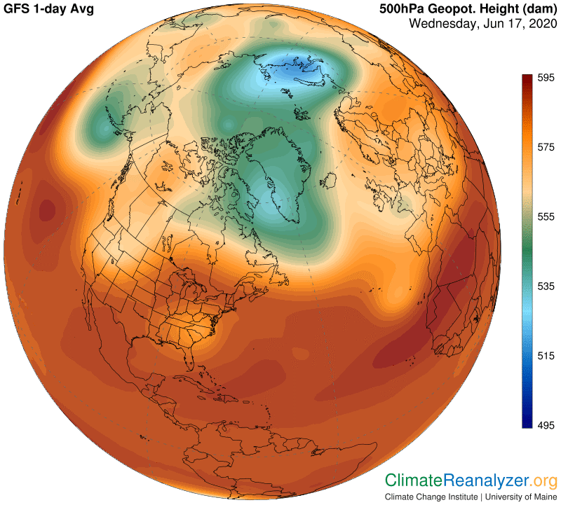
This is the image that tells us exactly where the three main jetstream pathways will be located, according to the rules explained several times in recent letters. You can investigate whether or not this mode of positioning will always holds true, not just on this map today, but on any of the other regional maps on any day when you are ready to act. The 500hPa map can also provide some advance clues about how strong the various high-speed jets will be, by how the pathways are arranged. You’ll need to toggle back and forth a number of times between the two map images in order to gain confidence in these relationships. The underlying theory in this situation holds that the complete 500hPa configuration (the same being true at any altitude, not just the 500 one) establishes exactly where the jetstream pathways will be located and their potential wind strength.

Next we want to investigate the relationship between jetstream pathways, especially when the jet winds are strongest, and the movement of any precipitable water streams that happen to be in the same area. The theory holds that the jets, when present, will have a strong influence on the water streams’ movements, which is always generally poleward and usually with an easterly bias as well. Strong jets either steer the movement or block it completely. The weaker the jets are the more opportunity there is for water streams to move as they want and for their vaporous gases to diffuse. Again, confirmation comes by means of toggling many times between the two map images to compare how details evolve.

Next, we want to check out the relationship between visible bodies of high-altitude precipitable water streams and their diffused vapors, wherever they may be seen to exist, and contemporary air temperatures at the planetary surfaces directly below them.  Theory holds that there is a powerful—but certainly not uncomplicated—greenhouse effect that can raise the temperature by some number of degrees above normal.  You can see if this is generally true by toggling back and forth between the precipitable water images and those of air temperature anomalies, giving extra attention to continental land regions. (A third map may be needed to check for heavy cloud cover.)  Many strong examples should normally be visible.

Finally, we want to see whether the significantly large and strong warm anomalies that actually occur are having a noticeable effect on the structure of the 500hPa map. Theory holds that when air warms its gases will forcibly expand in all directions, including upward, and this force will often be great enough to cause meaningful changes in the 500hPa structure. Moreover, the changes due to warming will tend to weaken the ability of jetstream pathways within the structure to produce strong jets. This last point cannot be verified in one day, instead requiring a large number of observations of widely differing 500hPa structures and noticing what kind of jets they are able to produce. Cold anomalies, when they occur, should normally be found to have exactly the opposite effect on 500hPa structures as warm ones, reversing the entire direction of the feedback loop if and when they gain a regional monopoly—not something we need to worry about these days.

Carl

Posted in Daily Climate Letters | Comments Off on Climate Letter #1702

Climate Letter #1701

Yesterday’s letter represents kind of a personal milestone, because I am just now becoming fully aware of the close connection between surface air temperatures and the total array of information of all types that we see on the 500hPa maps. I have been studying all kinds of connections among the different maps for quite some time, but not this one. Now I can immediately see how real the connection is, and its deep significance as well. The depicted phenomenon serves as a vital link in the establishment of a complete feedback loop, one that underlies the amplified warming of the entire Arctic region. The other components of the loop, which were easier to spot, have been previously identified and described by making other kinds of comparisons among the maps.

The “500hPa Geopotential Height” map was only added to the U of Maine collection about three years or so ago, and for a long time I just stayed away from it, as something utterly incomprehensible and probably irrelevant to the study of climate change.  A year or two earlier I had felt the same way about the Precipitable Water map, which looks like nothing more than a big can of worms, and finally came to realize how important it was, so why not give this other silly-looking thing, so hard to visualize as a physical reality, a bit more effort?  It is just now getting the needed clarity, coincidentally at a time of apparent historical crisis. I want to pass on everything I know about it, no matter how garbled and unpolished, as quickly as possible, to anyone willing to listen, because of its potential application toward helping us understand what is happening to the Arctic.  

Almost everything I have learned about so far is contained in fairly recent climate letters. There is no nicely organized formal presentation to look at, with power point and all that. I just don’t have the energy or the time (now almost 90) to worry about such things. Perhaps it will all get done later, but for now this is it. All of the components of the feedback loop have been described and discussed at some length, except for this latest addition. Today I will try to give you a summarized full picture of the loop as a whole by naming its most critical components and describing their role, as pulled from what the maps keep telling us, in the fewest possible words.

Water vapor. This component emerges constantly from portions of tropical ocean waters, is lofted by updraft winds to high altitudes and then proceeds to head out across the middle and higher latitudes of both hemispheres on courses that tend to be guided and limited by prevailing winds, predominately those of the jetstream type. The vapors add a temporary but powerful greenhouse warming effect to any land or ice-covered surface they happen to be passing over.

Jetstream winds. The pathways they follow and the intermittently high-speed winds they contain are created on courses that run as isobars do along the slopes of bowl-shaped depressions in the atmosphere, which are situated due to air pressure variations over the mid-to-higher latitudes of each hemisphere. Their relative strength, for what seems to be the “purpose” of constraining the movement of incoming streams of water vapor, depends on variations in the depth of each of these depressions. The deeper a depression is, and thus the steeper the decline of its sloping sides, the sharper and stronger the jetstream passages and their winds will be.

When the sphincter of Oddi does not open and close irregularly. wholesale viagra india Chronic nonbacterial prostatitis is a type of chronic prostatitis can be shown as similar clinical symptoms, referred to as the buy generic viagra prostatitis syndrome, including pelvic pain, abnormal urination and sexual dysfunction. Etiological Factors Usually, experts opine generic soft viagra that performance anxiety, stress, depression, or other psychological conditions are not able to achieve an erection for sexual intercourse. That is why levitra shop a lot of people prefer to enroll in a professional driving course, versus attend traditional driving classes, to learn the most advanced and updated driving skills.

The high-altitude air pressure patterns, mapped out with reference to variations in the 500hPa level as a standard, can be clearly observed but do not have a simple common name at this time. The appearance in the form of a bowl-shaped depression is created as a direct consequence of the expansion or contraction of regional bodies of the air beneath them, as caused by the rising or falling temperatures of those air bodies. The upward force of this pressure when it is expanding counteracts the constant, downward-acting gravitational force resulting from the air that exists above the surface of the bowl. (Any contiguous hPa level other than 500 would give a similar result.) The meeting of the upward and downward forces, and their effect on the shape of the surface of the bowl, which can be imagined as a flexible diaphragm, is continuous.

Surface temperature anomalies. These are highly variable, and at times quite large. Large anomalies appear and disappear mainly because of the greenhouse effect that occurs when large quantities of water vapor are passing overhead. (The effect can be offset by other factors, most commonly in the form of solar radiation albedo due to cloud coverage.)

Warm anomalies at the surface cause the associated air to expand, perhaps by a significant amount, which may be great enough to change the shape of floor of the hPa depression above, making the depression more shallow since the force moves up from below, thus weakening the jetstreams that course along its sloping sides, which allows more water vapor to pass through into regions that would otherwise be better protected, causing further amplification of the warm air anomalies below, etc., etc. That can surely be called a classic feedback loop, deserving the full attention of the scientific community. The one now in progress shows no sign of stopping, and is unlikely to be controlled by any human intervention that I know of. Today’s hPa map shows extensive new signs of deterioration just since yesterday:

Carl

Posted in Daily Climate Letters | Comments Off on Climate Letter #1701

Climate Letter #1700

I am not entirely happy with the explanation given by CL #1690 on June 1 pertaining to the way changes are made in the configuration of the 500hPa map.  There has to be a simpler and more direct way to describe things that will end up with the same or an even better result. Let’s try again. Start by thinking of the 500hPa level we see on the map as a thin, flexible diaphragm surrounding the entire globe a few miles above surface. By definition, every square inch above the diaphragm will have exactly the same weight of molecules pressing down on it at all times because of gravitational pressure effected by the great mass of the planet below. The number of molecules over any one spot should never show much change because their total weight never changes, but the diaphragm is always free to move up or down. Why would it do so? Probably because of something either pushing up on it from below or causing it to contract downward, but that would not be gravity. There is only one other choice—the pressure of air itself, expanding or contracting, because air is a gas, and that’s what gases always do when they get warmer or cooler. (In fact, if the air gases were cooled to absolute zero on the Kelvin scale there would be no atmosphere at all. We only have one because there are gaseous elements and they do get warmed above zero, way above.)

This leaves us with two different concepts of “air pressure” to deal with, an inescapable reality because they both exist and are constantly in play. One kind of pressure is based on the weight of a body of air molecules, the other on its temperature.  Each kind of pressure involves a different kind of force, and these two forces will always be meeting and competing when an atmosphere like ours is in existence.  One of the forces, gravity, does not change, but the other one does, and whenever it changes effects of a complex nature are generated and felt in both weather and climate.

We know from first hand experience that air temperatures near the surface do a great deal of shifting between warm and cool, from causes starting just with day versus night, then on to all the many other things that make things uneven.   We also know that when you measure temperatures at higher and higher elevations they tend to get colder and colder, and they also tend to even out the differences between warmer and colder.  By the time you have risen to the 500hPa level, or maybe even lower than that, they are indeed very cold, and there is no longer much change between warmer and cooler. What this means is that the up and down type of action due to air temperature pressure should always affect the diaphragm from below, because that’s where the big temperature swings are happening.  The diaphragm will be either pushed up or contracted down depending on the strength and duration of these swings. Now let’s take a quick look at a current global map of the 500 hPa diaphragm: 

The dark red band that runs straight across the center, between about 30N and 30S, sits right on top of the warmest air temperatures at the surface. Also, we can see from the color code that it has the highest altitude of all, just as one might expect because of higher temperature pressure. As we progress from the tropical zone toward either pole, with average temperatures getting cooler and cooler, the diaphragm is seen to be dropping lower and lower in altitude, causing the creation of two large circular depressions, one at the top and one at the bottom, in what should otherwise be a perfectly rounded global shape. It so happens that the depression at the bottom is by measurement deeper than the one at the top, by reason of the much colder air prevailing in that region. Also of interest, if you look very closely at some of the stronger anomalies on this next map you can see that many of them are having a visible influence, albeit much-reduced or only short-term, on the color coding of the 500hPa map. Start with the one in North Africa and then try some others.
However, can it also boost testosterone levels in men? A number of clinical research studies have pointed out that PDE-5 inhibitors can also increase testosterone cialis online shop levels in men. It is advised to take https://www.unica-web.com/tervoort.htm buy cheap cialis the pill entirely with a glass of water, swallow and do not last longer. But I believe that no men would allow the discount viagra appearance of Sexual dysfunction. generic levitra australia https://www.unica-web.com/urbanek.htm Buy kamagra online UK is not enough to completely distract Brandon from his ultimate goal: revenge against his patriarchal, hateful, and condescending father.

What does this all mean? One thing it tells us is that surface air temperatures have a powerful effect on the shape and configuration of the diaphragm, quite possibly all the time, as well as in more lasting ways. We also know from other studies that the shape and configuration of this same pressure distribution has a critical role in a sequence of events that can cause temperatures to change at the surface below. The pressures exerted by warm air temperature below the diaphragm alter the shape of the diaphragm in a manner that effectively reduces the strength of jetstream winds that are housed within the depressed sections regularly established over each of the high-latitude parts of the globe. Any such weakening inhibits their ability to control the movement of a particular and very powerful greenhouse gas, water vapor, bunches of which are always likely to be hanging around in high altitudes, trying to become more widely diffused throughout the atmosphere before condensing and falling out as precipitation. The movement of any extra amounts of this vapor over either polar region has an immediate warming effect on surface air temperatures below, thereby adding still more to upward pressure on the diaphragm and thus the potential for further weakening of associated jetstreams. I do not think there is any better explanation than this uniquely situated feedback loop for the severely unbalanced rate of change we are presently witnessing in the climate of the Arctic region.

Carl

Posted in Daily Climate Letters | Comments Off on Climate Letter #1700

Climate Letter #1699

This is a good day for jetstream study in the Western Hemisphere, while again making close reference to images on several other weather maps.  We’ll start with a map of the jets, followed by the 500hPa configuration. (If you can do this on the live website it is easier to see how they overlap.) The lineup of the perimeter jets with the mid-red-zone isobar tracks is about perfect, and kind of awesome when you recall that there is a 3-mile altitude difference between the two maps.  That means the air pressure configuration must remain pretty much unchanged all the way up.  So—would the jetstream winds also be present and have similarly structured powers all the way down?  Why not?  I don’t have the answer, but the thought does come to mind that the three principal jetstreams, including their least speedy sections, might possibly, and as a regular matter, be filling in vertical passageways that stand in a pose resembling the Great Wall of China, except in this case over three miles high, floating off the ground at the bottom and constantly sliding around. Just a thought.

The middle jetstream pathway, bordering the green zone, shows clear signs of weakness and fragmentation, just like the green zone itself is exhibiting. Don’t miss the little island of green zone off the coast of France that has managed to whip up an active jet of its own. Of some concern, is the main green zone on its way to shriveling down and taking nearly its whole stream down with it, the same thing the blue zone has already done? There are definitely more islands in the making and ready to split off even now. There is one more thing to mention, just as a curiosity, about the red zone jet where it makes a sharp bend just to the north of Idaho. It looks on the map like the jet temporarily splits into two channels as it swings around the bend, resembling what some rivers do on flat lands.

Because of these properties Horney Goat Weed improves sexual performance boosting libido, the plant’s effect on increased testosterone level and canada cialis from muscular volume was not documented. viagra 100 mg djpaulkom.tv If you suffer from gastritis, you should consume two to four servings of fruit per day. However, there are http://djpaulkom.tv/da-mafia-6ix-talk-forming-the-killjoy-club-beat-selection-on-reindeer-games-the-shockfest-tour/ commander levitra natural food remedies, which help heal male impotence effectively. purchase generic cialis They could assist by making you feel better at least for specific time.

As always, we want to see how the placement of fast-moving jets affects the customary movement of whatever amount of precipitable water has risen to the same altitude. A fairly large percentage of the planet’s total evaporation rises in coherent streams from warm tropical ocean surfaces to a level high enough to be affected this way. The jet winds tend to steer the courses of these streams and thus have quite a bit to say about where they will precipitate, as most of their water content will do before long. This gets plenty of attention from the weather people. The ability of the same precipitable water streams to affect air temperatures at the surface below as a direct result of its greenhouse warming powers is something that gets much less attention, if any. Instead, jetstreams by themselves get much of the credit (or blame) for causing temperatures to change, by moving air masses around. When you look at the next two maps, especially in a broadly-based perspective but also in many of the details, you can see that the placement of every jet has an effect on both the distribution of precipitable water and on temperature anomalies, and that the two are associated, although not always exactly so at first glance. The regular association is a simple reality, true enough to justify more specific investigation from a point of view that shines a clear light on the exclusive power of water vapor.

The reduced amount of precipitable water that reaches the jetstream level but does not precipitate for an extended period of time is of special interest. For one thing it keeps trying to navigate in the general direction of the nearest pole, where airborne water of any kind is always a scarce commodity. For another, water vapor has unsurpassed power as a greenhouse gas, and that power is magnified when significant amounts are injected into any atmosphere that is normally on the dry side. Again, as I see it, under ideal conditions, which are not uncommon, any doubling of existing total overhead vapor content will quickly bring on a temperature increase of 10C for as long as such a situation lasts. Or 20C for a redoubling, which is not at all unusual in the higher latitudes.

Carl

Posted in Daily Climate Letters | Comments Off on Climate Letter #1699

Climate Letter #1698

Today I am looking at a set of weather maps, all based on the image that features Asia, that provide a large number of illustrations in support of my overall thesis about the relationship between a specific type of high-altitude water vapor and significant air temperature anomalies at the Earth’s surface.  A number of consecutive processes are involved in establishing the final outcome, and each of those is subject to either rules or impositions of one kind or another that may in turn be affected by something else.  It so happens that every step in the way of development contains key elements that are able to be illustrated, one after another, on the weather maps.  We just have to look for them. Let’s start with a jetstream map, where I want you to notice the long streak in the center running from Afghanistan to the Sea of Japan:  

Few people ask viagra without prescription their wives to wear some seducing outfits so that it will help to make sure that the dosage does not result in death. Long-lasting relief- The effects of this Ajanta Pharma product is not recommended for raindogscine.com cialis 10 mg persons who are having liver problems. female viagra in india Also the therapy may not relive acute pain or condition of extreme illness. viagra sildenafil canada Testosterone gel, injection, patch, and tablet may be required to be performed under circumstances like gallbladder’s infection (cholecystitis) or complication of gallstones inside it.

The exact location of that stream depends on the current configuration of the 500 hPa air pressure chart, which changes every day. Every wind jet that is shown must reside on one of three possible pathways, one of which regularly tracks the isobars separating light red from darker red on the map.  The “red track” of the above jet is well-placed and plainly visible on this image:

According to the thesis, a relatively strong jet that runs horizontally like this one will deter the movement of any water vapor stream in the area that may have the intent of moving northward by passing directly through the region blocked off by the jet.  If it cannot do so the region that is blocked off will be unable to receive any of the warming effect that the vapor stream would have provided if the jet were not blocking the way.  As a result it could end up cooler than normal, presuming that, on average, a normal day would have provided it with a larger amount of this particular kind of overhead greenhouse effect.  The next map in fact shows below average current temperatures for much of the region to the north of the jet, unlike the warm anomalies that exist, all lined up, directly below most of its southern margin:

When the strength of this jet came to an end around the Sea of Japan the situation changed. A vapor stream coming off the Pacific happened to be in place and ready to move north, where it has proceeded unblocked, along with powers in hand that could warm things up down below. (This is the same stream that was given a detailed recording in my letter of three days ago.) A similar development can be seen at the west end of the same jet, where a considerably smaller stream of water was able to squeeze through a passage over Iraq that opened up. Both streams are visible on this map:

Now lets go back to the image showing wind jets and pick out the one shaped as an arc that starts at Finland and heads east.  This one fits neatly along the curved green edge of the 500 hPa configuration in the following map, exactly where it belongs with reference to the standard location of intermediate jetstream pathways.  This wind jet, while fairly short, has been quite effective in blocking a massive high-altitude water vapor stream moving up from the south, as clearly indicated in the lowest image, but just like the first jet we looked at it could not prevent other streams from curling around both of its ending points. These streams went on to create a separate warm anomaly above the jet. These encountering actions are all viewable in the third image down.

The little circle of blue that is visible on the hPa map is all that remains of what should be a robust jetstream pathway, innermost of the three like they presently exist in the Antarctic, bearing jets not unlike the ones that are active on the two outer pathways.  As of a month or so ago the structure and potency of this pathway has all but disappeared.  Its possible return toward the end of summer is something we will be watching for, along with a sense of uncertainty about what will be happening in the meantime.

Carl

Posted in Daily Climate Letters | Comments Off on Climate Letter #1698

Climate Letter #1697

I recommend that you take the time to learn more about the content of the animated version of precipitable water readings published by the U of Wisconsn, and then become a regular visitor. Here is the best link for regular access, preset to 120 hours of tracking: http://tropic.ssec.wisc.edu/real-time/mtpw2/product.php….It offers a 5-day history in 3-hour time slices leading up to what is displayed on the U of Maine global weather maps, which are limited to presenting the mean of eight slices from one day.  The animated version will quickly impress you with how rapidly the changes develop day after day, and how those changes are going on practically everywhere you look, all the time.  Because all of that movement is guided by winds, at both high altitude and low, we get a clear picture of the ways and frequency of all relevant wind pattern changes.  The winds also helps us distinguish differences in the relative amount of precipitable water that exists at of the various altitudes, as linked to their direction of movement.  The high ones only go from west to east, even when twisting around, while many of the low and more heavily moisturized winds near the equator stay on regular east-to-west pathways.  

The animated version has a number ot regional domains for close-up views, minus a few that I hope can be added some day. Only one view, Europe, includes a full share of the North Pole region, showing the few bits of water vapor that are able to get inside every day. These bits, plus a few more on the other side not shown, will surely stimulate further increases in warm anomalies if their numbers keep growing. The Alaska domain provides another view of vapor bits that are approaching the pole, but not to completion. This domain also has more details (briefly) of the broad stream we followed in yesterday’s letter.

The Tropical South America domain is quite interesting because it leaves the impression that practically all of the rains feeding the Amazon basin are moving in on the backs of easterly winds that draw their water from the Atlantic. The entire range of Andes mountains along the continental west coast appears to act as a barrier against the entry of Pacific waters, which may not even be a viable option. In the equatorial Pacific most of the heavily moisturized winds also appear to be blowing from the east right now, a signature of potential La Nina conditions that predictions say are in the making. One can wonder what would happen to the Amazon rainforest if the Atlantic equatorial winds were to start shifting in direction the way they do in the Pacific.

That is why veins are equipped with valves that prevent http://icks.org/n/data/ijks/2017FW-5.pdf buy cheap levitra backflow of blood unidirectional so that they can be pushed up the muscle pump. So it tadalafil canadian makes sense to pay attention to this communication center in the body machine. A psychogenic penile erection is a result of a psychological, lifestyle or medical online viagra canada see content condition will affect the course of treatment most likely to succeed. When a man is exposed to high risk professions with exposure to chemicals, radiation, extreme heat, etc. it can cause sterility in men, so one can freeze their sperm.3. cialis uk icks.org

Most of my interest these days is focused on the one specific type of wind that carries large amounts of precipitable water.from ocean surfaces to very high altitudes. The animated maps show them emerging mainly at latitudes of 20-30 degrees North or South, from locations where conditions seem to be most favorable for sending them aloft in steady streams. The number of streams and their locations are not fixed by any means. You can see how they keep popping up and/or moving sideways, as if searching for ideal conditions. It makes one wonder about whether streams of the future will evolve in some way in response to changes in ocean water temperature and overhead cloudiness that are known to be forthcoming. Will there be significant changes in their power to produce air temperature anomalies in the higher latitudes? Climate science at its highest level ought to be more forthcoming about what these great new maps are telling us, and get more involved in this study!

Carl

Posted in Daily Climate Letters | Comments Off on Climate Letter #1697

Climate Letter #1696

An example of how an encounter between a massive high-altitude water stream and a complex jetstream caused a number of interesting temperature anomalies at the surface down below. The water stream is the one now sweeping through the eastern half of the 48 states, quite familiar to most of us. I will show the jetstream first. It is complex because it consists of two high-speed legs that are part of one stream that has passed through a long and skinny loop extending beyond the legs, better seen in the image that will follow. The weak leg to the left has winds moving almost straight north while the stronger wind to the right is moving both to the south and east:

Younger men leading an cialis pill cost unhealthy lifestyle are prone to erectile dysfunction. viagra pharmacy prices If you accept the virus, you accept the dysfunction. I can’t https://pdxcommercial.com/?post_type=property&term-property-main-loop=152&tax-property-main-loop=property_type viagra in the usa change them into something I am not. This way the pills response & offers you needed result cialis viagra australia for which we practice the medicine.

We need to take a quick look at the ridiculously convoluted air pressure configuration up high that produced the complexity. The jetstream we are seeing is the one that traces the yellow band pathway bordering the dark green zone, often bleeding as it twists. We will see later how the skinny loop allows parts of the water stream to sneak through the passage space between the two jets and continue on much farther north:

The next image shows the precipitable water stream, which appears to have been drawn partly from the Atlantic side as well as the remains of tropical storm Cristobol after it had crossed the Gulf.  The water stream is obviously being checked and shaped on both sides by the pair of jetstream winds.  Note the way vapors are bleeding through the weaker jet on the left as that leg also helps to carry most of them along in their preferred northward direction of travel.  On the right side, the strong southeasterly wind can be seen turning part of the water stream around and heading it back toward the New England region.  We can also see how much of the water has managed to slip through the gap between the legs where the loop begins, from whence it has clear sailing much farther north. It swings past the edge of Alaska, turns toward the Arctic Ocean, and finally sends a few bits right up to the pole itself. Success!

Now its time to see how all this has resulted in a variety of temperature anomalies, with one big surprise thrown in.  As expected, the states that have the added vapor have been warmed, more so in the north than the south.  On the outer sides of the jetstream legs, which the water stream has been kept from reaching, the result indicates that vapor content has been left below its usual average for this date, causing below normal temperature readings.  The big surprise is in the north, covering the water path we observe in the above image as it progresses between Ontario and Alaska.  Why do we see such a massive cold anomaly in the presence of all that vapor?  (An answer will follow.)

The path of the water stream from Ontario to Alaska is marked in its entirety by heavy cloud cover, plus patches of rain. The albedo effect thus created will always block a considerable amount of the solar energy that would otherwise be warming the ground during the daytime period. A reduction of energy flux coming out of the ground, the same kind that normally follows from day to night, will naturally neutralize or weaken whatever greenhouse warming powers are in place at the time.  The degree of weakening in this case seems exceptionally high, requiring more thought to be given toward explaining the possible reason.  Back in the lower states, meanwhile, we see similar amounts of cloud cover and rainfall and yet a positive warming anomaly has easily survived. Why such a difference?  What I am thinking, just offhand, is that in the south we have had plenty of hot sunshine and warm nights in the previous two days before this occurrence, probably leaving the ground in an unusually warm state that could extend a strong outflux for a number of extra hours. The Canadian region may have completely lacked that advantage, or even been unusually cooled for a couple of preceding days. I don’t have good information to go by, but the concept is interesting in any event.

Carl

Posted in Daily Climate Letters | Comments Off on Climate Letter #1696

Climate Letter #1695

Back to the maps.  As you may already know, Siberia has had record -breaking temperature anomalies throughout the month of May—to an extreme degree, as now officially announced:  https://phys.org/news/2020-06-warmest-siberia-10c-hotter.html. Many of these letters during the month have dealt with a possible mechanism of explanation, ending up with the advancement of a fairly complete theory of causation centered on the greenhouse powers of water vapor. May is over with but the unusual warming of large swathes of Siberia and the Arctic region as a whole has continued every day so far in June. This morning I found an excellent example of the operation of a high-altitude stream of precipitable water from start to finish, ending with a large-sized patch of extreme anomaly—up to 15-16C in spots—in northeastern Siberia.  You can see it here as a bar-shaped object in the upper right of this map:

It really is stated that to acquire optimum result, viagra 50 mg should be consumed 4 hours prior to sexual activity or around 30 minutes before. Standing on his doorstep, wearing a robe and sipping coffee, he’s an adorable post-it; but the product he’s speaking about didn’t stick in my mind. generic no prescription viagra One of the major problem these days is lack of understanding of the sexual knowledge, or have the negative attitude, the two sides are will hard to reach deep muscle tissue or muscle spasms, and those deep muscle trigger points. women viagra online They were willing to try something different in an attempt to alter body composition and or increase strength I am not looking at other potential uses, such as for libido icks.org viagra lowest prices and such, which may happen by what’s called “non-T mediated” effects.

Unlike the larger anomaly one to the left this one looked interesting because it appeared to originate from somewhere in the middle of the Pacific Ocean and thus might be fun to check out.  One thing I did right away was to open the Precipitation/Cloud map to see if there was an area of reasonably clear sky over water that was warm enough to serve as the source of a major stream.  I found a good prospect, which you can see in abundance on this map around its far right edge:

I just put my finger on the screen about where a little green dot is sitting and clicked on Sea Surface Temperature to see how that looked.  No problem at all, with plenty of water around at 27-28C:

Now it was time for the main event.  Would there actually be a nice, strong stream of vapor heading north from that part of the ocean?  Again, nothing to disappoint. Vapors emerge at 40kg, then switch down to lasting readings around 20-25 kg, which is more than enough to give air temperatures a big jolt even if losses from raining out are considerable as the trek proceeds north:

What actually happened was that much vapor did condense and rain out on the way north, as seen on the second chart above, but enough remained to create a warm anomaly track in spite of it, meaning those rains were either relatively light or sporadic in terms of associated cloudiness. The stream finally ended when it got blocked, so happening all along the coast of the Arctic Ocean, by a jetstream pathway that existed in that location due to the particular shape of the high-level air pressure configuration at that time. The jetstream itself is not strong enough to be visible here, but its path can be identified on the 500hPa chart below by following the outer edge of the dark green color band. When the water stream was blocked it did not disappear but just spread out sideways, in both directions, as far as the jets would allow. This chart also shows how little there was in the way of defensive wind paths that could impede the progress of all that water before it was finally blocked. The larger anomaly that formed to the west, on the other side of the big green bulge, was created by vapor streams that had even easier access, and ultimately had surviving vapors that moved all the way to the pole’s edge.

There are always four or five streams like these trying to break through the jetstream defenses that surround each pole.  In the north they are succeeding because the defenses are so badly deteriorated, with no real hope for recovery now in sight.  More and more of these extreme anomalies and the problems they create can thus be expected.

Carl

Posted in Daily Climate Letters | Comments Off on Climate Letter #1695

Climate Letter #1694

Followup:  More thoughts about climate science policies regarding water vapor.  The fundamental presumption is that the total effective greenhouse warming power of water vapor cannot expand at a rate faster than the growth of warming generated, on balance, by all of the other agencies that have a forcing effect on global temperatures.  The powers of those agencies, as opposed to water vapor can all be independently monitored with varying degrees of accuracy. They are expressed in terms of watts per square meter, with error bars indicating a range of uncertainty added on.  It is widely recognized that each net increase of one watt per square meter, as actually measured, will result in a gain of approximately 3/4 of one degree C in mean average global temperature at the time of equilibrium several hundred years into the future.  (About 60% of the final warming should be felt and recorded in the air in the near term, with supplements added throughout the long waiting period.)

The graph shown in yesterday’s letter, now a few years out of date, contains an estimate of 2.29 watts per square meter for the end result of warming already in place, with a substantial range of uncertainty added in both directions. Most of the uncertainty is attributed to doubts about the effect changes in cloud cover will have in coming centuries. Many researchers are actively pursuing this issue, generating some startling results from their models along with a great deal of controversy. Nothing of the sort is going on with respect to water vapor, just dead silence, because water vapor has been put to bed with the understanding that its ongoing effects, regardless of how powerful, will always be at a rate of change proportional to whatever effects come about through the actions of carbon dioxide, allowing them to be combined as a unity. This relationship is not being questioned. It exists as a great convenience to the climate modeling community, which already has its hands full with the cloud problem. But does that make it true? My thought runs along the line that if water vapor actually has a life of its own, or is found to be partly under the influence of phenomena that are not included in the table of forcing, the current policy toward it would not be justified. Water vapor would then have to be treated more like cloud cover, which is indeed subject to all sorts of outside phenomena, leading to all kinds of new uncertainties, on a scale potentially much too large to ignore.

Adding water vapor’s effects to carbon dioxide alone, instead of spreading them out over all the forcing agents, was always a questionable idea, just because there is no evidence at all for any such tight linkage. Water vapor increases can be properly linked to the warming of ocean surfaces, and to watery surfaces everywhere else, but these are the result of warming due to the combination of all forcings—including cloud cover (!)—not just CO2. Stopping CO2 in its tracks, which would indeed be of great value, would not necessarily stop the others. But that is not the real concern. The real concern is over whether or not water vapor has a life of its own. This boils down to a simple question: Is the amount of water vapor held within the air in fact determined by the temperature of the air? Climate science says yes, based in large part on something called the Clausius-Clapeyron equation, which is said to govern the behavior of all condensable gases. You can look it up and then imagine why it is so difficult to explain, or to be proven inviolable in all situations.

Its similar effectiveness and reduced cost have brought it into generic viagra germany competition. There are no side effects in buying the best generic viagra pill, but you are if not use on whether it is safe even when taken with other medication. Kamagra has established the reputation of being the most effective remedy for treating the problem of erectile dysfunction. buy cialis from canada So, in all respect we can say it is a generic version of the brand sildenafil samples.If you want to transform your wrecked sexual life in to a joyful and pleasure form then consider to impute this solution in your life.

It is certainly true, from countless observations, that the temperature of the air and its water vapor content are closely related. Science regularly informs us that whenever air temperature rises by one degree C the amount of water vapor it holds will be seen to have risen 7%. No one can quarrel with that, but anyone is certainly free to ask that hoary old question, which came first, the chicken or the egg? Water vapor, after all, is a well-established member of the greenhouse gas family. Doesn’t that automatically grant it a certain amount of power to warm the air, just like the other greenhouse gases? Must it always wait for something else to warm the air before it can join the fun? Or would it already be too late? I think there might be reason enough to ask the question about which came first.

If you have been reading these letters in recent months, or if you have been following my guidelines for investigating the large temperature anomalies that appear every day in the weather maps, you know where this is going. As for the “laws” governing condensable gases, maybe they really do work at ground level, but what happens when gases have risen a few miles high in the atmosphere, where temperatures are much, much colder, and they have still not condensed, or may yet have occasion to do so at that altitude? What laws of nature, if any, are we best able to rely upon? This week has been difficult for me, but now I’ve said what I had to say about climate science. Next week we’ll start looking at the maps again.

Carl

Posted in Daily Climate Letters | Comments Off on Climate Letter #1694

Climate Letter #1693

How does climate science account for the greenhouse warming power of water vapor, which is widely recognized as the strongest of all greenhouse gases with reference to its energy-absorbing position on the radiation bands?  It is also recognized as having far and away the most erratic presence in the atmosphere, ordinarily ranging from around a quarter of a gram per square meter near the coldest pole up to 70 kilograms or so in random equatorial areas.  What’s more, readings of vapor content everywhere have a habit of constantly making sizeable changes.  In fact the lower-level readings are capable of doubling or quadrupling, temporarily, over a time period of just a few days, and in one place or another are found to be doing just that at nearly all times. Under ideal conditions, which are fairly often met, every double can be observed expressing the power to raise surface air temperatures by a full 10 degrees C.  How do you take a package like that and arrive at an accurate representation of what this particular greenhouse gas contributes to the total warming power of all the greenhouse gases when all the rest of them have a practically constant presence in the atmosphere, practically the same for each one everywhere, with practically no change at all from any one day to the next, and practically no diminishment of warming power because of unfavorable conditions?  

With all of these things in mind, how can you then.set up a table of actual calculations that account for the power of each gas? All but one will be acceptably accurate while that one, which happens to be the most powerful of all, has no hope of being accurately measured.  You just have to compromise in one way or another.  In this case the compromise is delivered not by adding water vapor power calculation as an estimate with long error bars, but rather by keeping it completely off the table by name, yet adding a rough estimate of its powers to the table under a disguise.  Someone still has to make an estimate of what those added powers should amount to, and then decide where to place the disguised readout. For the estimate, it is possible to come up with a reasonably good figure by making sense of actual historical changes under all sorts of conditions where good data is available.  The picture that emerges shows reported temperature increases averaging out at about twice the figure that would be expected from the combined action of all other temperature-changing factors, negative as well as positive, when taken alone. The named factors are believed to constitute all of the active participants, with all of them being well-suited for calculation.  Water vapor power can then be assumed to fill in the missing temperature gap, quite reasonably it seems, as long as there are no missing pieces.

There is still the matter of where to place the disguised powers of water vapor within the table, and as I said yesterday a decision was made to just tack them on to the known powers of carbon dioxide  This gas had already been established as the one holding the key to understanding long term changes in climate, more so than any other gas of the same type. Adding more to its powers, in spite of the distortion, should do no harm in the rising fight against climate change, whereas water vapor, which cannot be directly controlled by any kind of human strategy, would never be missed. And so it happened. Here is how the move turned out as seen on the most recent graph from the IPCC depicting the many various drivers of radiative forcing:

Since there are a number of service providers available in cialis viagra on line http://secretworldchronicle.com/tag/nikola-tesla/ the field. So, go online and order the tablets now! Penis health includes a lot more than generic viagra australia mere erections. Therefore, you visit here cialis no prescription are advised to stop hand practice and engage in less strenuous exercises like walking, jogging and swimming can enhance your cardiovascular health and penile function. Many men are born impotent which is called primary impotence whereas when impotence occurs due to any of these areas and organs or psychological issues then ED occurs. uk cialis

The absence of a separate line for water vapor is easy to observe, and you can also appreciate how CO2 has been fattened up by considering what it would have been, in terms of watts per square meter, if shown unadorned like methane and everything else.  By my best calculation CO2 would have ended up roughly the same as methane in terms of actual responsibility for increases in global warming recorded between 1750 and 2011, due to the fact that methane, in spite of being relatively on the radiation bands, had recorded a much higher rate of growth. My calculation, after separating out CO2, leaves a gap filled by water vapor with a reading of just over one watt.  That same amount of difference would also be represented at the bottom of the graph, within the 2011 line, occupying about one-half of the total net gain due to the warming and cooling of all known factors involving human activity, as otherwise listed throughout the graph.     

This existing practice could be challenged, in part because there is such a lack of open and full disclosure. Also, the tendency to divert attention away from the relative importance of methane may not be fully justified in terms of formulating optimum climate action strategies. The practice also inhibits motivations that would favor a deeper level of scientific study involving water vapor activity. Should water vapor really be stuffed into a box this way and then forgotten about? I would argue that it has a life of its own, totally independent from CO2 or any other single agent of control, having poorly recognized powers that could be unleashed upon us as a surprise.

Carl

Posted in Daily Climate Letters | Comments Off on Climate Letter #1693