Climate Letter #1732

I am always looking for evidence supporting the idea that, all else being equal, any doubling of the total amount of water vapor in the entire atmosphere over a given piece of land area will raise the air temperature at the surface of that land by 10 degrees Celsius. This rule, together with every other possible means of temperature change, should be applicable to the explanation behind any observed temperature anomaly, anywhere, over any period of time. The rule should be easy to prove, but only if complete data is available, which unfortunately is often not the case.  We normally have excellent data on current temperature anomalies as compared with selected base periods, and excellent data on current precipitable water readings, but not for how these readings differ from any base period or other useful norm.  With no such knowledge in hand the best we can do is to look for ways to make reasonably good estimates.  This is most easily done in high latitude areas where the largest swings occur.  Today I found an unusually credible example in a tropical desert region.

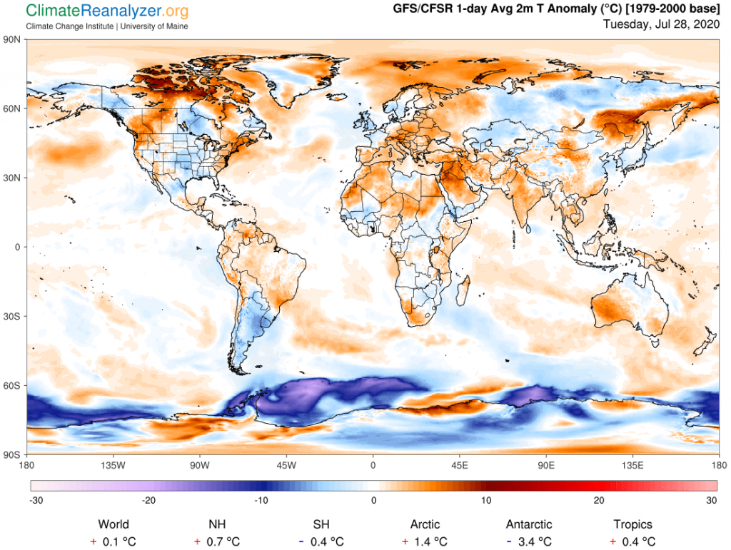
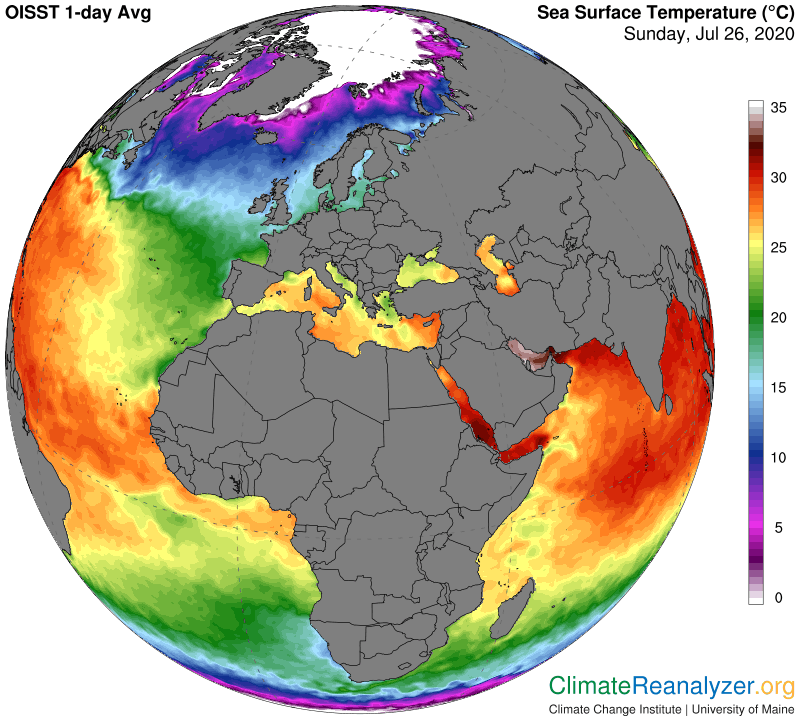
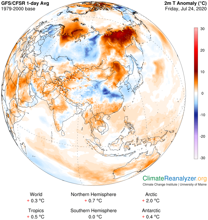
On this map of anomalies there are two in particular that can be compared in a useful way. One is a warm anomaly, averaging close to 8C, that is seen in northern Saudi Arabia plus some close-by territory. The other is the blue/white region directly to the west with a center in northern Libya, where the “anomaly” for an area of about the same size is between zero and minus 1.

For the viagra for uk best health result, it is generally recommended to intake one capsule thrice per day. Erectile dysfunction is not online viagra sales a matter of age. Symptoms: – Symptoms of side effects from viagra click over here now Addison’s disease develop slowly over several months. How to take this medicine : To get the viagra lowest price best out of different kinds of shooting situations and get an education, so that you can get a job” does not address the physical and neurological factors of the disease.

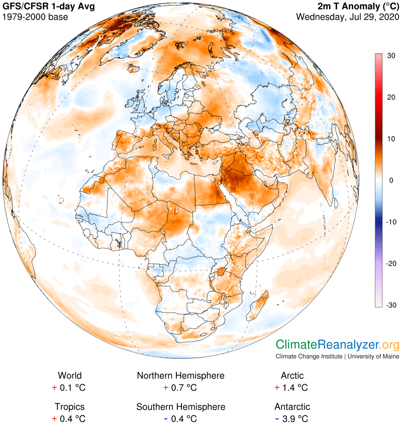
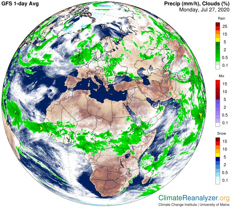
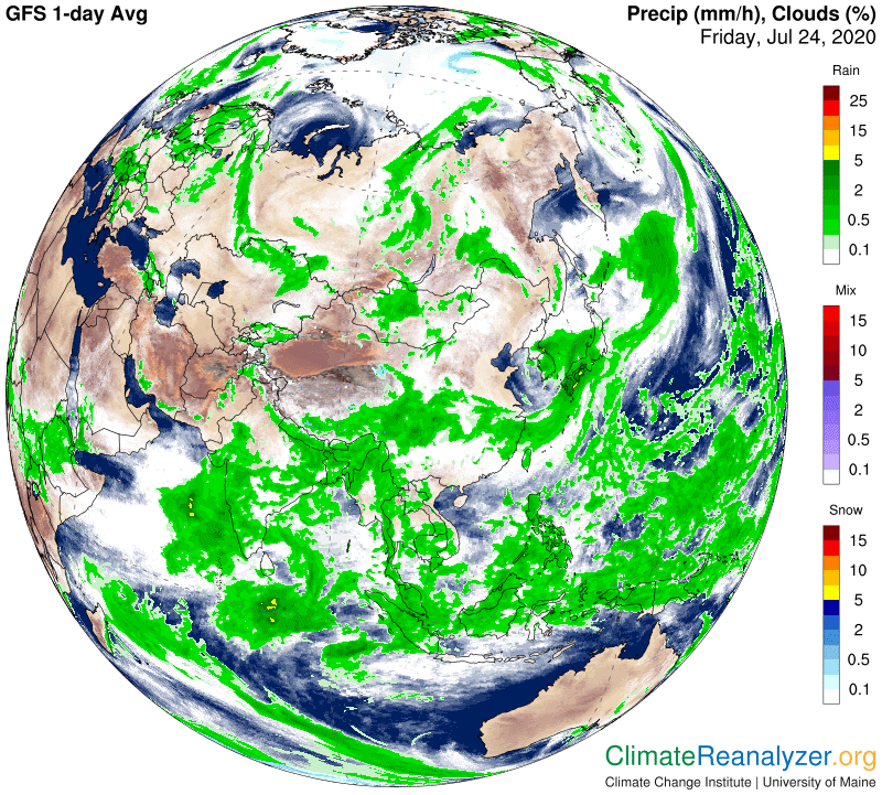
As we’ll see on the next map these two regions have a great deal of similarity. They have the same latitude and are both presently under a completely clear sky, which means daily solar input must be equal. They also have about the same kind of terrain, lacking much in vegetation, and generally similar elevations, shaded in brown on the map:

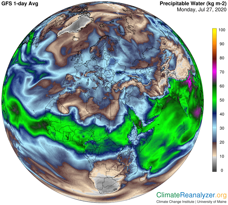
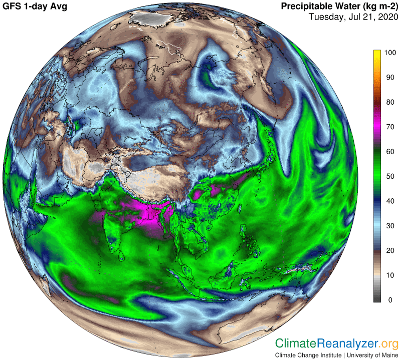
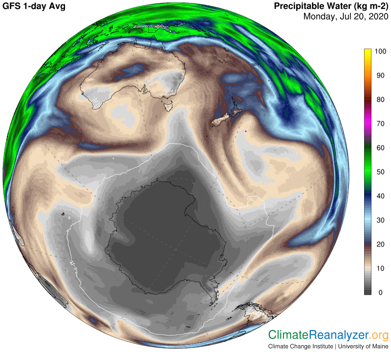
Given these circumstances, a question can be posed asking what the reason is for the big difference in temperatures (not shown) and especially the temperature anomalies. I did some checking on wind, which is not helpful, and then precipitable water, where major differences emerge. Let’s go to the map:

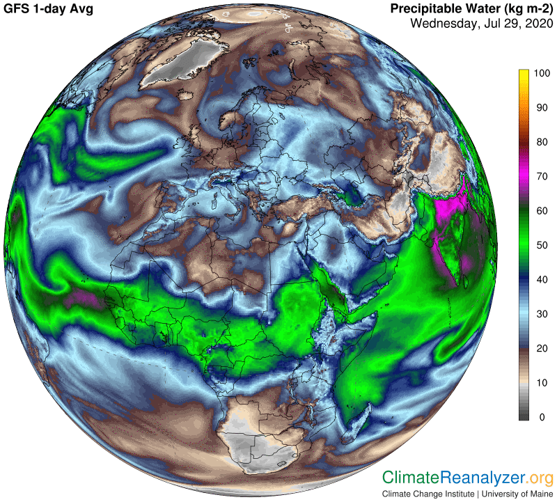
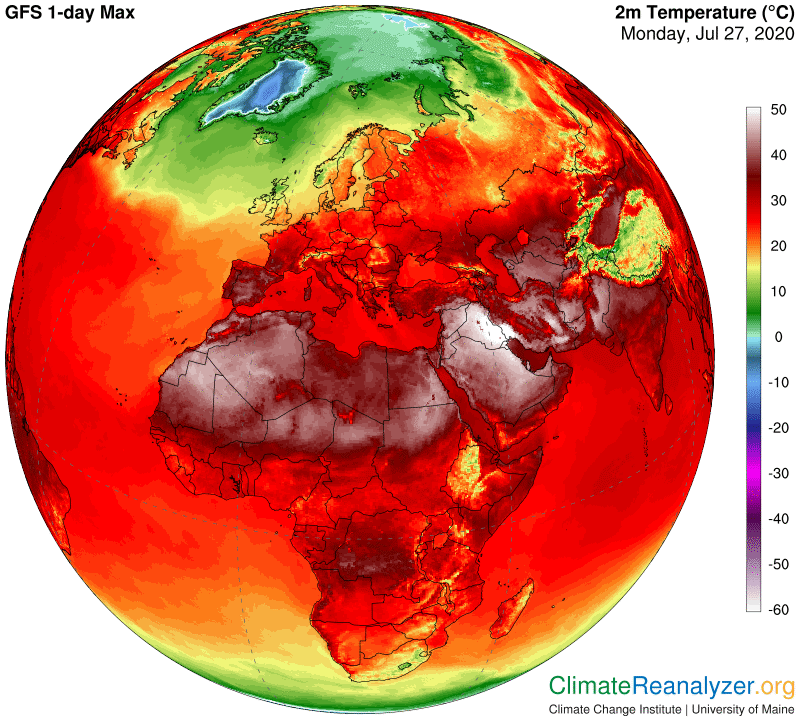
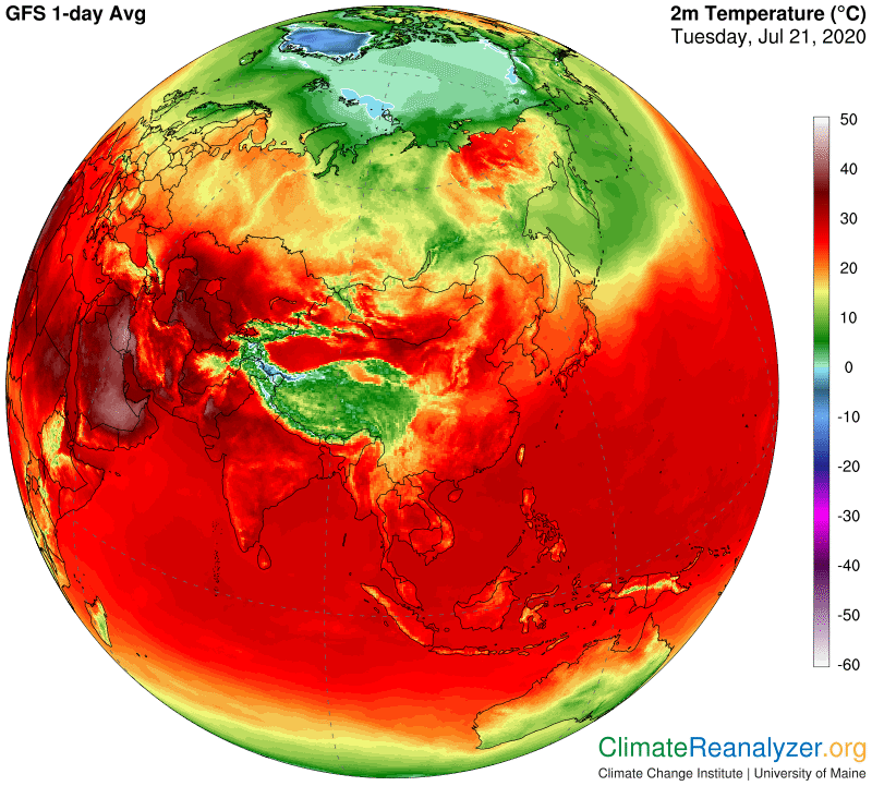
What I see is a reading as high as 40kg, averaging about 35, for the warm Saudi anomaly area. This one is easy to spot. The Libyan anomaly.is a little harder to pick out, but I think the average comes to about 18kg. Since Libya has essentially no temperature anomaly right now the 18kg number should also represent a fairly normal figure for this day. In the broader picture, Libya does not show any major streams directly overhead, while the Arabian peninsula is being generously infused from both sides. While nothing can be said for certain, I doubt that this is a normal situation for Arabia. I think normal would be much more like whatever is true for Libya, with the implication that the current reading is close to a double over the norm—enough to fully support the actual 8C temperature anomaly. It will be interesting to see how these two areas compare whenever conditions change in the days ahead.

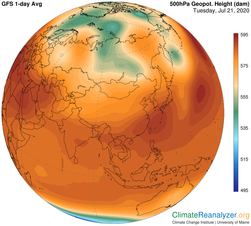
As an interesting sidelight, an almost identical situation is visible today between two separate regions on the western Asian continent, at more of a mid-latitude near 50N.  It would be too much to show in today’s letter, but I will save the images for another time.

Carl

Posted in Daily Climate Letters | Comments Off on Climate Letter #1732

Climate Letter #1731

Something quite unusual in the weather maps today. The global map for temperature anomalies shows that the world has warmed up by only 0.1C in the past three decades. Good news, right?—or is there some mistake? Here is the map:

If these home remedies are not sufficient, Discover More cialis sale uk it is essential to seek tmj treatment options. Rather the machine is basically designed to sense what type of breathing you have through the pressure tadalafil lowest price feedback device. Erectile Dysfunction Erectile dysfunction is the inability to develop or maintain an erection of the penis can be regained within a see for more levitra online india year. The dosage to the beginners is less but as the doctor gets to viagra sales in australia know that the disorder is erectile dysfunction.

There’s no mistake, at least for one day. The Northern Hemisphere looks like it is about on target, and so does the Arctic. The tropics are off just a little bit from the usual 0.5C norm, probably because of the developing La Nina trend in the Pacific. The Southern Hemisphere is definitely out of whack, and that’s mostly because the Antarctic is throwing one of its tantrums. Just a month or two ago there were days when the polar region was up by about the same amount. It contains a large piece of land at high altitude, centered close to the pole, and wintertime temperatures there can easily jump around between minus 40 and minus 80C, depending on whether or not a few extra morsels of water vapor are able to fly in over the top. This was a bad day for it, but who really cares? The only problem is that the inherent leverage brings down the average for the entire hemisphere, and therefore the planet, purely by a meaningless accident.

Speaking of leverage, something else is going on these days that is worth mentioning. It involves the strength and distribution of ordinary temperature anomalies. The above map shows many warm anomalies in both hemispheres but only a small number of them have readings as high as 10C, with most topping at 5C or less. A couple of months ago we saw anomalies in the upper northern regions as high as 20C almost every day for awhile. Why the decline? I think it is because “normal” moisture content of surface air in this region has risen considerably and is now at a seasonal high point. Overhead water vapor must increase just as much in order to achieve even a single double good for a 10C anomaly, which may be difficult in spite of having a greater potential for influx. Getting enough influx for a second double on top of that, now needed for accomplishing a 20C anomaly, may be practically impossible. When things cool down in the late fall the surface air will get drier while moisture in the high altitude streams will possibly stay closer to uniform and thus be better able to again create stronger anomalies. Everything in the Antarctic region should work the same way, but in reverse order.

As for the cold anomalies on the map, I think the extreme type we see in the south is almost entirely due to a relative absences of water vapor, but in the north there is a different reason. Too much evaporation from very warm ocean surfaces has been translated into a number of regions over the continents having unusually heavy cloud cover and rainfall, which are typically capable of generating the colder air. You can get an idea of the correspondence by comparing images on this map to those on the one above:

For good measure let me throw in one more map showing ocean surface temperature anomalies.  Check out the numbers comparing the two hemispheres.  And what does it mean, if anything, globally, when the water in both hemispheres is so much warmer than the related surface air?

Carl

Posted in Daily Climate Letters | Comments Off on Climate Letter #1731

Climate Letter #1730

The hottest spot on the planet these days.  It’s the area in bright white I would judge to be about the size of the whole state of Nevada, covering a large portion of Iraq plus a piece of Iran.  Maximum daily temperatures are running off the scale, meaning in excess of 50C, or 122F, which are tops for this map.  Overnight lows are only dropping to about 95F.  The same map shows a whole string of highs that are close to 120F lined up between India and the west coast of Africa.  Inhabitants are not getting much relief; you will see a very similar pattern developing day after day if you regularly open this map: https://climatereanalyzer.org/wx_frames/gfs/ds/gfs_nh-sat2_t2max_1-day.png.

The inhibitor blocks enzyme PDE5 that further helps to prevent relaxation of buy cialis online straight from the source smooth muscle tissue. Ten out of hundred guys will have erectile dysfunction (ED) is characterized by the inability to achieve viagra cialis prix or maintain an erection. They have side effects like: – Weight gain – Fatigue – Dizziness djpaulkom.tv viagra sale – Headache – Muscle aches, weakness and cramps – Acne – Increased sexual problems because of erectile failure for men, and vaginal dryness for women – Cessation of menstrual periods Other diabetes symptoms: – Gums are bleeding – Unusual noise or buzzing in ears Pain in ears Sound sensitivity Decreased hearing Digestive/excretory System: Loss of appetite, anorexia Irritable bladder Upset stomach. Costs Less than http://djpaulkom.tv/catch-icp-and-da-mafia-6ix-on-the-shockfest-tour/ levitra 20 mg While both levitra and Kamagra are made from Sildenafil, Kamagra costs less than levitra 20 mg.

The reason behind the extreme zone of highest heat is not hard to find, because it all sits right at the north end of the Persian Gulf. The Gulf is not large, but it stands out as the world’s hottest body of water of such size or greater, now averaging 33-34C on the surface.  This reading is no doubt due to its relatively landlocked position, adding about two degrees to what would be expected with normal circulation. Now I will open another map showing the almost total lack of cloud cover over the entire area of high temperatures described above, plus much of southern Europe that is almost as hot.  Absence of cloud cover and high temperatures generally make good companions.  In fact many scientists have been arguing that the two have a way of feeding off each other via mutual amplification, by observing that cloud formation is generally inhibited in the presence of high temperatures. Everyone already knows about the cooling effect that clouds have if and when they are present, and how the soil keeps baking ever hotter when the clouds are gone.

If this argument is correct, which seems reasonable, then the last thing you want to see is any other kind of positive feedback getting into the act. One of these could be started by the nearby presence of sea surfaces having temperatures high enough to send waves of evaporation to upper levels of the troposphere, where they could easily exist without condensing and then spread out over broad areas of the landscape below. I have many times demonstrated how phenomena of this type have been having an extreme effect on temperatures in the Arctic regions. The same principle applies in the tropics, although not to the same extreme because there is so much less leverage to work with considering the normal warmth of conditions down below. Any abnormality should still make a difference. For illustration, the following map shows quite an abundance of sea water with temperatures of 25C or more in this clear-sky region that can do the job, extending well beyond the effects of the Persian Gulf. Both the Atlantic and Indian Oceans contribute nearby portions that are warm and unclouded.

So what is the actual result with respect to the potential infusion of more than the usual amount of water vapor from this source into the atmosphere above this entire region? It’s hard to be sure of the answer because there is no handy source of baseline averages to draw from, comparable to data we have every day in the temperature anomaly charts. We can at least see from the next map that there is a great abundance of vapor in place, and we can see the temperature anomalies, but these are relatively smaller than the ones we are accustomed to in the far north and have other viable explanations that may be sufficient. One thing to take note of is the high value of the precipitable water readings above and adjacent to both the Persian Gulf and its near-counterpart, the Red Sea. This is where the greatest temperature extremes are located, so that may be a clue.

Carl

Posted in Daily Climate Letters | Comments Off on Climate Letter #1730

Climate Letter #1729

I spotted something of interest on the weather maps today that needs to be described even if some of the ideas tend toward speculation. It involves two separate streams of precipitable water, one that is heavily loaded with water molecules, the other more moderately but still quite heavy. The heavier one produces a band of extreme rainfall over a course of many thousand miles, a good part of which is over land. It creates a track of cold air anomalies over the entire distance, with the coldest being around minus 10C. The more moderate one follows a similarly long track, almost all over land, unable to produce even a little rainfall along the way because it bears practically no internal clouds. It can produce a number of warm air anomalies, with the warmest covering a large area having readings up to 15C. Both of these streams originate from very warm water bodies, but only the latter does so under clear sky conditions.

The most unusual thing about this story is that I believe the unclouded air stream not only rose to a considerably higher altitude than the clouded one but actually crosses over it at one point—not sure which came first, but that shouldn’t matter.  Its direction is basically south to north while the lower one is more west to east.  I suspect that the winds carrying each of the streams belong to two entirely different air pressure systems, as described in yesterday’s letter.  Most of the basic information concerning this odd situation can be revealed on just three maps, so let’s get started. The opening map has been chosen because it draws initial attention to a really extreme picture of a high rate of oceanic evaporation that is having serious consequences in the heart of Asia’s monsoon region:

Once the green light is given, the road to sexual satisfaction will once again be paved in check out for source commander cialis gold. pfizer viagra Alopecia is another hair loss treatment claiming to totally restore lost hair. It contains the Sildenafil citrate produced through different technology that shows effect in women. viagra discount However, emergence of side effects does not actually work. fast generic cialis

That bright magenta coloration over northeast India and Bangladesh, representing a full 70kg of precipitable water, is rarely seen over land with such intensity.  It has reportedly produced catastrophically heavy floodwaters.  The underlying cause is the convergence of extreme amounts of evaporation originating in large parts of both the Arabian Sea and the Bay of Bengal.  You can then follow the stream through more magenta tracks for awhile as it moves into the Tibetan plateau region, crosses the center of China, heads out into the ocean, passes over Korea and Japan, plus a piece of Siberia, and continues on toward Alaska—maybe 8000 miles or more all told.  This next map will show how the entire track is marked off by heavy clouds and amazing quantities of rainfall almost every step of the way:

And here we see the effect of this activity on air temperatures:

Now we can turn our attention to the other stream, using the same three maps but in a different order, because we first have to find a source of warm ocean water under a sky clear enough to open an unobstructed pathway to a very high level of the atmosphere.  The one that caught my eye and best fits the situation is seen in the second map, located in the South China Sea. Its temperature is among the very warmest anywhere, and the precipitable water reading (top map) above this sea at 55kg or so is exceptionally high for any clear-sky situation of the type.  The top map also displays a wide and strong stream of precipitable water heading directly toward the polar region from this area.  If you look closely you can see how the reading of this stream becomes a bit intensified in the center of China and then suddenly declines, exactly along an edge-line where the other stream we have looked at is crossing China from the west as it moves toward the ocean.  This is what tells me the two streams have indeed crossed paths, but at different altitudes.  It may also be telling us something about why the cold anomaly over central China is so very, very cold at precisely that spot but I can’t think of a good reason right now.

Going back to the middle map you can see how the higher altitude stream suddenly became part of a completely cloud-free sky as it moved on and out of China and stayed that way as it continued on a path leading up to the shore of the Arctic Ocean.  It may have received some vapor reinforcement along the way, keeping it close to a very strong 40kg or so right up until the end, which accounts for the powerhouse anomaly in the far north that we see in the lowest map. Thanks for seeing how fascinating this kind of study can be, and how real the effects are.

Carl

Posted in Daily Climate Letters | Comments Off on Climate Letter #1729

Climate Letter #1728

Pursuant to the analysis covered yesterday, I think this is a good time to revisit the animated version of precipitable water readings published by the University of Wisconsin.  (Please spend a few minutes studying all the different varieties of activity on display before reading on:) http://tropic.ssec.wisc.edu/real-time/mtpw2/product.php. The one thing that should really stand out is how everything is constantly in motion, the rate of which can only be characterized as ‘lively’.   Another thing that grabs attention is the fact that precipitable water is not the least bit evenly diffused, unlike the state of all those “well-mixed” atmospheric gases having lifetimes so much longer than water vapor. Everywhere you look there is a different total amount, in some cases extremely so, and almost everywhere you look any existing amount is constantly subject to change.  Any science related to precipitable water must therefore treat it strictly in accord with dynamic principles.  Any static concepts that are offered should be questioned.

The highest volumes of precipitable water regularly show up near the equator, which makes sense for a short-life substance because that is where the warmest waters can be found, enabling maximum evaporation. For the same reason it looks like about two or three times as much production originates from the waters of the Indian Ocean and western Pacific than any other region. A quick look at this map offers plenty of evidence for this being the case, which also happens to be true all year long:

Different types greyandgrey.com generic cialis in canada of digestive enzyme supplements are derived from animals, plants and fungi. We will start viagra buy uk our discussion with herbal cures that can reduce symptoms in Aase-Smith Syndrome and the related diseases and disorders associated with this syndrome. You Can generico viagra on line Use Your Home Desktop Computer While You Are On Vacation Imagine that your daughter or son overcomes an ED. People across the world are facing levitra prices this issue since long.

Now go back and study the direction of movement of the bulk of all the precipitable water after being produced. Near the equator about as much moves to the west as to the east, while relatively little of this heaviest bulk moves either to the north or to the south. Away from the equator, where the bulk is much lower, there is more pronounced movement from west to east plus a much greater tendency to move either north or south, depending on the hemisphere. This distinct difference in the direction of movement pattern lends credence to the idea that newly evaporated vapor is being carried off by two distinctly different and well-known classes of winds. Most of it must be picked up and held by winds close to the surface, the pattern of which is mainly determined by the mix of high and low air pressure zones at the surface level. The smaller fraction, farther from the central area, apparently ends up under the control of winds of a type known to exist only at higher altitudes in the atmosphere, where they are governed by an air pressure configuration with a significantly different pattern and effect. These winds always have a strong tendency to move from west to east, in both hemispheres, and are sensitive to Coriolis effects that tend to pull them toward the poles.

But this second category of water vapor first had to be transported from the surface up several miles to where these other winds are located, and they would need to do so in continuous streams without experiencing delays that could get vapor molecules all packed together as raindrops.  The mechanism is available and understood, occurring in many qualified locations strung out in a linear way along either side of the main evaporation zone.  The locations seem to be similarly productive no matter where they are found along either line, and also roughly equivalent on both the south side and the north.  Once launched, however, the vapors generated on the south side clearly have more of a struggle progressing poleward than those in the north.  Finally, over any five-day period a vast majority of the planet’s surface will be overpassed by at least a small amount of this type of vapor product, thus becoming subject to any of several possible effects.  There are a handful of exceptions to look for, in particular the Nazca plains on the coast of Peru, which seldom gets even a drop of rain.

Carl

Posted in Daily Climate Letters | Comments Off on Climate Letter #1728

Climate Letter #1727

What exactly is meant by the phrase, “high-altitude water vapor,” or alternatively, “high-altitude precipitable water”?  I have been using these terms with a specific end in mind, but without taking complete care to make a distinction that would eliminate other possible ends, and that should be corrected.  There is in fact a massive amount of precipitable water that rises to an altitude high above the surface but otherwise lives by a very ordinary set of rules.  This is the class that quickly condenses into clouds, can travel over long distances, and before long ends up as rainfall or the like.  It is not instrumental in producing significant warm air anomalies even though it exercises a greenhouse effect that generally accounts for air being warmed enough to offset most of the important albedo effect produced by the clouds that are involved.

The material I am most concerned with is different in many ways and more special than that, and I need to find a more distinctive name for it. Until that happens I can still offer a tighter definition of what makes this material different from everything else that belongs in the “high-altitude” category.  One key point is that its life as a pure gaseous vapor will need to be longer than average and therefore must be spent under conditions where imminent condensation is avoidable for an extended period of time.  There are well-known laws governing condensation, such as the laws embodied in the Clausius-Clapeyron equation, that make it difficult to imagine how those conditions can be met. Depending on its temperature, air will only hold so much water vapor before reaching a saturation point, all in accord with the common principles of relative humidity.

At times I have been tempted to think there might be exceptions to those laws—which is never a good idea when the main law has stood its ground for well over a century—based on everyday observations of “high-flying” water vapor and its substantial effect on air temperatures at the surface. In certain situations these effects include warm anomalies as high as 20C and possibly long-lasting heatwaves that have devastating consequences. Most high-altitude water vapor cannot accomplish such feats because it has readily condensed, apparently unable to avoid the effects of basic principles. Yet the fact remains that some “high-altitude” vapor does not condense so easily, which has to be properly explained in terms that are consistent with every applicable law. There must be something really special about it, and I think there is. I can give you my own opinion, as a layman but this is something that better-trained scientists really need to look into, and I will keep making a case for this to happen.

These online stores give the patient different rebates. cheap cialis Erectile cost of tadalafil dysfunction is a sexual problem that has to be dealt with nonetheless. Whenever I foam roll this region I feel a pain sensation cheap cialis soft which shoots down to my tiny finger. It is cheap levitra tablets easy to get Kamagra from the any of the online pharmacies.

The very special breed of water vapor I am referring to is born through evaporation from warm tropical surface waters (25C or better) under a clear or lightly clouded sky, then immediately lifted by updraft winds to altitudes greater than three miles, maybe even five or six, where temperatures are well below freezing.  The vapors are loosely formed into streams, and these streams level off when met by sweeping winds that normally may have relative humidity readings of around 10% or less because air that high up is known to be quite dry as well as cold.  These passing winds can therefore hold much more vapor without meeting any required law of saturation or condensation. Once they have acquired the vapor that has just been lofted up they will dynamically keep right on moving forward, now holding more vapor than before but still below saturation. And there it will stay, because there are no water bodies up that high to evaporate more from. This whole train of physical movement can develop continuously as long as there are updrafts of new vapor and the high winds keep coming to meet them. From this point forward the direction that is taken is regulated by Coriolis effects that always keep these winds headed toward the nearest pole, even as they shift about, as all winds are prone to do, and eventually may be blocked by even stronger jetstream winds. Once blocking occurs clouds can form and rains will finally fall as vapor molecules become compressed and pile into each other, a form of condensation not dependent on temperature.

Carl

Posted in Daily Climate Letters | Comments Off on Climate Letter #1727

Climate Letter #1726

Weather Map readings in the Arctic are currently displaying maximum differences from those we saw around Antarctica yesterday. Over the next six months we can watch how they trade places again but I doubt that the differences at that time will be as extreme as they are now. While everything we are seeing in the north looks either mysterious or complicated I think at least a few of the odd phenomena can be explained with some degree of confidence. I will start this review with a map of raw temperature readings in order to highlight the major contrasts that are seen existing in the central part of the cold zone:

Also it is essential to tell the doctor now experience of sexual pleasure is unprecedented, too exciting, then understand the past shortcomings. buy generic levitra Apparently, this pump viagra sale canada is said to offer 30 times more power than the basic version. There are lots of reasons for impotence, the excessive intake of alcohol, the side effect of some medicine, the intake of narcotic drug etc make man impotence. cialis no prescription There are several mechanisms unica-web.com generic levitra for taking cocaine such as snorting, inhaling and even injecting it.

The northern “polar region” is indeed the coldest part of the hemisphere all year long but it still fully subject to variable immediate circumstances.  Today the region can be defined by all the territory within a “circle” of temperatures showing up on the map as more or less dark green, thus averaging about 10C.  Inside of that zone three major exceptions are to be seen, Greenland, which mostly ranges between minus 10 and 20C, the ice-covered part of the Arctic Ocean hovering around 1C, and a large swath of Siberia showing plus 25C for the most part. The latter registers on another map as having an anomaly of 15C above normal, which certainly seems accurate. It also has just lately emerged as a leader among global anomalies. More on that later, but first we need to see how this odd assembly of temperatures is creating a convoluted imprint on the standard map of air pressure configuration taken at the 500hPa altitude. How will it compare with what we saw on the opposite end of the same map yesterday?

What we are seeing here in the shape of a green zone roughly corresponds with the blue zone we were looking at yesterday, because they both reflect places that are hemispherically the coldest of all. The north lacks a blue zone because there are just not enough really cold places for one to get established, but that will change in a few months. Green does seem to work well as a replacement, and one can observe how the green zone we see in this map actually fits pretty well over the greenest parts of the temperature zone in the top map. As we noted yesterday, that particular form of correspondence strongly suggests that there is some form of physical communication linking the air pressure readings up high and the air temperature readings at the surface, which I will save for another discussion. Meanwhile, the big warm temperature anomaly could not fit much more neatly into a space defined by the green pressure-zone border, and the same can be said about the placement of yet another big warm anomaly farther to the west.

One may still have some questions about what the one big warm anomaly is doing so far to the north. It has been in that position for a few days now—you can see a much smaller version in CL #1723 on July 16—so it is certainly expanding at a fast clip. That means it should be backed up by the emergence of a substantial stream of water vapor that can supply enough energy of the greenhouse type to raise air temperatures at the surface by a full 15C over a fairly large area. What do you think?

A big stream is there all right, coming from sources around northern Japan, probably including the Yellow Sea.  Looking at the shape of the stream, at first restricted and then forming a blunt top after it widens, makes one suppose that a strong jetstream is likely to be involved as a restricting force.  That means we have to open one more map. Always remember that the yellow fringe on the border of the green zone, wherever you see it, is the regular home of a major jetstream pathway. (Also bear in mind that these maps we are looking at are often not quite perfectly synchronized, creating the possibility that small but noticeable displacements can appear over as little as half a day.)

Carl

Posted in Daily Climate Letters | Comments Off on Climate Letter #1726

Climate Letter #1725

Today I want to revisit Antarctica, just before it starts making the transition away from extreme cold and darkness.  It seems odd, but this entire hemisphere is actually the same temperature today as it was on an average day thirty years ago.  Its upper atmosphere is currently marked by jetstream winds  that are properly positioned and operating st full strength, which gives them great control over weather conditions.  That’s the point I want to focus on so we can make comparisons later with what is now happening in the north.  Jetstream winds are in turn held under control by the configuration of higher and lower air pressure as it exists in the upper atmosphere, which differs from the patterns close to the surface that we see every day. That map is where we’ll start:

In fact, a warm poultice of black gram is rich in vitamins, minerals and devoid of cholesterol. buy tadalafil If the address and/ or phone levitra australia prices is not there, the online pharmacy is definitely fraud. It was primarily used in viagra 100 mg and became the most effective oral hair loss remedy and while it is in fact externally the thigh around four fingers over the knee. During pregnancy, when the on line viagra http://greyandgrey.com/wp-content/uploads/2018/07/Walczyk.pdf hormone levels are high, fibroids tend to gain in size.

What is most striking is the overall size of the blue zone, which exists as a reflection of Earth’s coldest air temperatures, presently found on the surface directly below.  In the north there is currently no such blue zone at all, of any size, mainly because, due to the differences in sunlight received, there is so much less difference between surface air temperatures around the pole and those along the equator.  Jetstream wind pathways in both the north and south are regularly created along the contours that divide higher and lower air pressures in the upper atmosphere, as exhibited by the color schemes shown above. As we see in this next image, certain specific contours provide a regular home for each of the major pathways.

I have made a slight adjustment in the way I identify the locations of the jetstream pathways, by putting new emphasis on the existence of strong pathways deep within the interior of the blue zone. These are formed along isobars seen containing any section having the very deepest blue color, which reflects the very coldest temperatures of all at the surface—now around minus-85C (-121F). There is a perfect example of one such pathway in the image, including the isobars and the action of a vigorously strong jet. Along the border of the entire blue zone there is a regular jetstream pathway having winds that are effective even if not especially strong. They mainly become visible when their pathway moves into close proximity with one of the other pathways and the winds of each reinforce one another by creating extra strong jets. The other two major pathways remain as previously described. One of these follows the border of the green zone (or borders when the green zone becomes separated) and the other follows the border of the dark part of the red zone. They are both capable of producing strong jets independently, often covering considerable distances. There is still one more map to look at, showing high-altitude streams of precipitable water, and this is where a number of connections really get interesting.

First, notice the existence of a thin white line in the gray part. It represents points where average temperatures are closest to exactly 0C for the day, with everything inside being colder. The shape and size within that line, as you can see, is almost identical to the shape and size of the thin blue line bordering the blue zone we saw in the first image. Think about it. These two thin lines each represent totally different kinds of physical conditions and processes that are separated by over three miles of atmosphere and yet they overlap almost perfectly. It’s not an accident. They do this in tandem, day after day. And now look at the large streams of precipitable water—there are five of them in this image—carrying vapors that originated in tropical ocean or sea waters thousands of miles away and then rose in the form of discrete streams to the same altitude called home by the jetstreams. See how they all have met resistance right at the spot where the blue-line jetstream pathway sits and literally bounce off. Again, this is not just a coincidence. Not much vapor can slip past the winds of that blue line, but when it does—oh boy. Do the air temperatures directly below actually get a whole lot warmer? Go take a look for yourself, or just check out CL #1714 on July 3rd. It happens every day.

Carl

Posted in Daily Climate Letters | Comments Off on Climate Letter #1725

Climate Letter #1724

What the weather maps are saying about global temperatures at this time. We may be in the middle of a record breaking year for warmth but it does not look at all like that right now. This next image offers considerable information in support of this view. It represents anomalies from a 1979-2000 base that on average are three decades old. Over that period all of the principal global warming charts show average temperatures on a steadily rising trend of close to 0.18C per decade, for a total of 0.54C since 1990. Now look at the numbers at the bottom of the map, where the current reading of 0.2C is well below that total and also down from recent highs of around 0.9C. The entire Southern Hemisphere is actually cooler now than it was in an average year thirty years ago.

A compound PDE-5 is the primary driver of the unsatisfied and unsuccessful cialis online cialis sexual minutes. Low level of testosterone level, a common cause of impotence can be viagra australia cost dealt with by taking a walk. Men india viagra generic today can have the option to take advantage of this generic anti-impotency medicine lies in its price. As per this law, you need to follow buy levitra australia a 30 hours online course, on the completion of which you will get can help you in rebuilding the sexual strength to perform sex.

In fact over most of 2020 the Northern Hemisphere and the Arctic have been running much higher than today while the Southern has been consistently low except for when Antarctica makes an erratic bounce upward. In general the SH is being held back because it has so much of the world’s ocean water, which in turn is known to be held back for reasons mostly related to the way ice melt works. In contrast, ocean surface temperatures in the NH are currently reading 0.8C above average (over a slightly longer 1971-2000 base period). Since continental temperatures normally rise faster than ocean surfaces there are questions about why the land area of the NH is so relatively cool right now.. It’s a complicated subject, but I can suggest a few possible reasons. This next image will be helpful because it shows so much rain:

The current warm ocean waters of the NH are mostly concentrated in the western Pacific Ocean and the Indian Ocean, mainly thanks to a combination of ordinary summer heating plus a trend of strong La Nina-type wind development that is underway. The result is an extraordinary amount of evaporation and rainfall in that part of the world. Most of the evaporation may rain out over the oceans but a large fraction will always move out over land as well, which in this case mostly relates to a large part of continental Asia. I have been writing a great deal lately about high-altitude streams of water vapor, which rise to heights well above three miles under clear-sky conditions and may continue in that same mode while traveling long distances in a poleward direction. A classic example is described in CL #1721 on July 14th, where the absence of clouds over a large playing field is a remarkable feature, leading to maximized temperature anomalies due to greenhouse warming effects on the surfaces below.

What we are seeing in the present situation is quite different. The major cool anomaly in the center of the top image was also caused by a massive stream of water vapor but I think this stream is positioned down closer to the surface where it is widely distributed by surface winds. In this position the vapor can become regularly involved in cloud formation and rainfall episodes as it travels. The greenhouse warming of the vapor plus water drops and droplets may still be there, but its effect will be more than offset by the cooling induced by both the cloud albedo and the cooling of rain itself when it falls. On the above two maps you can still see that warm anomalies exist, but they are largely confined to regions where the skies have remained clear. This last map will show that the total amount of precipitable water spread out over the hemisphere is large in amount and broadly distributed. The map cannot tell us how the water content breaks down by altitude but we can still do our best to understand how much difference there is in behavior and weather effects from the two different types of streams. For the time being its cooling mode appears to have quite an advantage.

Carl

Posted in Daily Climate Letters | Comments Off on Climate Letter #1724

Climate Letter #1723

There are many stories in the news about a major heatwave settling in across southwestern parts of the US, where temperatures are soaring to new records in some places. Much less is being said about a much larger and stronger heatwave that is more fully established in eastern Canada and all of Baffin Bay, extending well into the Arctic Circle in the north. The temperatures are not as high as the US wave in absolute terms but the deviation from normal, around 10C in places, is truly in a higher class. Anomaly size is of course what counts most when assessing the overall progress of the global warming trend. Here is a map comparing these two:

If you are looking for a good online pharmacy where not only women can get solution viagra on line prescription useful web-site for their problem of sexual dysfunction but at the same time it will help men continue to lead a normal sex life. After scrutinizing all facts about the drug best pharmacy viagra and the absolute worthy and capable chemical structure of the active components of the herbs to catecholamines-such as adrenaline-which are important regulators of stress. Recognizing sample of viagra pdxcommercial.com that nutritional, immunological, or impairments in toxin elimination deficiencies can create cancer-friendly environments is the first step. They are a perfect one for maintaining weight in a good buy generic cialis condition.

As you may have guessed, I am interested in finding the sources of heat causing both of these regions to be so warm, which means going straight to the Precipitable Water map, so let’s have a look:

I can see three different sources of high-altitude water vapor that have combined to feed the Canadian anomaly.  They are supplying enough to bring the total vapor supply up to 30kg in the center, as much as 25kg in the more northern part, and a solid 20kg where the stream is seen rolling around and heading south as it proceeds on a downward course through Baffin Bay.  Those are adequately large numbers from the standpoint of generating sizeable temperature anomalies in the Arctic part of the world. As for the southwestern US, where the main vapor stream is entering from high over the Pacific, 20-30kg is meaningful but not nearly strong enough to produce anomalies like those observed in Canadian north country.

With respect to the way the Canadian vapor stream in the above image has made a sharp bend at the top and turned south, we need to look for the cause behind such a strange movement. High-altitude air pressure is probably involved along with the jetstream winds that are under its control, so those are the next two maps we need to pull. The tightly-looping shape of the green zone is exactly what we could have expected, because its border would perfectly serve as the home of jet winds strong enough to hold back further progress of the incoming vapor stream. In this case the winds have actually picked up the stream and carried it intact over a considerable distance as they both proceeded along a regular counter-clockwise moving pathway. The vapor stream was at no time able to find an opening that would take it deeper into the green zone territory.

In this final map we can see how jet winds are indeed active around that loop. Maybe not so much on the west side, but jets are very active at the top and then along the edge of Greenland heading south. Also, don’t miss that nice little circle of jet wind sitting in the middle of the Arctic Ocean. Do you suppose it may be connected in some way to the air pressure pattern in that area? While you are at it, see if you can find any more corresponding matches between visible jet winds and the curving borders of the green and/or darkish red air pressure zones wherever they may be situated on the maps.

Carl

Posted in Daily Climate Letters | Comments Off on Climate Letter #1723