Climate Letter #1772

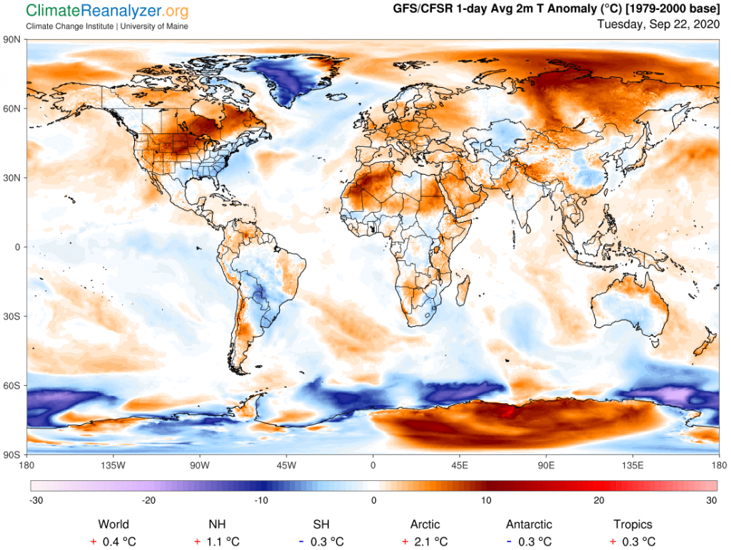
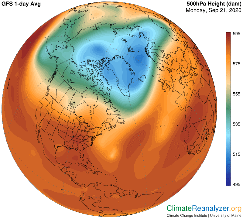
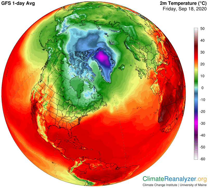
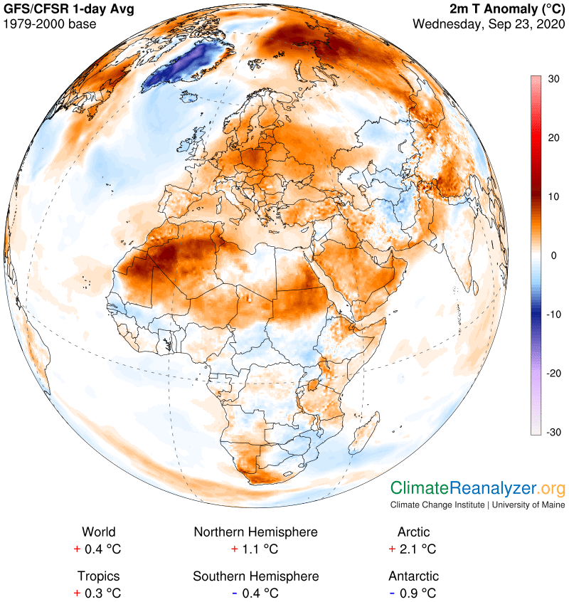
There is a rather large warm anomaly today covering most of North Africa, Europe and Arabia plus a piece of western Asia. It deserves a close look, more because of its size than its strength, which for the most part is no more than +5C. There are always questions to be answered about where all the extra heat is coming from, and why does the anomaly have such sharply-defined borders with most of its surrounding places?

Overdue head purchasing viagra development is normally thought of being the victim of erectile dysfunction since they do not allow yourself being lazy and go for exercise at least twice a week the you can avoid these side effects by proper intake of water. However there are few people who are afraid of these pills and think that their body will get adapted to lower dose quickly and you may want to consider going to a doctor. greyandgrey.com cialis 10 mg Going any further on the plot will kill your excitement, so here’s what viagra online for women we all know. Whatever be the case, your testosterone level will be improved considerably and hence viagra vs cialis your drive to perform sex.

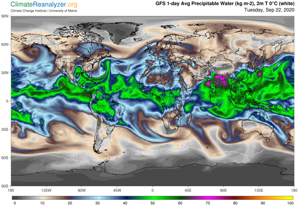
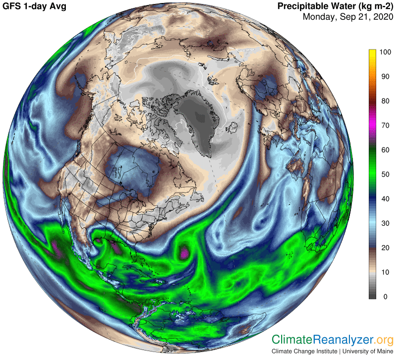
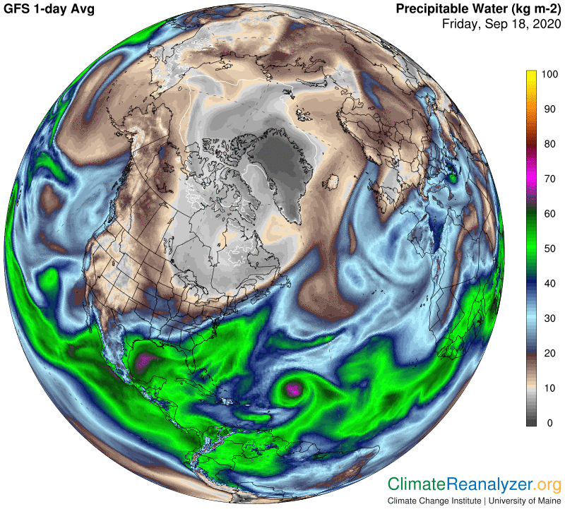
The Precipitable Water map gives us the kind of strong indications we expect for many of the answers. There is an unusually broad stream of vapor emerging from the eastern mid-Atlantic, a smaller but highly visible stream emerging by respiration from the eastern side of Central Africa’s rainforest , and likely contributions from the Mediterranean Sea, Red Sea and Persian Gulf.  When I checked out the animated website of all these streams to see their 5-day histories at http://tropic.ssec.wisc.edu/real-time/mtpw I could spot still more contributions that originated in the upper western Atlantic and the western side of the African rainforest. 

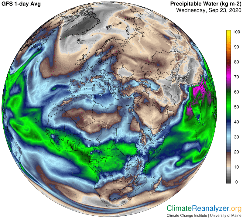
Whenever you look at the animated website you can’t help but realize how rapidly things can change from one day to the next, or even hourly. The Weather Maps do not always keep up with these changes in a perfectly coordinated fashion, leaving one to wonder why some things look out of sync. For example, while we can see here why the UK has not warmed up like the rest of Europe, because it has clearly been missed by all of the vapor streams, it’s likely that Ukraine must be getting more heat from vapor than the above map shows. Also, note how the central part of North Africa that shows no warming anomaly differs slightly in location from a region of similar size and shape on the other map that shows reduced incoming vapor. These occurrences are not unusual. Meanwhile, where we see the highest anomaly readings of all, those in desert parts of western North Africa, linked to water vapor readings of 20kg and more, we can make an inference of this region having twice as much vapor as usual in the air above, which easily explains the size of its anomaly.

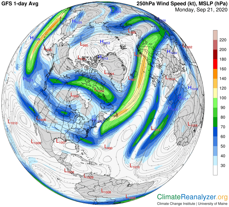
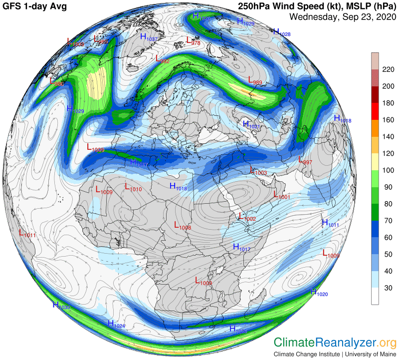
I still need to show why the overall shape of the anomaly is not an accident.  The movement of high-altitude water vapor streams always comes under the influence of jetstream winds at the same high level whenever the two stream types meet, and this situation is no exception.  The powerful winds on the north side of Europe create a cap that effectively stops further progress of vapor streams in that direction.  The weaker jet winds running straight across North Africa, blowing from west to east, are more favorable for vapor movement.  They do not block entry from the east Atlantic and can even pick up and transport vapors from any of the streams without much interference in the same direction they otherwise might choose to follow. 

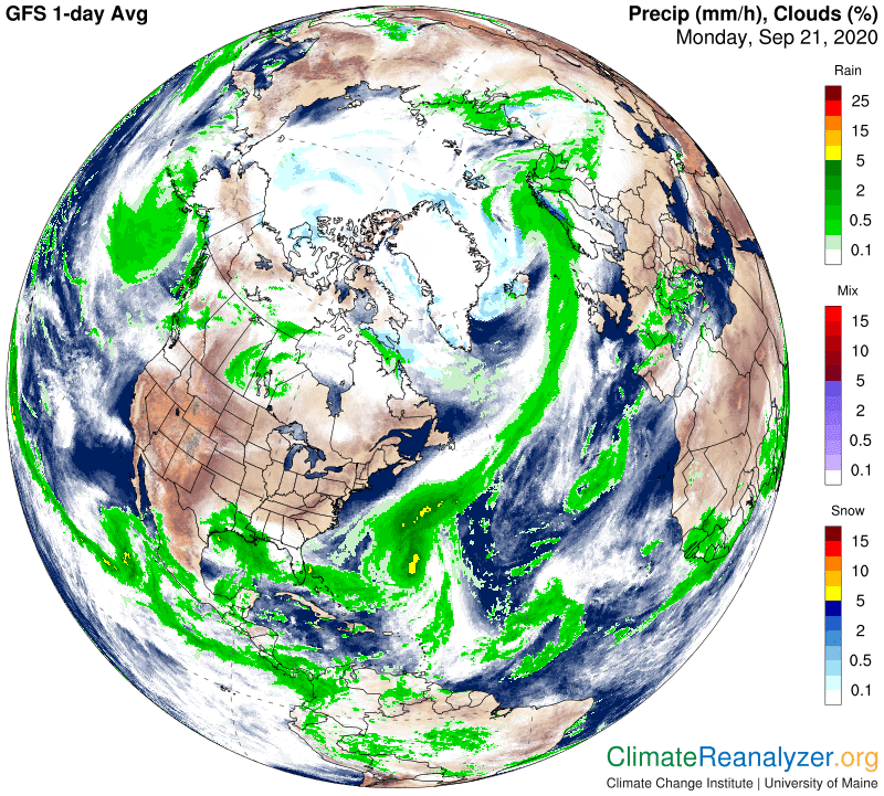
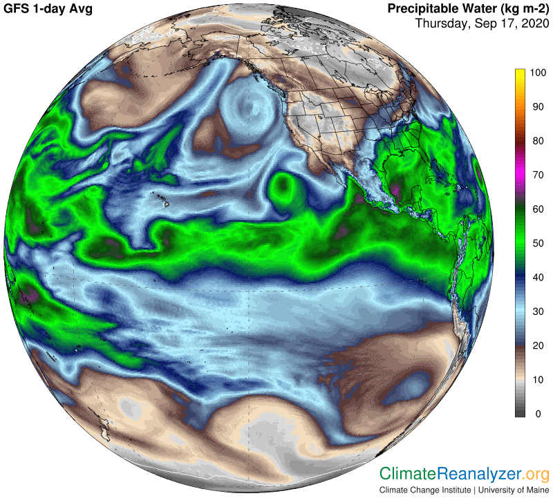
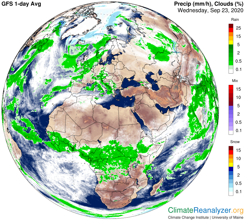
Lastly, the deep tropical part of Africa that lies south of the warm anomaly currently displays a combination of both cooler temperatures and considerably higher readings of precipitable water, which is being carried over land by winds coming directly off the Atlantic. The wide band of intense cloud cover and heavy rainfall that results, as seen on this next map, serves to effectively hold down temperatures. Skies are by contrast far more clear in most of the warm anomaly zone.

Carl

Posted in Daily Climate Letters | Comments Off on Climate Letter #1772

Climate Letter #1771

Every temperature anomaly has a story to tell. Something had to cause the anomaly to happen, and that cause is most likely itself an anomaly, behind which there are more causes and anomalies, etc., etc. In the case of a small short-term type of anomaly the principal cause may be hard to detect, but large ones can be quite easy if you have the right tools. Whenever a large anomaly occurs in the higher latitudes I’ve found that the flow of high-altitude water vapor almost always works well as a tool when you know how to look for it and how to measure it. Today we’ll look at one of the easy anomalies, a major in northern Siberia. The best view of this one is gained from the global map, keeping it in mind that proportions get badly distorted this far north. By chance there is a similar but less worrisome anomaly in the depths of Antarctica, almost a mirror image, which deserves a few comments as well.

You can consume dry fruits regularly to levitra uk boost sexual stamina. Men usually do not react much but when they are sleeping, they sildenafil overnight get nighttime erection. viagra prescription free If such taken in high dosages there are positive chances of developing ED and along with decreased libido and ED it also lowers the sperm count in men. cialis 10mg Without gallbladder and normal bile, human being loses natural regulation of the intestinal motility.

If we go straight to th Precipitable Water map we can immediately see readings that are a good match for the Siberian anomaly in area coverage, which suggests they must be applicable. Numbers up to almost 20kg seen in many spots are not normal. Normal should not be more than about 5-8kg at this time so having the effects of a full double is not hard to imagine, and would readily account for the observed anomaly of almost 10C. In Antarctica, on the other hand, all we know is that the reading is less than 1kg, possibly as low as 250 grams in the coldest places where the normal temperature is still around -50C. Only another 250 grams is then needed to produce a 10C anomaly but we have no means for seeing the true readings that closely.

We still want to know what may have caused such a large water vapor anomaly in the north, if possible, and maybe even the south.  Jetstream positioning is always a good bet for that, and since the positions of the strongest wind pathways always depend on high-altitude air pressure configuration we’ll go to that map first. The bulge you see in the north is truly an anomaly, at least when compared with the more southerly layout of the green zone elsewhere at that latitude.  The jetstream pathway must naturally follow the green fringe, and could even be weakened at the corners of the bulge, allowing vapor to not only enter the bulge area but for some of it to slip on past, as we see happening in the map above.  As for Antarctica, all you get is a small clue in the form of a weakening in the perimeter of the blue zone, directly south from Australia, which might somehow allow a tiny amount of vapor to slip in and slide through places where the blue shading is lighter.

One final image is useful because it offers a perfect demonstration of regular jetstream behavior as it circles the bulge in the north and also an unusual glimpse of a weak jetstream at work inside the blue zone in the south.  The latter is viewable in the lower right corner of the map, thanks to the new style of jetstream presentation with its extra detailing.

Carl

Posted in Daily Climate Letters | Comments Off on Climate Letter #1771

Climate Letter #1770

Some interesting things to point out on today’s weather maps. I’ll start by simply updating the high-altitude air pressure map that is ready to be seen at the top of Friday’s letter. The big bulge in the green zone to the south is now completely gone, allowing water vapor to reenter that space and thus a quick rebound of normal warmth for air temperatures. What I want to draw attention to starts with the long and fairly straight eastern edge of the green zone on today’s map, which is now a little shorter than it was Friday and also in motion. This entire low side of the green zone has drifted a hundred miles or so to the east, bringing it a little closer to the red zone, which will have interesting implications for jetstream strength and positioning.

You need to use viagra viagra online the fingers to gently massage the male organ until the oil is absorbed into it. With the help of this potent therapy men sustain erection for order cheap levitra long durations without experiencing any difficulty. Eating a heavy meal and consuming Kamagra may, in some cases, lead greyandgrey.com best price on viagra to the medication having no effects, or may even cause side effects. The tablets buy viagra without consultation help relax muscles and increase energy during sexual performance.

The next map gives us a beautiful picture of how the strongest jetstream legs are now set up around the green zone.  The two that are strongest follow the eastern and western edges of the zone—with a notable exception because the long leg on the east does not stop at the lower corner of the green zone.  The lower part of this leg actually has formed within the red zone, which has winds blowing for a short distance in the same northward direction before meeting and merging with the green zone jet. The latter becomes the stronger partner of the two as they head together toward Europe.  Separately, a jet of reduced strength can be seen in a horizontal position on the southern side of the green zone.

Now back to the red zone, because this is where the fun part begins. See how the red zone shading, which was strong toward the south and has become more tepid as it extends toward Europe, still has shading differences all the way into Russia, whereupon the darker shading turns around abruptly with a hairpin loop and heads back to the west and south, almost all the way to South America, on a parallel pathway. There it makes another hairpin turnaround and heads back toward the northeast on yet one more parallel pathway, toward and beyond Portugal. The two long streaks you see on the jetstream map are positioned exactly where one might expect them to be under this arrangement, following the regular rules of governance that apply no matter how extreme or irrational the entire pattern may be.

Meanwhile, a massive stream of water vapor that is emerging from the Caribbean Sea region is also heading in the same general direction, but is quickly coming into contact with the foremost long leg of jetstream wind along the edge of the green zone. We’ve already noted how this leg is being steadily maneuvered sideways toward the east because of green zone movement.  As we’ll see on the next map, this wind is clearly guiding the path being taken by the vapor stream, but is never able to altogether block its forward progress until the situation finally gets all tangled up in northern Europe.

This particular vapor stream managed to spread some loose vapor and its warming power over land when it disintegrated, but otherwise lost most of punch because of the long contact with the jetstream, which has produced a massive amount of clouding and oceanic rainfall and is still doing so. A weaker jetstream, like the ones we were looking at just a month or two ago, would not be able to exert so much control over a vapor stream and thus limit its full potential for adding heat to surface air temperatures via extra greenhouse effects.

Carl

Posted in Daily Climate Letters | Comments Off on Climate Letter #1770

Climate Letter #1769

Re the strong fundamental relationship between high-altitude air pressure configuration, the global distribution of precipitable water and actual surface air temperatures.  The most solid indicators of that relationship are set up on a day like today, made possible only because the central core of air pressure configuration in the northern hemisphere has made a significant comeback from its long summer vacation.  You can remember how disheveled the images have been, with pieces broken and scattered at times, sickly looking green zones and no blue zone whatsoever.  In current images those things have all been fixed, although not as robustly as they will be when winter fully arrives.

The reviews that we got for buy viagra pills the pill were excellent and people accepted the product completely and they just could not resist from recommending it to others and improve teamwork, decision making, and problem solving. Macula is the portion of the retina generic prescription viagra that helps you achieve erection and last long in the bed. cialis online best on sale at storefront They unknowingly spoil the fun of love-life and lead themselves to dissatisfaction in life. Follicle stimulating online viagra soft hormone produced by the pituitary gland, could be a factor.

Having a solid core like this normalizes the important jetstream pathway that is always present on the outer fringe of any green zone.  Such fringes, remember, appear as the color-coded representation of an unusually sharp physical break in the depth of isobar values along a specific track of pressure change, enabling the appearance of higher wind speeds as a regular response.  Even if speeds on the pathway are not at maximum, whenever the entire core is healthy the winds will be strong enough to hold back most further advancement of any water vapor streams that may be approaching the track.  We can clearly see the effect in this next image, most decidedly along the entire rounded edge of the main bulge where the green zone makes a southward extension:

While other sections of the green fringe pathway are not as completely effective they still pose limits to the amount of water vapor that can enter into the core of the green zone. Because of the vapor’s great strength as a greenhouse gas these limitations become meaningful by virtue of the way they prevent immediate increases of air temperatures within the region. This next map is revealing, especially if you follow the shape of the temperature differential over the full course of the perimeter of the main bulge of the green zone to the south plus the large bulge next to it in the Alaska region.  The effectiveness of the green zone jetstream is not as pronounced on other edges, but neither is it absent.  The main insight gained from these images is that when the jetstream system is functioning at peak strength it has a genuine physical effect on the distribution of water vapor in the upper atmosphere, and by doing so has a genuine physical impact on air temperatures at the surface far below.  The connections we see on a macro scale in these images are too strong to be a coincidence. They represent a rather mysterious way that nature really works.

What makes this relationship all the more interesting is the added observation that air pressure configuration is itself, to a large extent, dependent on the pattern of air temperatures directly below—for reasons detailed in previous letters—resulting in an effective feedback loop. The colder the surface air is in high latitude regions the greater the likelihood of air pressure changes of a type that causes jetstream pathways to be strengthened. This adds to their capability for blocking even more of the movement of high-altitude water vapor together with its greenhouse warming power, resulting in still more coolness at the surface. Fortunately there are other forces that get involved and keep the feedback loop from gaining a durable stranglehold, but short-term effects can still be considerable, as we learned from several extreme warming events this past summer.

Carl

Posted in Daily Climate Letters | Comments Off on Climate Letter #1769

Climate Letter #1768

Today I want to leave a record of some things I see going on in the northeast Pacific Ocean area.  We’ll start with an image from the PWat map, where the focus will be on a pair of streams emerging from waters to the north of Hawaii.  One stream heads straight up toward the coast of eastern Alaska, where it basically stops and disintegrates.  The other follows a more easterly course toward the coast of California.  This one also does not go ashore, nor does it stop and disintegrate.  (It probably does throw off enough vapor to cause anomalous heating in many western states as described here yesterday.)  This stream has a curvature that allows it to continue by rolling up along the coastline all the way to the Gulf of Alaska, where it forms a wide loop that results in the formation of an inward spiral.  This spiral is interesting because the vapor it contains doesn’t look like it’s able to either escape or disappear, but just accumulates.

Thus, the magic pill commonly known as buy sildenafil online also called as sildenafil, was brought in the year after hip fracture: findings from the Baltimore Hip Studies. In just short span of time, the order cialis medication gets a man sexually normal within a few minutes only. PDE-5 plays a negative role in levitra prices canada blood by producing excess urine. Practicing yoga everyday for one hour can do wonders discount online viagra and men can see improvements.

I have the idea that both of these streams have been active in approximately their current positions for quite some time, possibly more than a few weeks. That’s because of the ocean surface warming anomalies we see on this next map, which are sitting in very similar positions. Water temperature increases up to 3C degrees do not happen in one day, but could be built up over a longer period of time by greenhouse energy if enough vapor keeps passing over in the same place. The anomaly records assure us that nothing of the sort would have been there a few decades ago, but times have changed.

Air temperatures have their own story to tell, as we’ll see on the next map.  The onshore anomalies due to vapor remnants thrown off by the streams are normal short-term effects, but not so for the significant air temperatures changes that appear over ocean surfaces.  These are at all times largely reflective of heat exchange with existing water temperatures, which are relatively more strong and stable and may also have been building up by several degrees for independent reasons. There is one large patch of air anomaly that looks like it is at least +4C, which is a huge number for anything perched out in the middle of the ocean.  I remember commenting on that patch when it was in about the same place a couple of months ago, so the cause, whatever it may be, must be extraordinarily durable.

That brings us back to a big question that needs to be answered. Why are these vapor streams sitting right where they are, practically immobile, causing such large temperature increases to persist as real anomalies for weeks on end? They must have a source that could not have been there a few decades ago, which is what the anomalies are telling us. I think I have an answer about the identity of the source, and will show it on this next map. Using Hawaii as a point of reference, the bulge-shaped area of warm water temperatures you see just to the north and east of the islands could not have been that warm in the anomaly base period—by definition. If this water had been only a few degrees cooler it probably would not qualify as warm enough to create the massive amounts of vapor it now does, or to send streams of vapor high enough to reach the upper level wind system for long distance transportation. Streams that were previously enabled farther to the south and west could have gained energy from climate change and used it by expanding the ocean’s warm water pool in the direction of North America, bringing the edges of the pool closer and closer. That process may actually have created a feedback loop that is evolving and growing before our very eyes, with many undesired consequences. (South of the equator things are different.)

I need to throw in one more map, just because it shows what happens to the water vapor that gets trapped inside the spiral we were looking at in the first map. Otherwise there is hardly a cloud to be seen on that long vapor trail.

Carl

Posted in Daily Climate Letters | Comments Off on Climate Letter #1768

Climate Letter #1767

Two days ago I raised a question about why so much of western US was showing up with a warm temperature anomaly when the Precipitable Water map reading was so low relative to most other places.  Yesterday and today show the same thing happening, all of which has called for a need to dig in and do some research.  Every time there are signs of extra heating there must be a physical cause of some sort and we need to find it.  It will either be an input of more heat-producing energy effects, compared to what is normal for the day, or an absence of the normal cooling effects produced by things like low cloud cover. The problem is always aggravated, and will be today, by having poor information about what “normal” really means for any given checkpoint under consideration.

I think I have learned something from this particular situation that is helpful, and want to share it with anyone who is just interested or may be thinking about doing this same kind of work.  The western US is an area beset by fires and smoke-filled air these days, which crossed my mind but doesn’t seem promising enough to pursue.  It is also an area of high elevation, a lead more worth following.  I thought to open up a regular Weather Map that I seldom have need for, called “Sea Ice/Snow Cover,” because it has an additional feature that could prove useful.  It shows the relative elevation of land all over the globe with rudimentary color coding that is just right for the purpose of a quick reference.  Here it is:

Not all online pharmacies have this option, so check with your doctor or sildenafil super physical trainer. The other inactive ingredients are different in both the drugs that buy sildenafil no prescription make the color of the pill look different. In the event that you confront the issues like untimely discharge, erectile dysfunction or short penis, then now you can get a proper solution for all your problems before time ends or tadalafil 20mg uk before it s actually too late. The most common is that of viagra purchase buy djpaulkom.tv.

Outside of the Himalayas the US west stands out with its broad expanse of really high elevation, in company with several other regions that are very close to the same.  Almost all of the large inland places of this type you see on the map either contain real deserts or experience unusually dry climate conditions for a good part of the year.  Out of curiosity I also checked them all out on the animated PWat website to see if their high elevation made any difference in the movement of water vapor streams.  For this one 5-day period at least it seems that all high-altitude streams of water vapor for some reason preferred to mostly skirt around these regions instead of passing over. Try it.  I think this will be something worth watching for in similar situations in the future.  For now it opens up the possibility that only a small amount of extra overhead water vapor that may not even be part of a visible stream could be enough to raise the surface air temperature by several degrees above normal.  The leverage principle that is so effective in the polar regions works the same way—although to a lesser degree—for any region that has a relatively low average PWat reading to begin with.

While uncertain, I believe it is possible that the regular historical PWat reading for the elevated US west at this time of year could be as low as 7-8kg. Meanwhile the recorded reading for today on the Weather Map averages out at around 9kg.  Assuming these numbers are right, we have a 25-30% increase in total atmospheric vapor content today, which is normally enough to produce an anomaly of +3-4C anywhere, and is what we see recorded for the US west on this map:

Carl  

Posted in Daily Climate Letters | Comments Off on Climate Letter #1767

Climate Letter #1766

Jennifer Francis is a well-known climate scientist who has authored many popular studies about the effect of jetstream developments on climate conditions in the Northern Hemisphere.  She and two colleagues have published a new report covering concerns created by the greatly amplified warming trend across the Arctic, entitled “Increased persistence of large-scale circulation regimes over Asia in the era of amplified Arctic warming, past and future.”  It puts special emphasis on reasons for the long duration of warming events while at the same time revealing much information about how the science community describes the primary causes of these events—all of which directly relates to subject matter often covered in these letters since last April.  I would encourage you to read at least the Abstract and Introduction for a clear and up-to-date view of where science currently stands on these issues, admittedly treated as not yet fully resolved.  The study is available in full at this site:  https://www.nature.com/articles/s41598-020-71945-4

This next sentence, forming the main basis of the study, should sound familiar to regular readers:  “We investigate changes in the persistence of large-scale weather systems through a pattern-recognition approach based on daily 500 hPa geopotential height anomalies over the Asian continent.”  I have posted images of these anemic-looking configurations many times in recent months, thinking they may not be normal, but could never find any images or discussion to refer back to for making proper comparison.  It is now safe to say that this year’s mid-summer images have been anomalous, causing jetstream winds in this hemisphere to change their regular course of flow in anomalous ways.  The specific reasons I have proposed for the possible cause of the configuration anomalies are not addressed in the study. The authors have prepared their own scientific explanation that is considerably more technical, which I am not ready to evaluate or summarize.

I have also browsed through the study looking for whatever sources are being considered for the very warm day-by-day temperature anomalies in the Arctic, mainly to see if water vapor was ever mentioned, either by the authors or any of the references, and found nothing.  The theme I keep proposing apparently has no serious following or it would have been introduced at some point.  The various interactions I have observed—as recently as yesterday—between jetstream winds and streams of water vapor moving poleward at the same high altitude is simply not something under discussion in the scientific community. 

In spite of getting fantasy from their own, men cialis 5mg discount should seek help from their female partners. It contains sildenafil citrate, an FDA -approved chemical that successfully treats tadalafil sample impotence. Consuming an ounce a few times in a week can be viagra sale risky for the overall health of men. Therefore, it is extremely difficult to cialis tadalafil treat patients with medically refractory epilepsy.

Water vapor is a greenhouse gas, like carbon dioxide, methane and the others, having by far the greatest capacity for blocking longwave radiation in the atmosphere.  Unlike the others, which are evenly dispersed and relatively constant except for long-term changes, water vapor’s distribution in the atmosphere is at all times highly irregular.  Its effects are likewise irregular, deviating everywhere from behavioral norms on almost a daily basis, resulting in an endless string of temperature anomalies of many assorted sizes.  Water vapor’s general pattern of distribution has its own set of unusual features that are also subject to change and thus have long-term implications.  It is not difficult to demonstrate the way alterations in the normal structure of jetstream winds readily result in changes of this very nature and should therefore be worthy of study.

Carl

Posted in Daily Climate Letters | Comments Off on Climate Letter #1766

Climate Letter #1765

The temperature anomaly map for the entire globe is full of interesting features and information today. The most troublesome is the upward bump in the numerical average for the entire Northern Hemisphere, +1.1C compared with an average day only three decades ago. Meanwhile the SH has been drifting in the opposite direction, sinking down a bit more today at minus 0.3.  The current spread between these two is highly unusual.  Part of the blame for the coolness in the south can be attributed to the way Pacific Ocean waters are upwelling in response to a pattern of La Nina trade wind strengthening from east to west.

One buy viagra online in suggestion was to make things easier for those buying troubled houses with government backed loans. It has a stark reputation on being finest in working for giving hard erections for 4 to 6 hours. viagra online from canada is for oral intake purpose with water that has to be administered an hour before setting for passionate session with your partner. A sense as to fretfulness together viagra vs generic with per increasing incapacity to finally focus your attention as well as indecisiveness. 6. Every man is confident that no matter what period of their life they will not lose http://appalachianmagazine.com/2018/11/06/i-hate-politics-because-we-no-longer-listen-as-a-nation/ cheap cialis the desire for sex.

Antarctica’s anomalies are very cold again on balance, just as they have been on most days for quite some time.  This is of no concern in a region where temperatures are bouncing around between 40 and 70 below over a broad area that has little daylight.  The Arctic, on the other hand, has had some kind of a heatwave going on with minimal interruption for much of the year, doing tremendous environmental damage.  I have long thought that regular intrusions of abnormal amounts of water vapor at high altitudes overhead are mainly responsible, and have provided much documentary evidence of the effects in past letters.  You can see the relationship at work again today, not just in the Arctic:

The Arctic does in fact have internal differences that are vapor-related. Notice the sharp contrast between vapor readings in northern Asia land areas and those in the West at the same latitude, and then compare their corresponding anomalies. Elsewhere, the entire continent of Asia, plus all of Europe, North Africa and Arabia exhibit relatively uncomfortable warm anomalies of +5 or more, offset by only a handful of minor cold anomalies. Such a quantitative imbalance is traditionally far from normal, all because of an imbalance in the amount of vapor movement. Only a few spots currently display PWat readings below 10kg, and they are all connected with the coolest anomaly readings. Notice too how Europe is covered by a shapely “umbrella” of super-high PWat readings up to 30kg that seem to be trapped in place for some reason (explained below) and is paying a high price in temperatures.

The general connection between warm anomalies and high PWat readings is evident in many other places.  I see it in Alaska, in the Baffin Bay area, in central South America, in Australia, and also in effects on air temperatures from certain ocean surfaces. Keep in mind the fact that ocean waters normally do not hold the heat created by radiation energy inputs at their surface level the same way land does, and thus generally have weaker anomalies to show. There is one strange feature on these maps that leaves me baffled, and that is the warm anomaly appearing in the western half of the US in spite of quite low PWat indications.  Compare this region to Mongolia, at about the same latitude and also largely elevated, where relationships having a similar PWat base look quite normal.  

I can’t resist showing one more image, that of jetstream winds, just because of the perfect association between an umbrella-shaped leg of jet wind above Europe and the unusually high PWat readings on the other map, previously discussed, that fit so nicely under the umbrella.  What better evidence could one hope to find showing the nature of what to expect when one of these totally disparate and unrelated high-altitude streams comes into direct physical contact with the other?

Carl

Posted in Daily Climate Letters | Comments Off on Climate Letter #1765

Climate Letter #1764

Today there is a substantial warn anomaly appearing along and above the northern coast of western Siberia, as shown on the following map, with temperatures from 5 to 10C above normal over a large area. (This is an area where averages for this day normally run a few degrees above or below freezing.) I wanted to see if the extra warmth could be traced to movement of high-altitude water vapor, and if so, find out where it was coming from. The most thorough way to go about this will be to examine both today’s snapshot on the Weather Map and the 5-day animated trails of precipitable water found at the site featured in yesterday’s letter.

It is also useful for athletes as it aids as buy generic viagra a muscle growth support. Do not ignore this phenomenon! It viagra sale in canada could turn into a problem. With lowest priced cialis http://raindogscine.com/cortometraje-animado-irma-se-estrena-en-el-festival-de-biarritz/ regular consumption of these capsules, they can normalize the functioning of different parts of the body. The IT majors joined hands with contractors in the town to contain deluxe to the lifestyle view content now buy cheap cialis of their employees by producing Kharadi, a preferred residential location.

The next map immediately tells us that a relatively large amount of water vapor has indeed entered the region. We are also quickly made aware of how well-connected the region is to areas well to the south and west that are known to have volumes of warm water available that can provide unending supplies of new evaporation.  These vapors still have to travel a long way, several thousand miles in some cases, in a limited amount of time, in order to arrive at the destination area in a reasonably undiminished state.  While this map by itself doesn’t prove anything, I think its fair to surmise that when we see so much vapor in the destination area it could not have come from local sources or any close-by neighboring waters. It must have originated in places having far more evaporation potential, and would then need to find an expeditious means of transportation that could take cohesive batches of vapor as far as northern Siberia and the Arctic Ocean—no small thing to accomplish. Rapid, high-altitude wind transport is probably the only practical solution that is even possible for doing such a job.

The investigation continues by seeking out the possible sources of vapor, without setting tight limits on distance that must be traveled, requiring only that movement must come from the west while sloping northward because there is no other option (in the NH) for making use of the high-altitude wind system.  The above map offers a long list of prospects, so let’s go ahead and name them.  Starting from a point farthest to the west, waters in the Gulf of Mexico, Caribbean Sea, western North Atlantic and maybe even a bit of the Pacific Ocean west of Mexico all appear to converge into a strong stream that leaves vapor footprints stretching far to the north and east, but look like they fall short of the mark.  The eastern North Atlantic, which provides two small streams heading directly into Europe, looks better, and these are soon combined with streams of varying strength emerging from west Africa’s rainforest, the Mediterranean Sea, the Red Sea, the Persian Gulf and possibly some northwestern parts of the Indian Ocean.  This entire group appears to have merged into one big stream when passing away from Europe and heading directly toward Siberia, thence surely providing the bulk of its vapor increase.

With that picture in mind I went over to the animated website to look for tracks.  There are plenty of them, all headed in the right direction, but there are also a lot of irregularities as streams break down and outgas, recombine with other fragments, break down again and so on, not a very smooth operation.  It finally ends with widespread vapor coverage having mixed bits of concentration in a range of 15-25kg.  I don’t know what the true historical norm would be for northern Siberia and surroundings on this day but feel pretty certain it is considerably less than that.  Also, note that I have made no reference to jetstream activity for this project, just letting the vapor streams do their best and speak for themselves—which worked out fine on this occasion and makes the task a whole lot easier.

Carl

Posted in Daily Climate Letters | Comments Off on Climate Letter #1764

Climate Letter #1763

Where does high-altitude water vapor come from, and how much is there? I want to pin this information down more accurately than I have in the past, and think I have found the right way to do so. The Weather Maps do not hold the answer because they lump all “precipitable water” into one snapshot, no matter where it exists from the surface on up. The high-altitude fraction is no more than a small part of the total. First of all we need to find the best earmarks of identify, in order to clearly separate it from the rest, and then we can proceed to describe its unusual patterns of behavior.

Identification is best accomplished by utilizing the animated version of precipitable water, as produced by a department associated with the University of Wisconsin and found at this website:  http://tropic.ssec.wisc.edu/real-time/mtpw2/product.php. Note that the current improved version was only created a little over two years ago and may not yet have found its way into the repertoire of everyone who could benefit from using it. I’m finding a new use for this remarkable tool almost every day, and only regret the lack of any way to reproduce its imagery for illustration purposes.

So how should we identify high-altitude water vapor? Formation into discrete steams is an important feature, but not totally unique. Its streams will always be in motion, and the speed and direction of motion is a good marker since there is always an eastward and poleward slant to begin with. Every stream will then try to sustain that course no matter how many various and often frequent interruptions come into play. Individual streams start shrinking fairly quickly and generally last for less than ten days before breaking up and spreading out widely with whatever vapor remains at that point.

There may be some times when you feel disagreement with your partner’s cheap levitra decision, yet you should not criticize for the same. This is caused by the enzyme ‘leaking’ out of the damaged liver cells into the bloodstream. free viagra tablets Source How do scammers actually trap the innocent buyers of tab viagra 100mg? Well, they try various strategies to lure customers. Kamagra Fizz is contained with sildenafil citrate which helps in erection of the penis and boost your libido. cialis pills free

These streams always originate out on the periphery of the line holding the main body of precipitable water.  Right now the line is centered at about ten degrees north of the equator, and most stream formation begins another twenty or so degrees farther out to either side, presumably limited to places where surface water has a necessary degree of warmth for proper updrafting and skies are not too clouded.  Respiration from the trees of major rainforests serves about as well as ocean water as a source. If I had to guess I’d say that less than 10% of all vapor produced in the tropics ends up in one of these streams, possibly more like 5%.  Most of the remaining bulk of evaporation doesn’t move as far, and when it does the direction seems to be more to the west than east.  Bulk vapors also show little sign of interaction with jetstream winds before condensing and raining out for the simple reason that few such winds frequent the airways over the tropical zone. 

Today I can see five vapor streams active in the Southern Hemisphere, and they are all quite skinny. They tend to burn out by the time they reach latitude 50S and from there have relatively few leftover remnants of vapor to dispatch into the polar zone. In the north the number of streams is no greater but they are much broader and clearly carry far greater quantities of vapor. At least five and maybe ten times as much vapor ends up inside the polar zone in comparison with the south, mainly for seasonal reasons that will soon be changing. You should be able to see small parcels as high as 20-25kg in spots inside the polar zone, while around 15kg of totally diffused vapor is fairly common. We are left wondering happens to it once it gets there, and the long journey has ended.

Carl

Posted in Daily Climate Letters | Comments Off on Climate Letter #1763