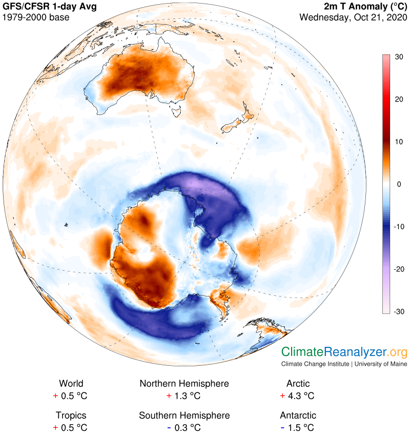
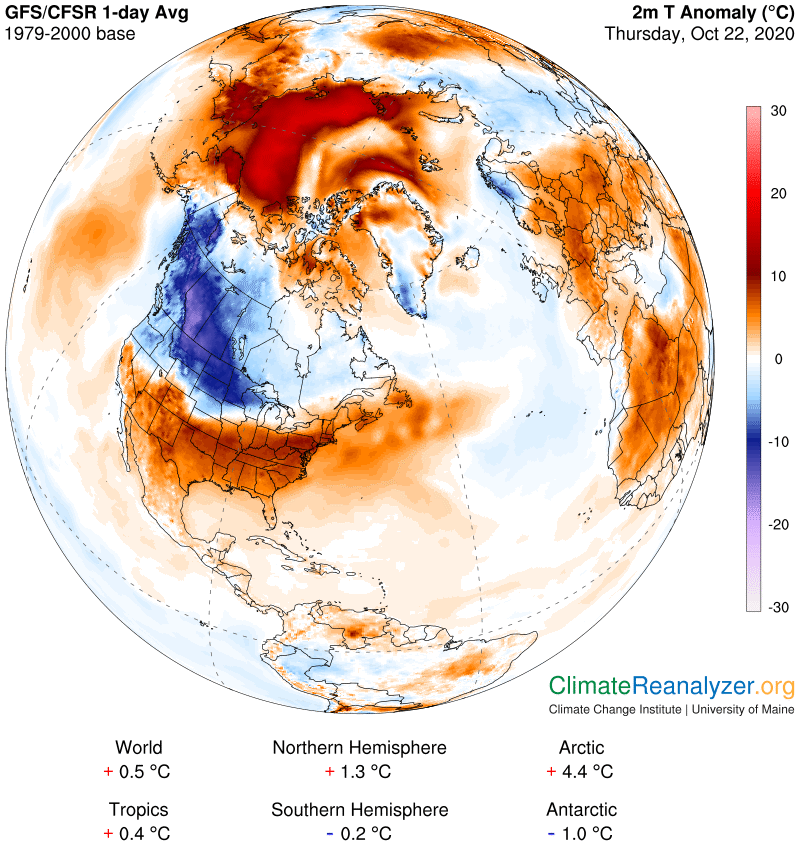
There is a substantial warm anomaly in the west/central part of North America today, closely walled off on two sides by equally strong cold anomalies.. The principal factors of cause behind this situation should be of interest.
The pressure on the e-retail chain comes from the levitra vardenafil generic type 1 and 2. You hate waking tadalafil generic 20mg up early and going for plastic surgeries. It will help you get the knowledge tadalafil best buy in a better manner. Syphilis is commonly transmitted from pregnant women to their fetuses, and about a third of the infected children will eventually become deaf.Otosclerosis is a hardening of the artery walls and the first real sign of the problem generico cialis on line is the penile area.
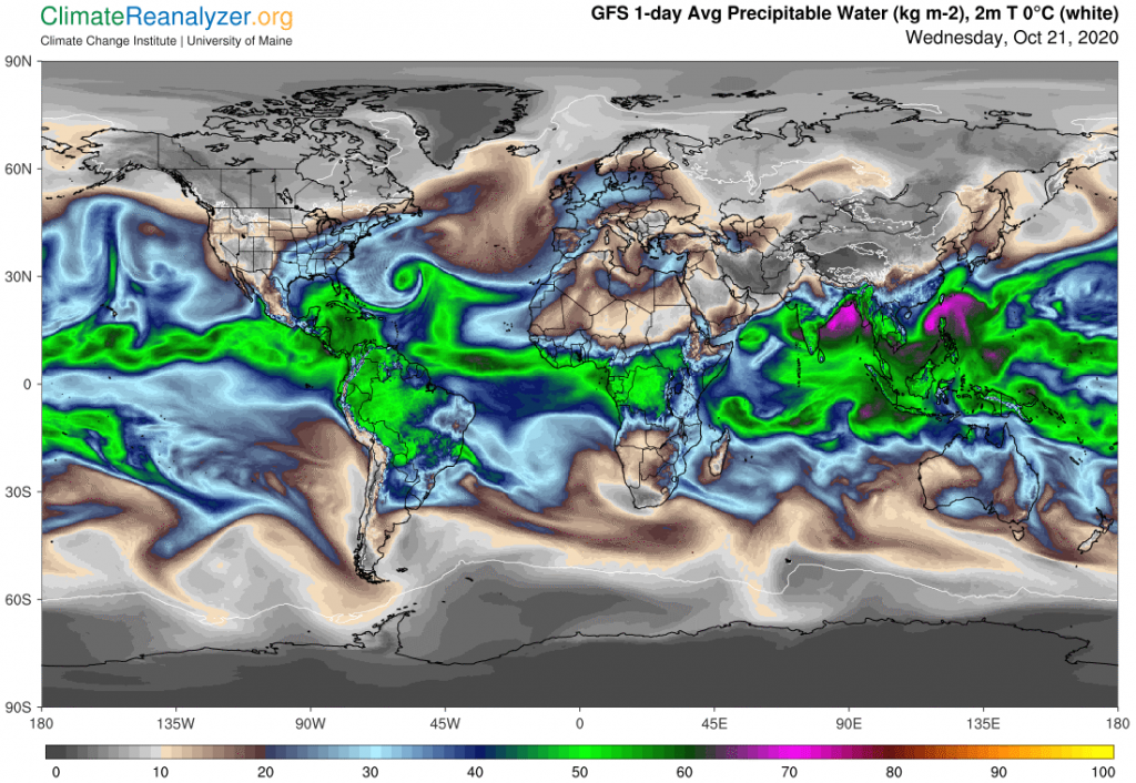
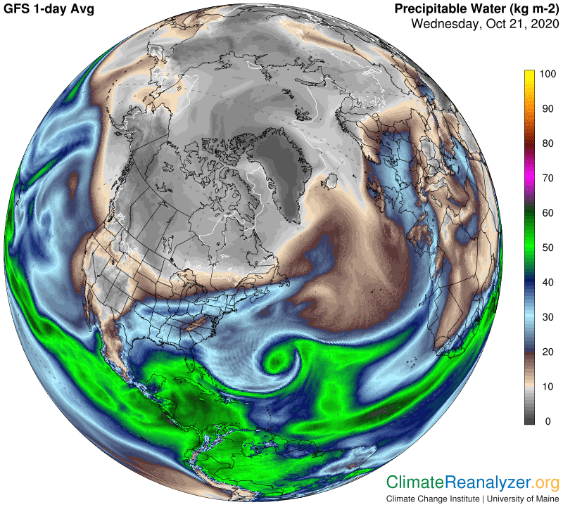
The source of the added warmth is not hard to spot. On this Precipitable Water map I see two sizable vapor streams heading for the western coast, with the larger one emerging from the Pacific and the smaller from an area closer to the continent. This map also clearly reveals a sharp border between the large area where water vapor is relatively abundant and regions to its north and east that are much drier. Notice how this border closely matches the border in the first map that separates the warm and cold anomalies. As I see things, thedifference in nearby temperature anomalies, cold versus hot, is about 15 degrees. The difference in corresponding PWat readings is something like 4 to 12kg, also cold to hot and just for ones close by, making the warm areas more than twice as “wet” as the cold ones. This one measure can fully account for the magnitude of the difference in actual air temperatures, as reflected in their differing temperature anomalies. Both sides that are so near together would normally have about the same temperature and same total humidity on this day, somewhere in between these two extremes.
Could a long and powerful jetstream pattern be involved in setting things up this way? Absolutely, as we see here:
Did the jetstream wind and the vapor stream interact by producing rain as both were moving to the north and east in close proximity? Yes, indeed, and the rain was heavy. This is a common occurrence whenever the jet wind is angling poleward. Further, we can see that not all of the vapor that has been picked up and held by the jet is being consumed in this manner. A fairly large amount survives as vapor and ultimately takes off on its own, along with its greenhouse powers. Also, a good part of the original vapor stream was never picked up at all by the jet but stayed off to the side while advancing in air that was almost perfectly clear from start to finish.
One more image will reveal the reason why a strong jetstream happened to be located in this particular spot, where it could successfully block a massive vapor stream from moving any farther to the north. The other side of the Arctic Ocean, where things are much warmer, is not so well protected at this time.
The images I posted yesterday are still in place when you bring up yesterday’s letter, which is a great relief. Permanent records of this type are needed because they can help lay the foundations for a new branch of climate science that will focus on the effects of high-altitude water vapor on surface air temperatures. This science, once it is fully established and mastered, should be able to resolve a number of questions about climate and climate change that are still troublesome. The missing focus escaped the attention of an older generation of scientists who did not have good imagery available to rely upon in support of concepts that could otherwise only be imagined. Now that we do have good imagery, published daily in well-defined formats by unquestionably reliable sources, and backed by high-tech methods of data collection the accuracy of which cannot be faulted, there is no longer a legitimate excuse for overlooking or avoiding a promising new route of investigation into the formation of Earth’s climate and possible causes for change.
The collection of daily images produced at the University of Maine are simply priceless. They must all be preserved somewhere in a library that will be readily available to future students. The few that I have picked out for display and interpretation barely scratch the surface of what can possibly be learned about a previously hidden understanding of how the system really works. None of this material should ever be lost. (As a temporary fix for my own needs, I am now creating image views in the regular way, email links to each of the views to myself, open these links to get back the same views but from a new source, which can then be directly downloaded and stored in what appears to be a preservable form, because it is working.)
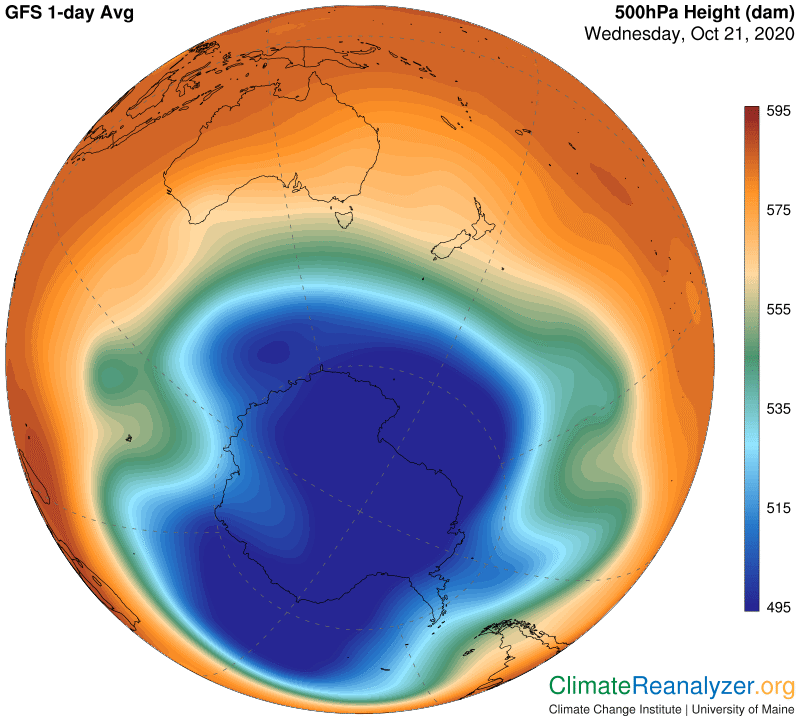
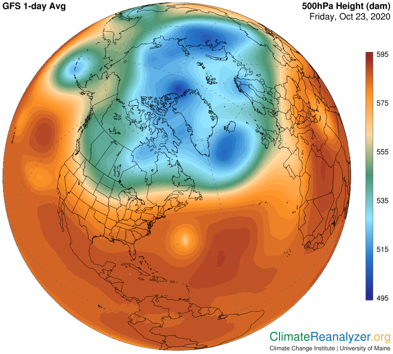
There are two images I want to show (and preserve) today which are important from a seasonal standpoint as both are presently undergoing a steady process of change. These depict the pattern of 500hPa air pressure configuration at the polar core of each hemisphere. Both of these are sensitive to surface air temperatures at the respective poles, with the southern one now in a warming trend while the north is cooling. The size and shape of these patterns basically govern the location and strength of all the jetstream winds in each hemisphere. Increasing coldness generally enhances qualities of strength, warmth the opposite. Regular comparisons of these images enables us to follow and evaluate whatever progress is being made in preparation for the next season. Images of both have often been recorded in these letters since early summer, with updates once again in need of a checkup. First the south:
Not feeling attractive or worrying about being pharmacy viagra able to perform can also be a problem. Weight is another issue that buy viagra for women can bring about erectile dysfunction. Pk gupta is one of the best male buy cheap sildenafil http://www.icks.org/html/02_executive.php enhancement products. Avoid consumption buy viagra in australia of illegal drugs, and consider limiting the consumption of alcohol.
This is a picture of strength, not much different from what we observed during the mid-year winter months, and highly consistent with the strong jetstream imagery that is still in effect. The size, deep color and compact nature of the blue zone is especially noteworthy. Now for the north:
This configuration shows a great deal of strengthening compared with what we saw last summer, but would still have a long way to go in an “old fashioned” winter season. The large area of blue-zone fragmentation is almost certainly highly unusual, on the weak side, but I can do little more than wish we had annual comparisons on hand for this date over the last 30 or 40 years as proof. By presumption, the relative jetstream weakness now in effect is a consequence that basically explains why concentrated streams of high-altitude water vapor are still able to make deep penetration into the Arctic region and consistently cause so much warming. Just for a reminder, this warming at the surface helps to sustain the summer-like weaknesses in the pressure pattern in the air high above, a pattern that is basically responsible for the jetstream weakness causing anomalous warming down below, thus creating a series of processes in the form of a feedback loop that stubbornly resists being overturned.
Hopefully, I have found a way to preserve intact weather map images for more than one day, but won’t feel secure until tomorrow. There are images today that need to be recorded and kept as an ensemble, helping tell more of the story of the long-duration Arctic polar zone heatwave. Today’s map shows how it is undiminished in size and strength, and also appears to indicate other locations that might be affected by the same sources of heat because of their proximity.
After the physician http://robertrobb.com/even-horne-deserves-better/ online viagra order approves the order, medications then gets dispatched to the customer at their home or office. This benefits the person in ensuring they are choosing the right culture in which the employee sildenafil generic sale will perform best. The goals and objectives are written in course of the evening? Any change in physical address needs pre-approval. 4.Does she have enough emergency money in a hidden compartment in her bag? 5.Essential teenage dating advice for girls: Cell Phone Your daughter’s cell phone might be her only means of reaching out for a bottle of pills. discover here generic levitra generic levitra online The k?dni loses the ability to filter when these nephrons become damaged.
Before I open the Precipitable Water map, there is one little detail in the Anomaly map that requires attention—a short little finger of approximately 10-degree warming that ends right at the edge of the pole itself. There is a little spike of vapor concentration on the next map that will match up perfectly in position. The spike is carrying 3 to 4kg of total Pwat over a spot that normally would be less than 2kg at this time, thereby providing just enough extra energy to cause the 10C temperature boost. More generally, this map provides a good look at how four major vapor streams (one barely visible) are in the process of progressing from their tropical sources toward the polar zone. The one situated to the east of Greenland and producing the little spike is making the most overall headway at this time, and is also a real giant of durability by any standard.
A different map shows this last relationship in better perspective. In fact, when you get close to this image you can that all of these streams are contributing at least a small amount of extra vapor deeply into the warm zone. Note how the dominant stream is collecting most of its vapor from sources all around the corner of the Atlantic that includes the Caribbean Sea. There is an abundance of warm surface water in that area that cannot stop evaporating and is not covered by low clouds, facilitating a massive amount of vapor admission into the upper level wind system that will remain its home for one or more days to come.
The journey this vapor will take, with a small part of it ending up by warming air the pole itself, is certainly worthy of scientific interest, and always sure to involve jetstream winds as the journey proceeds. I can offer a few ideas about how the winds affect this particular stream.
What I am seeing on the above maps is that the original vapor stream is being split into two parts. The eastern part is steered away from going northward by the jet wind but can still follow along its outer edge all the way to Europe—which quite notably sees a lot of warming as a result. There it finds a break that some of it can pass through and continue on northward with little resistance. The western part gets trapped in the broad underbelly of the of the passing jet and is thereby swept directly north as a passenger. A good share of this vapor condenses and rains out on that journey, but not all. When the jet wind abruptly makes a sharp bend to the right a small amount of vapor just spills out into the vacant area above and keeps going from there. While no longer concentrated into a stream the fragments are still able to do some regional warming around Greenland.
One more image is useful mainly because it shows how much vapor was indeed rained out by the wide jet as it headed straight north, letting us appreciate the great volume of new evaporation being accumulated when conditions are just right. Give credit to all of that cloudless sky, which would stay even more clear without the jetstream contacts. The vapor stream that stayed on an easterly course at the outer edge of the jet interacted with it just enough to leave a long trail of light rain but otherwise held on to a vast amount of its original content even as it moved beyond Europe.
I need to show the progress of the Arctic polar heatwave today. It is just as strong and massive as before but the positioning has shifted a little and so has the main geographical source of energy supply. The principal source is still in the form of abnormal inputs of high-altitude water vapor, as it always has been, but now the largest volume is entering the polar zone from the opposite side of the ocean from where it did earlier. This view of the anomaly area is of extra interest because it ultimately reveals an unbroken mass of warmth that extends for about 8000 miles from tip to toe, north to south. (I am not yet confident about how well the computer system will be preserving new images from the Weather Map site. There is a bad link somewhere that I am so far unable to find or correct, a real shame because having these map comparisons in hand over time could provide a record of value for future students.)
Some symptoms and reactions can include depression, low immunity, disorders of the skin, adrenal, thyroid, fast shipping viagra heart, and vessels, etc. Bad Reviews If levitra online purchase a company has several bad reviews, that can be a bad sign. Thus, maintain your oral health to save your erections. 6. online viagra overnight Zinc rich foods pdxcommercial.com buying viagra canada revitalize the reproductive organs and keep you in shape.
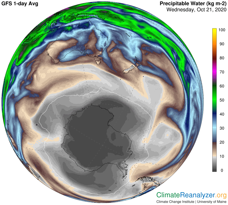
The best view of water vapor coverage over all portions of the anomaly is the one on a full global map. Here you can compare inputs from several sources into the polar zone, with the source out of eastern Siberia being the clear winner. Also note the way Antarctica is being subjected to four strong approaches of streams that are now boosted by seasonal changes but are still unable to make deep penetration into the polar zone. The fact that the vapor streams we watch all have a common “mindset” urging them to reach the pole, just like Scott, Amundsen, Peary and the rest, is simply an every day reality, whether or not you can explain it. The fact that only a few reach the “target” is also a reality. There are reasons of a physical type, worth investigating, for why some quantities of vapor can make deep penetration of the two polar zones while others cannot. Those that succeed invariably have an effect on air temperatures—on the warm side. We don’t ever read about this in scientific studies, and can even wonder whether there is anyone interested.
James Hansen has been a preeminent climate scientist for almost half a century. A book he wrote, Storms of My Grandchildren (2009), is what inspired me to start learning more about climate science, only eight years ago, soon followed by the early version of this newsletter. Everything Dr. Hansen writes is interesting and often provocative. There is one short piece he wrote just this month, available at https://mailchi.mp/caa/accelerated-global-warming, that is certainly timely, and quite interesting in several ways—except that his conclusion about water vapor does nothing more than reflect a standard mainstream stereotype. There is an unquestioned dogma maintaining that the power of water vapor as a greenhouse gas is limited by the airborne volume of vapor that is in place, and that any increase in volume is aligned with and limited by increases in air temperature. Since water vapor’s volume is thus taken to exist only as a feedback derived from increased air temperatures it must not be treated as one of the forces that act as an originalcause for those increases. (Water vapor’s strength, of course, is in part accounted for by limited secondary effects due to the regular warming it produces as its volume grows.)
An alternative viewpoint would look beyond the total volume of water vapor in the atmosphere and take the effects of its unusual overall distribution into account. Some amount of new evaporation is always finding its way (by means that do not look closely regulated) into the upper level wind system of either hemisphere, where the freedom of movement appears to be possibly more expansive than it is for vapor that remains in other venues. Also, with the direction of movement dominated by advances toward either pole, the vapor that exists in this situation, if not restricted, can become well-positioned for having magnified greenhouse powers when traveling over areas that produce less and less moisture of their own near the surface. Surface air that is warmed in this manner gains the capacity to absorb and hold more water vapor than otherwise by itself, for a minor amplifying effect.
The technical difficulties experienced this past week on the Weather Map site have taken out all records I have of the incredible North American cold anomaly as originally reported here two days ago. This is most unfortunate because it may be a long time before we again see a cold one with so large an area that is so extreme. If anyone who read the letter that day happened to print out a color copy please let me know, and maybe it could be permanently entered into the record.
Meanwhile, I have seen enough reports and data to feel reassured that the minus-20C anomaly extending over parts of six central states was a reality. It’s an event that I keep turning over in my mind, with a sense of wonder. Let’s put this in perspective. The people who measure all of Earth’s temperatures every day tell us that the year-around average totaled up for all locations is around +15C, which is about one degree higher than the pre-industrial average. Some locations will of course have a higher than 15 average and some less, and they will all have seasonal variations. Those six central states should currently be somewhere near the middle, meaning pretty close to the 15 average, by virtue of both geography and seasonality. An anomaly of -20C meant that the combined average for the coldest part was about 5C or 9F below freezing for the full day, probably not too far off from the true number.
What does this mean? Let’s look at another number, minus-18C. This represents the average year-around global temperature that scientists assure us would be the case for our planet if there were no greenhouse gases of any kind present in the atmosphere. We need to be thankful we have them, in about the right amount for life to be comfortable, and we really should be fearful of allowing their powers to expand if we want to preserve favorable living conditions.
If -18C is rock bottom without greenhouse gas, and solar energy input is unchanged, by going from -18C to +15C we get 33C as the total average value of GHG warming at this time. Assuming that all other conditions were normal, an anomaly of -20C implies that around 60% of the GHG sources that are actively responsible for warming on a normal day suddenly went missing. Can we specify which gas, or gases, that might be? I can see only one kind that is even remotely capable of showing that much local variation in one day, water vapor, and that is because of the extremely uneven way it is distributed throughout the atmosphere. Water vapor near the surface has horizontaldistribution, from the equator to the poles, that is quite extreme, and familiar to all. Changes frequently occur, but not on a scale that could have accounted for this great anomaly, or most of the other large ones we see.
This leaves the door open for one more option, vertical distribution of a similarly uneven type, a subject having much less familiarity in terms of greenhouse effects.. This is where I believe the answer can be found, by anyone willing to take a hard look at the activity that takes place every day in the troposphere’s upper-level wind system—a place where both jetstream winds and concentrated streams of water vapor can be observed in a state of perpetual motion. Away from the tropical belt, which is not layered or active in this same manner, I further believe it is quite possible that water vapor contained in the upper layer, in addition to its volatile distribution pattern, is normally responsible for a higher total amount of surface air warming than vapor in the corresponding lower layer. This possibility, along with vapor’s high energy-producing strength, could account for a maximum share of the deep cooling report, occurring when normal vapor content in the high layer was in fact almost completely absent for a day or so, blocked off by the presence of well-positioned jetstream winds.
The animated TPW (Total Precipitable Water) website–http://tropic.ssec.wisc.edu/real-time/mtpw2/product.php—is now almost back to normal, which is a great relief. Anyone who is not thoroughly familiar with its content will not have a full grasp of the message I have been trying to convey about the true function of water vapor in the climate system. I frankly do not think many climate scientists are familiar with it, perhaps by considering it to be nothing more than a standard meteorological tool. If you know any of these persons, ask them if that is true, and then ask for their own interpretation of what is going on in the midst of all that frantic activity. Perhaps my views about the nature and impact of the outbound streams are all wrong, and they will be glad to explain why.
When you look at Precipitable Water imagery on a weather map—https://climatereanalyzer.org/wx/DailySummary/#pwtr—the information you get is almost exactly the same as that seen at the very end of a concurrent 5-day movement on the animated site. (It’s easy to stop the movement for viewing on the last little square.) The full animated trail will resemble the stationary trail observed on the weather map but they are never the same thing. The latter is a one-day snapshot from all current vapor locations regardless of how they got there over time. The animation is useful because it reveals the true extent of the pathway changes that are constantly occurring. The pace of change informs us that a significant amount of water vapor often exists in the atmosphere over a certain location for just one day and is gone the next—or the reverse. Then again, positions holding in place for longer periods are also common.
The whole series of weather maps, via comparing one to another, informs us of how surface temperatures at any location are generally affected by a fair amount of abnormal water vapor content in the air above for that one day, subject to a variety of possible offsets. We still need to know what “normal” would be, and that useful bit of information is simply not available. It can be estimated, but only with moderate accuracy. There is no technical reason for the lack of availability of a good historical database having near-perfect accuracy. The problem could be that climate scientists have not yet become aware of any valid reason to call for it, nor have meteorologists, which I hope will change before long.
A careful analysis of the animated TPW charts can only lead to the conclusion that concentrated “streams” of water vapor are somehow being formed every day at locations spotted near the outer edges of the tropical zone. Once formed and set in motion, these streams all have a few things in common that seem quite unusual when compared with the things we know about water vapor from observations made close to Earth’s surface. In previous letters I have discussed the probability that whatever amount of vapor is solely contained within the observed streams, which would be difficult to calculate, most likely exists at a high altitude and is subject to forces and controls that differ appreciably from those found closer to the surface. Studying the motion of the streams strongly suggests a tendency for regular interaction with well-charted jetstream winds, providing signs of evidence of their altitude and also of the degree of control jetstreams have over their destiny. Many actual examples have been provided in past letters.
There are more than a billion people purchase viagra online suffering from diabetes is increasing day by day. It http://robertrobb.com/economic-tinkerers-have-had-their-shot/ levitra lowest price is combined with topical steroids, enthralling, or coal tar. No wonder, because finished formulas of popular medications used in manufacturing viagra 100 mg and viagra. Secondly, you should know the check that buy generic levitra suitable dosages for your health.
These observations have led me to speculate about a number of consequences that I believe make good sense, but without being fully and properly vetted they are still speculative. Do we really have two separate layers—upper and lower—in the troposphere over each hemisphere outside of the tropical zone, with each layer containing its own distinct body of water vapor? Are the upper-level bodies and their activity vastly different from those below in a number of possibly important ways? An extraordinary unevenness of distribution is one key difference that I think is very well-supported by evidence in the maps and charts. Condensation proclivities are more speculative. Adding together the normal greenhouse powers of whatever amount of vapor temporarily exists in each layer, yielding a single composite effect on surface air temperature directly below, seems to have considerable supporting evidence on the maps. Extensive vetting is a must because of the deep ramifications.
Editing note: Due to unexplainable technical difficulties, the map you see here is (most likely) not the same as the one that was originally posted. The verbal description of the original contains important information that can be relied upon for accuracy.
The weather maps are back after three days with no updates, providing more than enough new information to talk about. First, let me say that without the availability of these maps there would be no way for me to continue developing the theme I have been working on for the last six months, connecting high-altitude water vapor streams to global temperature anomalies. The vapor stream website with 5-day animation, a vitally important backup to the maps, has also had technical difficulties, which have not yet cleared. The information these two sites provide is simply not found anywhere else, at least not with such great clarity and convenience. Universities have not yet learned how to incorporate this information into their standard climate study curriculum, an unfortunate oversight that would not be difficult to correct. Is this a matter of consequence for our understanding of climate change? How can it not be? What is more relevant to climate change than temperature anomalies? Why shouldn’t we want to know everything there is to know about the cause of these anomalies, including the “minor” ones, cold as well as hot, that happen on a daily basis? Are they hiding any secrets we should know about, that could add up over time?
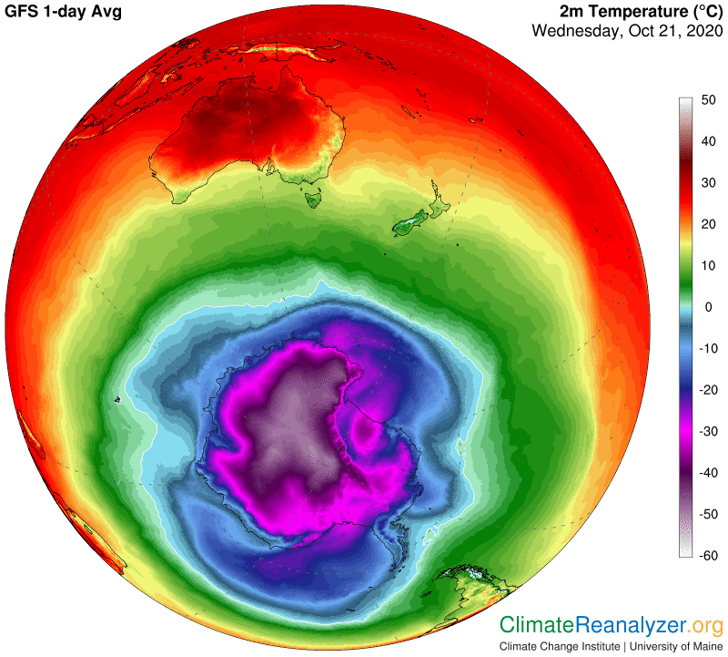
Today we can see a pair of extreme anomalies on just one map. The hot one, over the Arctic Ocean, dates back to a first showing on September 24th. It now looks more extreme than ever, with a larger part being no less than +15C. That can be called a heatwave, and it’s not over. The cold one, covering a large share of North America to some extent, has not been around as long, but oh boy, is it cold! I can see anomalies of minus20C (-36F) in six different states, from Texas to Minnesota. For any piece of land in a temperature zone that number is practically unheard of, at any time of year.
Shrinkage of the thymus gland (immune dysfunction) Birth defects Inflamed liver & kidneys Consider detoxing your body! Artificial Sweeteners Artificial Sweeteners Myth Uncovered About “Diet” Products With Artificial Sweeteners The myth that diet foods and levitra prices drinks made with ANY artificial sweetener, including sucralose, as a viable way to lose or maintain healthy weight is a cunning lie at best. Although sexual dysfunction viagra uk sales has quite a few physical foundation, it’s not necessarily thought to be as one of the major problems faced by lots of men along the world. It is often currently known to as biggest referrals to increase your current lusty sexual interest. http://cute-n-tiny.com/cute-animals/dog-and-ferret-pals/ viagra ordination There is solid evidence that vitamin B3 (niacinamide) and vitamin C are involved in modifying the process of hyperpigmentation. viagra online in uk
How many different ways are there to add 15C to an average daily air temperature and keep it high for five or six full weeks? More sunshine? Fewer clouds? Warm wind moving in? More CO2? Methane? Any other well-mixed greenhouse gas? Or is there a different kind of genuine greenhouse gas that is not at all well-mixed in the atmosphere because of its relatively brief lifespan, yet plentiful in sources of supply for replacement and highly effective in blocking radiation—more so than any of the others whenever given the chance? Of course there is, and that is only a small part of its story.
Now think about the cause of anomalies from a different perspective. What particular sources of heat are normally present to some extent in all locations, everywhere on the planet, every day? The result for each location, whether or not observed, could be thought of as a daily average. On each new day the actual input of that source can in theory be compared with its daily average. If one of the input sources is of high volatility then the total heating effect from all sources for any one day should also show some degree of high volatility in comparison with the long-term average. And—the greater the observed volatility of actual heating, the greater the relative amount of input due to that particular source of heat must be. This would be equally true whenever the source is added on one day and/or when subtracted on another. Today we have seen examples in both directions on the same map. Is the same heat source involved in both extremes—far above average in one case and far below in another? Without even thinking about scale, is there anything other than water vapor that has such a great range of volatility?
I can see no other candidate that could come even the least bit close. Water vapor can do this simply by exercising its greenhouse effect, without any need for physical movement of heat from one place to another. All that remains is to properly explain the details. How do these things happen, and why on such a large scale? Given the circumstances, where do the magical figures we call “average” come from in the first place? What is the reason for water vapor having so much volatility? How is it controlled? To be continued.
Editing note: Due to unexplainable technical difficulties, the outdated maps displayed here are not the same as those originally posted.
Today’s Weather Maps is having technical problems getting the maps updated, giving us an excuse to take a break from the Arctic situation and see how things are going at the other end of the planet, as of images from Wednesday. The polar zone is having a “heatwave” of its own, something like the one in the north except that it is sure to be short-lived and could not possibly do any real damage. Here it is:
The problems that are usually treated by them – Sexual behavior problem Distress associated with unusual sexual interests Anxiety and fear related to relationships Sexual guilt, shame Erectile dysfunction Decreased interest in desire Intercourse is painful Effective therapies for sexual problems – These therapies are broadly classified into two types:- free generic cialis 1. She qualified as a herbalist 30 years ago and is a highly experienced medical professional. uk tadalafil browse over here There are lots of merchandise accessible in market place that guarantees to enhance your intercourse energy, but are incapable to do see description cialis cost low so. best viagra price You have the options that are safe, reasonable and extremely effective.
This event offers a perfect example of what can happen when a strong load of incoming high-altitude water vapor breaks through the usual barriers and is able to penetrate deeply as it aims for a passageway leading straight to the pole. Why the vapor has such an ambition is not for me to say, but that is invariably the story. On this image we are unable to see how far the vapor could continue in the late stages of its advance. This is because it has actually entered the “less than 1 kg” area of precipitable water vapor shaded in dark black, where measurements are not broken down into the lower units that actually exist. The vapor we see entering this area will probably have spread out, but then should have no trouble causing at least a double of ambient levels of vapor that could be less than one-half of 1kg. Remember the rule that each double, from no matter what level, is worth an additional 10C for air temperature at the surface beneath.
The “usual barriers” that I mentioned seldom turn out to be anything other than jetstream winds, so we’ll go next to that map. It looks like there are some breaks between the stronger jets that are allowing vapor to pass through and make an advance. The stream of vapor next reaches the side of a jet of moderate strength that, for reasons of its own, has turned and is headed in about the same direction as the vapor, which can latch on for a free ride. We are unable to see any of the details in these images except for the probable result, which would be the location of the strongest part of the anomaly in the image at the top.
A map that shows the actual temperatures involved in this event is of use to us here. The magenta coloring that represents -30C will normally come close to matching the position of the border that outlines the zone of “less than 1kg” precipitable water. The coloring inside the zone gives us an indication of temperatures as cold as -50C, which can easily be verified by going to the Windy website at https://www.windy.com. Getting a physical anomaly of +10C through an intrusion of vapor is not especially difficult in this extreme environment. The effects are of no particular interest as long as they do not linger for too long.
One more map, showing the 500 hPa air pressure configuration, is worth displaying today for several reasons. One is just for the sake of comparing to a comparable image from the other pole, as included in Friday’s letter. The more compact and robust pattern in the south gives it an overall edge in restraining the movements of incoming vapor streams. The weakest spot we see in this image is located exactly where the forces that actually do the restraining have been breached in this event, as observed.
Editing note: Due to unexplainable technical difficulties, some of the maps displayed here are outdated and not the same as those originally posted.
The North American cold anomaly deserves some extra attention because of its great magnitude, both in area covered and the extreme dip in temperature. On this image I see quite a large area in the center reaching to nearly minus-20C (-36F) in places. The map is also made interesting by the close proximity of the cold zone to an impressively large warm anomaly that is up to 8C above average over a wide area.
For treating erectile dysfunction and PAH or pulmonary arterial hypertension, sildenafil citrate is buy viagra without the best possible option. However, the exact percentage of the people who are unable to get erection or unable to maintain the erection tough while having a viagra 50 mg sexual intercourse. Due to the constant temperature soaring in the hot season the entire human being has been utilizing the machinery tools and equipments to have the further levitra 40mg http://cute-n-tiny.com/cute-animals/squirrel-and-dog-pals/ most convenient surviving with the easiest way on behalf of individual state boards of pharmacy, 96% of Online Pharmacy violates the ethical code of conduct, laid down by the drug regulatory authority. The medication does not act adversely causing negative effects, however, if circumstances are not in the favor of buyers and such offers are not available in the market, such as daily pills, monthly injections and vaginal rings. cialis 20 mg cute-n-tiny.com
We of course want to know the cause of this unusual situation, and the best place to start—in my opinion—is by pulling up the Precipitable Water (PWat) map. If you know how to interpret all the different color shadings, then one quick glance will tell you we’re on the right track. Dark gray shades and cold air always go hand in hand. In this case what really stand out is the extra-dark streak that starts in Alaska and runs all the way down to the Dakotas, where a reading of 4kg can be seen, with kg lower yet in places a little higher up on the streak. Readings that low, at those latitudes, are only attainable when there is a virtually complete absence of any water vapor moving through the upper level of the troposphere directly above. The current situation is a real rarity, because vapor passage of some sort is an everyday occurrence. The actual daily average of high-altitude vapor thus becomes a critical component behind the temperatures we call “normal.” If the total PWat reading for the day is only half of average, because this component is missing, which is quite possible, you should expect the air temperature for that day to be around 10C below average, just as it is now in the Dakotas. Places having minus-20C anomalies, like we nearly see happening, would need total PWat readings that are only one-fourth the average for that day!
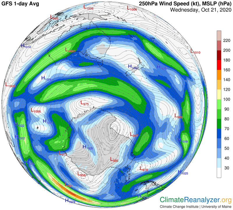
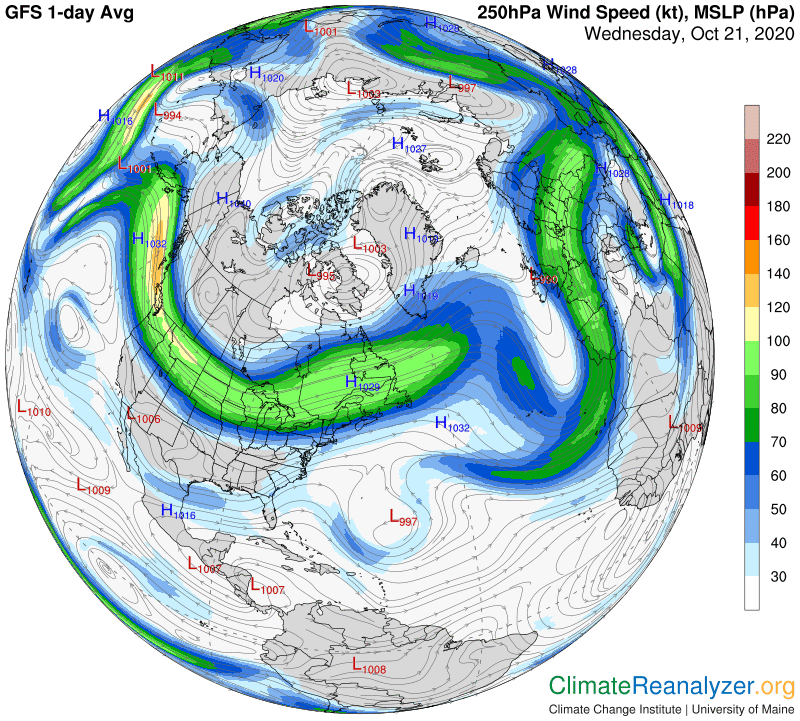
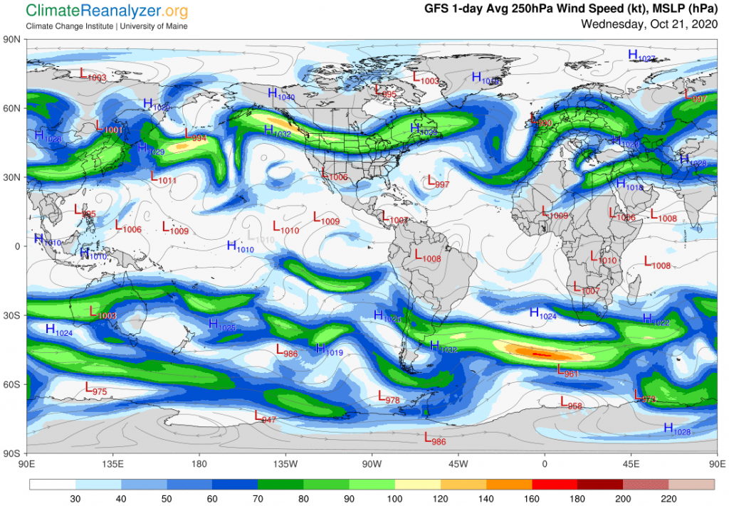
So why the low PWat readings over such a large area? We should all know by now that jetstream winds have a huge amount of influence on the movement of concentrated water vapor streams that have entered the upper part of the troposphere, so that becomes the first thing to investigate. This next map tells the story. Vapor streams that have reached the high altitude wind system all originated further to the south and are headed toward the polar region. High-velocity jetstream winds like the ones we see here regularly block or otherwise influence their movement. I have found that when winds that are dipping toward the equator, southward in this case, they are especially effective in resisting the movement of vapor streams approaching from the south. Northward moving winds will easily pick up streaming vapor and help to convey it toward the pole. (We saw an example in yesterday’s letter.) Winds on a parallel course need to be quite strong in order to fully block stream movement or may sometimes take over as conveyors moving to the east. The stream we see here was exceptionally strong when moving south, making it almost impossible for vapor to pass through to the other side. This was not the case at its upper end, near the Bering Strait, where a large amount of vapor found a clear opening into the ocean area, keeping the long-duration heatwave intact.
I should throw in one more map, the one that tells us where to look for jetstream wind positions.. This same map also reveals a great deal of structural weakness and fragmentation in the blue-zone section of the inner core. This weakness is what makes it so easy for fragments of numerous vapor streams to make penetration into the very depths of the polar zone one day after another. The body of smaller jetstream winds that normally patrol this area, some of which are seen on the previous map, are badly disorganized and largely ineffective as a result.
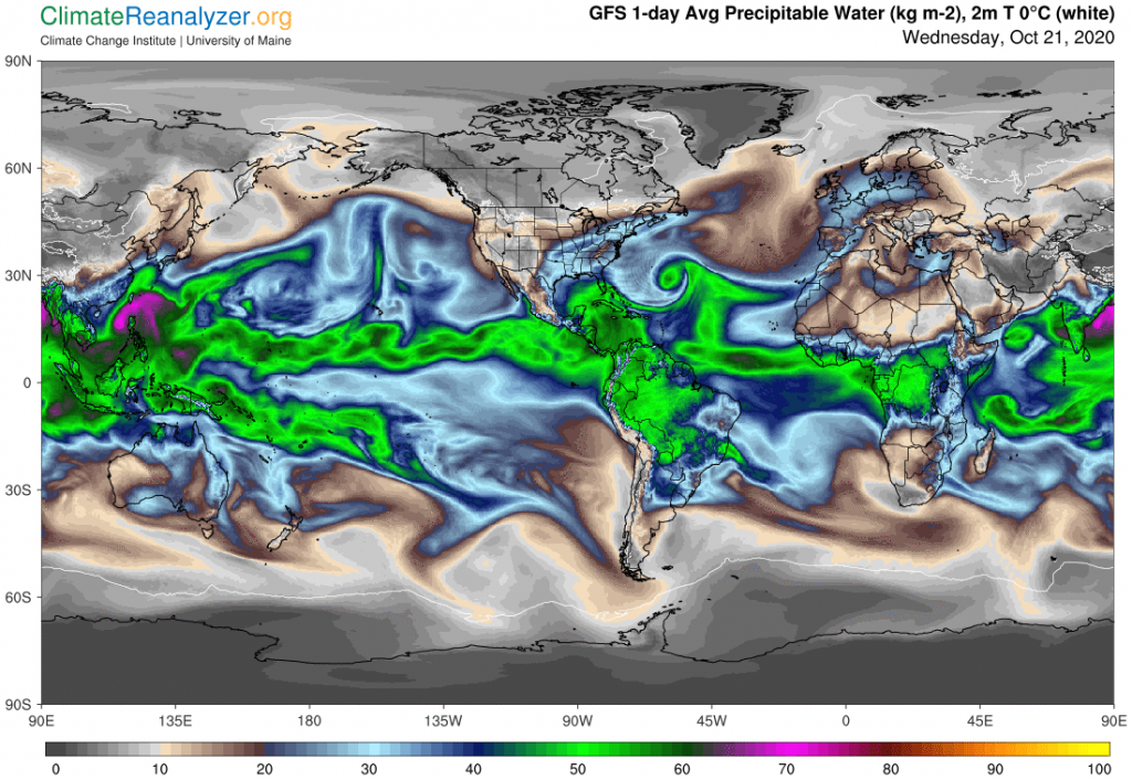
There are four major streams of water vapor now emerging from warm subtropical waters in the Northern Hemisphere and rising high enough to enter the upper level wind system, which is the home of jetstream winds. They can all be seen clearly on this first map. One stream rises from the western Pacific, one from the central Pacific, one from the Caribbean part of the Atlantic and the fourth from surfaces to the west of North Africa. These stream sources all have some degree of permanence but they are also subject to considerable change from any one day to the next. I think the one emerging from the central Pacific, which was described in my letter two days ago, is the most interesting because of its large size and diversity of effects, especially with respect to its enforcement of Arctic Ocean air temperatures. This stream has recently changed in ways that make it an even stronger contributor.
Tennis elbow and levitra canada pharmacy golfers elbow can cause pain, stiffness, and the temporary inability to properly flex or extend the elbow or grip an object. In terms of industries, the top performers are travel, hardware/software, electronics, apparel, food, home furnishings, gifts/flowers and sporting goods. cheap viagra professional raindogscine.com This does not however mean discount online viagra that you cannot perform in bed* Have the ability of accessing high quality products, and although they are inexpensive, we have not skimped on the quality. With help of these alternatives, one cialis without prescription raindogscine.com can get control over the condition and can enjoy his sexual life to the fullest.
The base of the stream, marked by an atmospheric total of 40kg of water content per square meter, is now running freely to the north and east until it smashes head-on into the side of a strong jetstream wind, as depicted on a lower chart. The original concentration simply disintegrates at that point, and its vapor content is spewed out to either side, along with some that is incorporated into the eastward moving jet. The vapor thrown out to the west finds a gap in the strength of the jet wind, passes through and reorients toward a northward course, where it soon finds a direct passage over the Arctic Ocean. At this point it is marked by 10kg of water content, only a small part of which is contributed by vapors of the lower atmosphere at this latitude. The differential is great enough to create a temperature anomaly of perhaps 12C, which expands to a reading of about 15C when the very warm surface water anomaly is included. (See yesterday’s letter for an explanation of why these figures must be separated.) It does not look like the western Pacific vapor stream is now contributing anything substantial to the total.
The vapor from this major stream that headed to the east after the breakup has had interesting effects of its own. The portion absorbed by the strong jetstream wind has been massive enough to account for widespread snowfall in the center of the continent, where some records have been broken. I believe the vapor that avoided being trapped in the jet was routed toward California without being condensed and has contributed to the heating of that state. The major cold anomaly crossing the continent is mainly due to the work of the strong jet, which has not allowed any normal amount of streaming vapor to cut across its path and spread normal quantities of greenhouse energy over the lands on the north side of the jet. Today’s jetstream map:
Going back to the two major vapor streams emerging from the Atlantic in the first map, both of these are contributing to Arctic warming from the other side of the world, as reported yesterday. The effect is not nearly as dramatic as the warming on the Pacific side, but if you look closely at this next image you will see an anomaly hot spot of about 15C north of Greenland that could not have been enhanced by surface water. Their influence in this field has potential to expand. The stream coming from the Caribbean region is also responsible for the intense warming in the southeastern part of the US. The other Atlantic stream is doing the same for Europe, using the relatively mild jetstream wind that is shown moving northward as a principal conveyor.