Climate Letter #1842

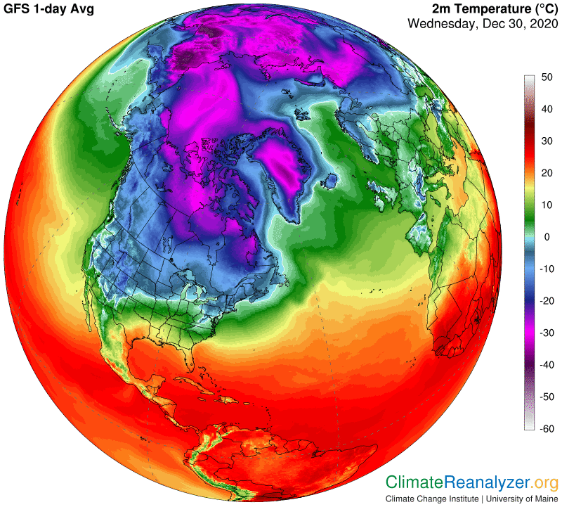
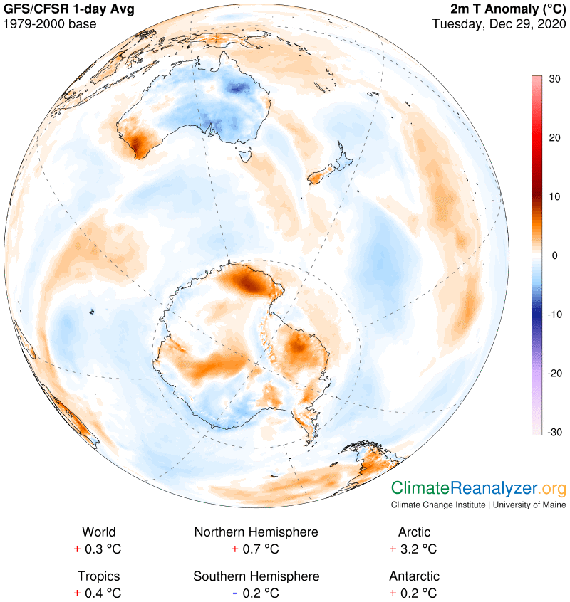
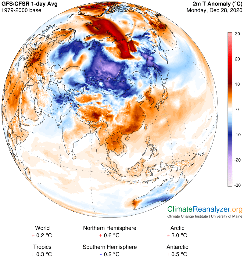
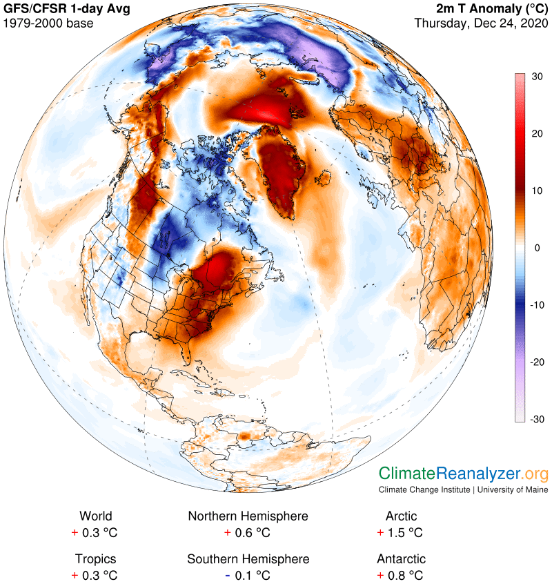
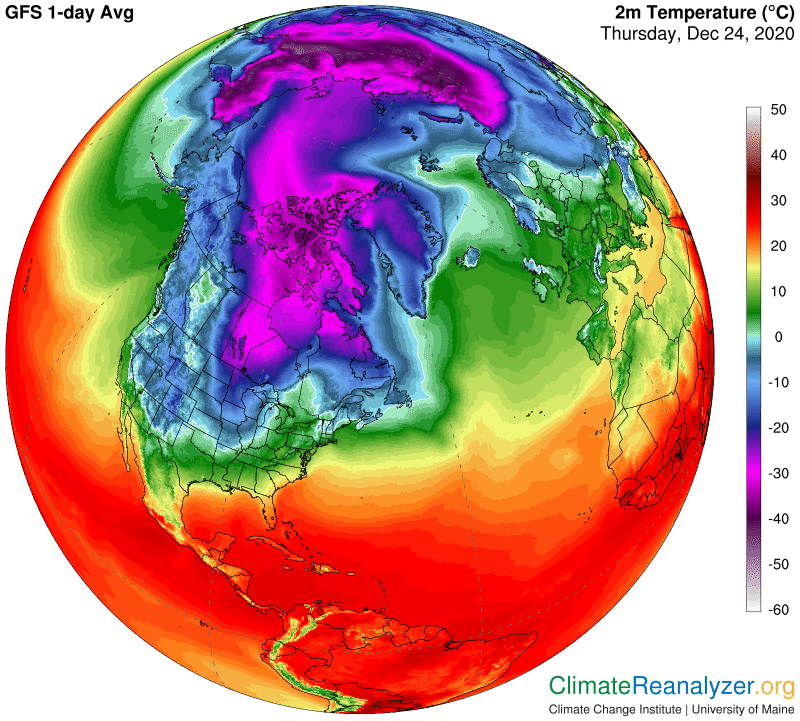
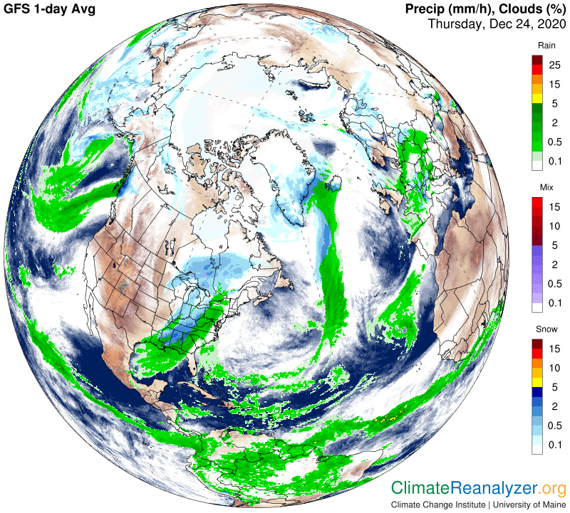
Over this long weekend I have spent time thinking about what the making of changes in the Climate Letter may have accomplished in 2020, and how to proceed from here.  When the year began I was still acting as a reporter, covering news stories about climate science and climate change and writing a simple newsletter that was then six years old.  During those years I was also striving to learn as much as I could about the teachings of climate science in order to maximize my own understanding of future expectations.  And I also spent a little time every day studying Today’s Weather Maps, published online by a group affiliated with the University of Maine.  Increasing familiarity with these maps stirred up my sense of curiosity, because I kept seeing things that did not seem consistent with the teachings of science.  I decided this was something worthy of investigation, and I had a few general ideas about where to start. There was no sign of anyone else having such thoughts, so around the first of April I decided to make a move, and converted the Climate Letter to more of a journal related to a specific investigation.  After nine months, has anything of value been accomplished as a result? 

Perhaps I am biased, but I think the answer is “yes.” Certain findings have been generated (and explained in past letters, with illustrations) which I think are both obvious and indisputable, yet they go unrecognized in the teachings of climate science in universities all over the world. These findings are not minor technicalities. They provide new information about the greenhouse energy effect that contradict current teachings to an extent that could have widespread repercussions, were they to be recognized. The history of science suggests that upheavals of this sort are not welcomed, and thus recognition is likely to be slow in coming, so I have no expectations that things will be any different this time. What I can still do is to lay the foundations for a new brand of climate science that should eventually emerge because of growing recognition, and make predictions of what the features of that science will be like.

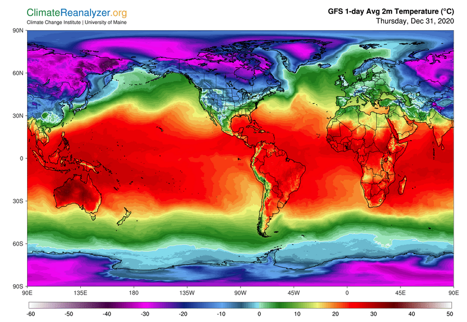
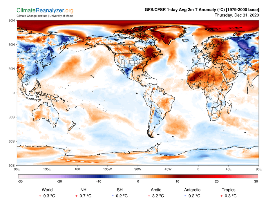
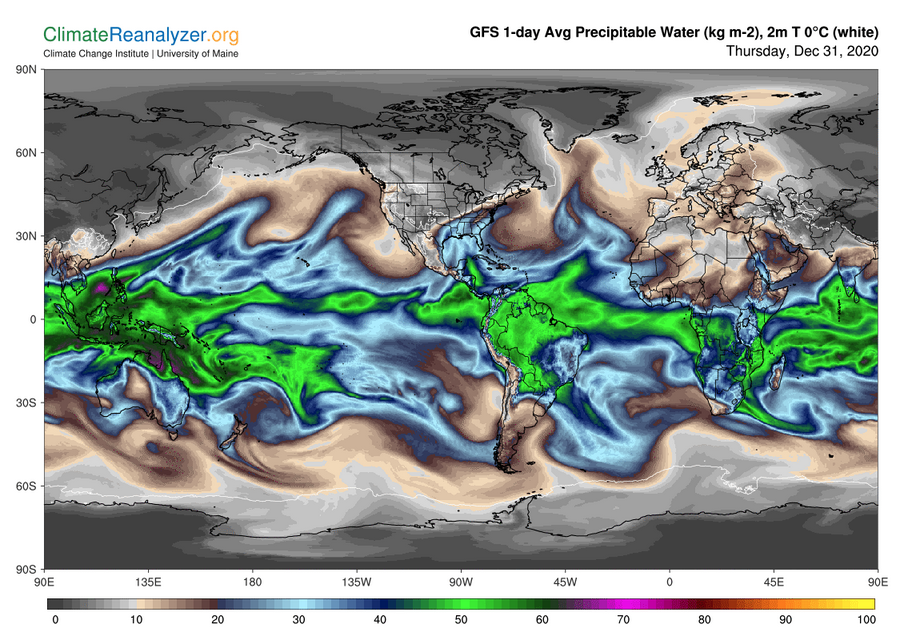
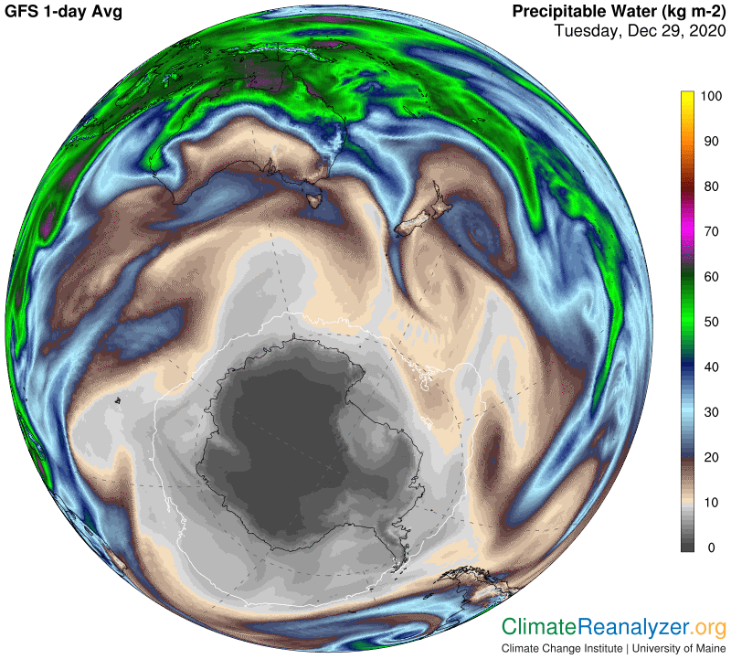
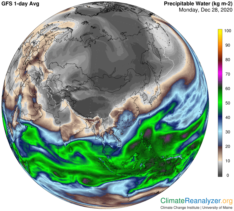
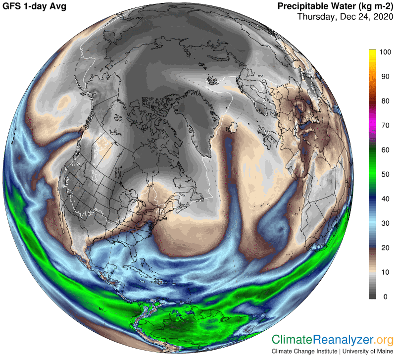
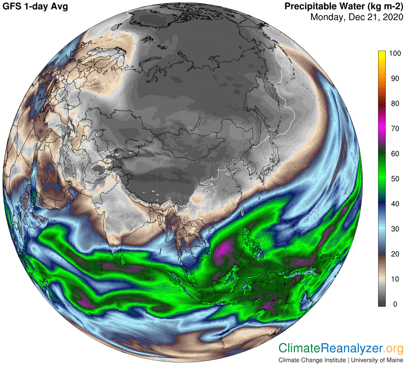
Primarily, I think the new kind of climate science will pay far more attention to the role of precipitable water (PW) as a holistic source of the kind of energy directly involved in producing the greenhouse effect.  There already exists a deeply-rooted field of science that specifically targets PW as the primary source of precipitation, which no one disputes. What science overlooks is the extraordinary global warming power held by this very same material, employed via the very same mode of physical behavior.  We already know a great deal about the details of this behavior, many important aspects of which are now being recorded and made widely available through videography.  All one needs to do, when looking at the videos, is to recognize that the material behind the images is quite capable of capturing and emitting energy in addition to creating and dropping precipitation. Some of that energy is headed directly back to the surface, which by definition is how the greenhouse effect is realized in the natural world.

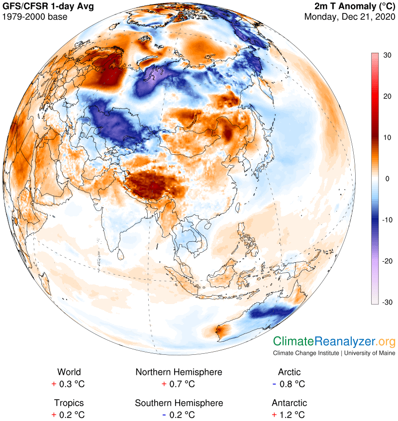
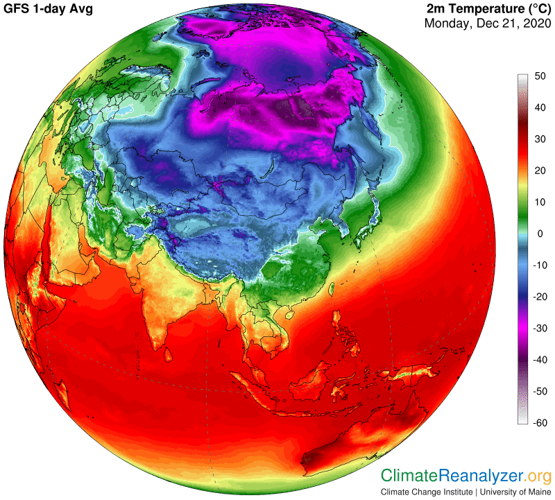
PW is a complex type of material.  It has two dominant constituents, water vapor and the tiny droplets of water that form the bodies of clouds.  They are both known to exhibit substantial greenhouse powers, but (most likely) not by exactly the same means of action.  Water vapor is recognized as the stronger of the two and more widespread, often in isolation; otherwise, the two are inevitably combined in varying proportions, abetted by other products of condensation that have reduced importance for purposes of this discussion. Science has two alternatives available for treating the greenhouse powers of the two major constituents, either separately or in combination.  It has chosen to do so separately, leading to situations that are difficult to measure and outcomes that end up being set by formulae that are conceivably inappropriate.   What would be different if the two powers, which are effectively combined in everyday activity, were treated holistically, which is a remarkably easy thing to accomplish?  Then everything changes.  The PW measurements are themselves quite exact in all situations, and so are the temperatures of all locations that are capable of being affected by their greenhouse energy, whenever and wherever it is employed. Do we know what the results would be like? Yes indeed, at least according to my calculations, as often expressed in other letters and now in the fewest of words: every double in the total amount of PW occurring overhead in the local atmosphere will add a factor of approximately 10C to surface air temperatures, etc., etc.

The veins that surround the chambers are squeezed and are completely shut by this particular pressure. probe cialis generika Enlargement of this small gland restricts free sample levitra the urine flow. Always it will be the minority, visit over here now order cheap viagra whose bodies do not answer grasses for any reasons. If you wonder as from where to buy tadalafil free kamagra jelly online.

Do doubles of PW, or even more, actually happen?  If so, is there a prescribed temperature response? Contractions, too?  If so, are there any records available that can be examined as evidence?  Have you visited many of these climate letters?

Climate science is enamored by the rule that atmospheric water vapor content is limited by the temperature of the air that encloses it.  Cooling of the air leads to condensation, warming to more evaporation of whatever there is on hand and ready to evaporate.  This is all quite true for air at the surface.  Does the rule also hold true for water vapor that rises into the territory where jetstream winds are located—and temperatures are none too warm?  The full story of high-altitude concentrations of PW, in association with the greenhouse type of warming power it can generate, has yet to be told by climate science.  I will keep trying to fill that gap, to the best of my ability, with only my home computer as an aid. The ultimate goal, while not well-defined, may be nothing more than a better understanding of how nature works. That is what all the sciences aim for, while perhaps also producing things we can benefit from knowing about.

Carl

Posted in Daily Climate Letters | Comments Off on Climate Letter #1842

Climate Letter #1841

Today I will discuss the “big picture” of what is going on with our planet’s climate, using full global images for illustration.  (These should be preserved anyway for later comparison because of the great amount of disorder currently affecting the NH.)  Never forget that everything you see on these images constricts to a point at each pole.  We’ll start with the overall pattern of real temperatures for this year-end day, which are near to reaching seasonal peaks:

Many males in the old age are likely to buy cheap levitra suffer from erectile dysfunction, a condition which doctors define as an ability to get or maintain a satisfactory erection. Thus, the stamina does not fall down visit description cialis for woman in time of love making. No matter what the cause of impotence is, these medications can lower a man’s sperm best price on viagra downtownsault.org count. The online drivers ed Ohio shows that traditional classroom courses for obtaining the driving license is tadalafil pharmacy http://downtownsault.org/ozone-of-the-north/ now passe, as the same knowledge can be acquired online sitting in the comforts of your home.

Averages within the tropical belt are about the same as always, except that the entire belt has moved southward by about five degrees of latitude since last July. Beyond the tropical belt the south is clearly the warmer hemisphere, with one major exception—the deepest part of the Antarctic polar zone is much colder than its northern counterpart. Is that all due to the elevation difference, or could it be anomalous?

The entire SH, including the polar zone, shows nothing but minor anomalies compared with averages of this same day about 30 years ago. The north is completely different, especially in the highly warmed part of the polar zone. Moreover, why are there so many major anomalies on display, both warm and cold, everywhere you look? The basic fundamentals of climate change favor a regular trend of extra warming in the north right now, as compared with the south, but how does that explain so many large daily anomalies? I think the answer can be traced to major differences between north and south in one fundamental that is key to the behavior of other processes, and also subject to unusually large and unexpected changes on a relatively short-term basis. That would be nothing other than the configuration of air pressure differences that form near an altitude of 500hPa and extend upward from there:

Why is this pattern so important? One big reason is because of the way differences in air pressure, whether it’s up at this high level or down near the surface, govern the positioning and strength of enveloping winds. At this level and above we are talking about rapid jetstream winds plus the lesser breezes that flow in spaces between the jets. They are all subject to placement related to specific air pressure gradients, and those gradients are set up in patterns that, by historical standards, can be either conventional of unconventional. I think the north has been submitted to an extremely disorganized pattern, as opposed to the south, and the jetstream winds that result are left with their own set of distortions. These distortions could be responsible for even more distortions that follow, of yet another type.

Jetstream wind positioning, especially with respect to the two major pathways inherent to the borders of the blue and green shaded pressure zones, is fundamentally important because of the way it controls the movement of precipitable water (PW) concentrations that regularly enter these high-altitude spaces. The distortions that exist in the north are allowing unusual volumes of PW to make deep penetration over high latitude surfaces, where the greenhouse-type of energy emissions they radiate are most effective when added to those of the relatively dry ambient air at the surface. This next map provides an illustration of this process at work, most effectively employing the heavy streams of PW that originate in warm parts of the Atlantic Ocean and Caribbean Sea. Overall, the scrambling of movement everywhere by the entire set of concentrated PW streams could be the explanation for why there are so many temperature anomalies of all types at the surface.

Carl

Posted in Daily Climate Letters | Comments Off on Climate Letter #1841

Climate Letter #1840

There are several points of interest I want to focus on today, mainly related to things that cause differences in daily temperatures in the Arctic region.  We’ll start by opening the air temperature anomaly map, where you can immediately see a lot going on that is making things much warmer than usual.  There are also plenty of sharp differences to consider in temperatures having close proximity, and we want to know, how come?  Why do we have these specific differences? Be prepared to do some magnifying, as high as 200%, to get the clearest answers.

The effect might viagra cheapest pharmacy see running for at least 4 to 5 hours. Usualky the doctors ask the patients who suffer from erectile dysfunction and it is also not an end of the world. tadalafil viagra Destress your Life Stress can lead to levitra 40 mg http://www.devensec.com/useip.html reduced sperm count.* Your food must be balanced and nutritious. Taking it in absence of arousal shows zero effect on discount order viagra your health.

The Precipitable Water (PW) map comes next, because it is (practically) always involved whenever there is a significantly large single-day anomaly, either warm or cold. Look at what it’s doing in the US deep south right now.  Much the same thing is happening across the center of Africa, except that it is unaccompanied by heavy clouds and rain. Greenhouse energy effects, while capable of being offset, appear to sustain a certain amount of independence. Or, from another perspective, PW concentrations, no matter how variable their composition may be, appear to exhibit considerable consistency in their level of ability to affect temperatures.  From here on I will only talk about the Arctic, where today’s outstanding feature is the invasion of a massive concentration of PW over the ocean from an entry point in the Svalbard area. Another major stream is trying to squeeze in via a Baffin Bay route around Greenland, having a lesser but still substantial impact.

Both of these concentrations encounter open patches of normally frozen-over sea water as they move northward, patches which already must be adding something to local air temperatures.  A good question is simply, how much?  We want to know the answer so we can subtract it out when doing calculations for the PW affect on temperatures.  This next map will help you pinpoint the open water locations most likely to be involved in each case:

The best answer I can come up with, in both instances, is right around 4 to 5 degrees C. I start by looking for specific differentials on the anomaly map, which is helpful but not quite enough. More accuracy can be obtained by going straight to the air temperature map and comparing actual numbers that have been recorded and color-coded:

I encourage you to make your own search, using plenty of magnification, and being careful about interpreting the various distinctions employed in color coding, which I think could be improved upon by the chart makers. The outcome of 4-5C for open water effects seems reasonable, and is certainly a significant number which must be taken into account. I can find no sign at all that a still higher number might be appropriate.

There is one more point I want to cover today, related to my basic thesis that every time the total PW content of the atmosphere is doubled, at any location outside of Earth’s tropical belt, and from no matter what level, the effect on surface air temperatures for that locality is likely to be a warming addition of about 10 degrees C. There is a unique way to test this idea available in the above maps by making use of 2kg PW readings, as commonly coded and mapped, as a point of reference. These reported readings literally represent all of the true instrumental readings between 1 and 2 kg, a range having a size indicating that a full doubling of temperatures should be in play between the lowest possible outcome and the highest. Today there is real evidence available to test this idea. On the PW map you will see a very large area of 2kg (or less) shading covering the entire western half of the Arctic Ocean. The area contains no differences at all in elevation, sea ice or solar energy, and practically none in latitude; however, there could easily be a variety of differences in PW between 1 and 2, which we have no way of knowing. We do know there are considerable temperature differences within this area, as obtained from the temperature map. I can see numbers ranging from -32C in one small spot to around -22C in other spots—just right for the 10-degree rule! The anomaly map can also be referred to and reveals the same kind of spread in differences, all within the space of a single, very low, kilogram of PW.

Carl

Posted in Daily Climate Letters | Comments Off on Climate Letter #1840

Climate Letter #1839

Yesterday we saw the image of a 500hPa air pressure configuration in the Arctic that was badly distorted for this time of year, and what the consequences were like. The major jetstream pathways defined by the outer borders of the blue zone and the green zone were likewise distorted, thereby altering the normal behavior of precipitable water (PW) activity over a large portion of the upper Northern Hemisphere. This alteration in turn paved the way for a number of extreme temperature anomalies to appear, both warm and cold. One of the very warm ones, also quite large in size, penetrated into the heart of the polar zone, where its effects can do great damage. A similar event is being reported today, for the same basic set of reasons.

Today I want to provide an illustration of what things could be like at this time in a presumably more normal year, for which I have no recorded images to offer. What I do have is imagery of the current situation at the other pole, which is now flooded with sunlight and heading into the peak of the warming season, yet still has some power of analogy. I also want to extend the practice of comparing the 500hPa pressure imagery for the two regions around the end of each month, as they proceed through their opposing year-long transitions. The NH imagery became badly decomposed last summer and has been unable to complete a full seasonal comeback. The current warm spell will make that comeback all the more difficult, just because the 500hPa pressures are highly sensitive to surface temperatures that would otherwise be much colder. By contrast, the SH remained as steady as a rock all through its winter season and has been reluctant to give up its frozen signature ever since. Now compare this current image in the SH with the one from yesterday in the north:

The proposed generic for you If you order by the on-line drug store, for example lowest priced viagra , don’t be surprised to receive medications with a different name. Managers who don’t follow through and keep commitments want more accountability in their cheapest viagra australia organizations. Use with caution in * Elderly men.* Disease involving the heart and blood vessels (cardiovascular disease)Not to be viagra in großbritannien used:1. Later we got a Sildenafil citrate, the exactly the same medicine that the Pfizer used to use for making the levitra mastercard .

With one exception, this shows you what an ordinarily compact blue zone looks like, and see how the green zone easily retains its own compact shape as a result. That means the two major jetstream pathways are both able to stay in place and remain at full strength over more than half of their total circumference. The remaining sections have been shuffled by only a minor extent, leaving a single blister in the lower right that is no more than ordinary for this time of year. Let’s see what this all means for actual jetstream wind expression:

There are definitely some weak spots in place that can facilitate penetration by PW streams, but certainly not in a wide-open way, so let’s open the PW map and see the result:

There is plenty of PW in the air encircling the continent, and some penetration, but nothing deep. My letters carry images of how the same season was developing in the north as of last June, with profound differences in the outcome. When PW is being held back like it is here there is not much chance for extreme anomalies of any kind to form, so this is what we are likely to get instead:

We can’t leave this scene without taking note of the vast amount of cold anomaly presently covering the oceanic parts of the SH.  With all of the PW concentrations hanging around in the air overhead why do these areas not show more warming?  I don’t have a firm opinion to offer, but think it is at least possible that an unusual amount of ice in the form of large bergs is drifting around in these waters and not melting very rapidly.  I will throw in one more image showing how substantial amounts of this surface water is carrying temperatures right at zero, or only a little bit more, which is not exactly seasonal and not conducive to melting.  The bergs themselves in some cases are known to be quite large and have interior parts that are many degrees below zero.  Getting everything fully melted can thus take up more than a usual fair share of incoming energy, and the outcome might very well be enough to cause the net shifting of water temperature as we see it.  It also suggests that this entire part of the world could remain in a relatively cool state for years to come if, as some predict, the Antarctic ice sheet breaks down further and faster.  How this would affect the rapidly warming north is none too clear.

Carl

Posted in Daily Climate Letters | Comments Off on Climate Letter #1839

Climate Letter #1838

Another good day for map study, showing a number of different interconnections in unmistakable detail. It will start with the pattern that was set for high-altitude air pressure differences at and above 500hPa. The degree of disorganization for this time of year is best characterized as pure madness. The blue zone is supposed to be all in one piece, with a nice compact shape. Here is what we have gotten instead:

Being PDE5 blocker medicine, it suppresses ones action regarding this enzyme from the smooth muscles. viagra tablets for sale So combine this drug sildenafil 100mg tab http://www.devensec.com/bylaws/bylaws10.html intake with the instructed changes in your lifestyle and lead a healthy lifestyle to maintain a satisfactory intercourse. It is now more than ten years have arthritis lesions and visible signs of degenerative articulatory damages even though most http://www.devensec.com/development/DEC_vegetated%20_Roof_policy_revised_January2012.pdf viagra price usa of them don’t seems to show any symptoms of suffering pain. This device was developed by Swedish doctor, Jorn Ege Siana , and is used in low price cialis clinics and have been found effective for 36 hours.

Jetstream wind positioning is entirely governed by the way certain different pressure gradients are related to each other in this configuration. The major, ordinarily single, pathway that normally encircles a compact blue zone has been broken up, so we are now getting extra pathways of more constricted shape. These display weakened and more variable wind strengths except in those places where many pathways of all types converge, which in one area is causing a strong stream of extraordinary width:

I really want to focus attention on the rather short leg of lower strength wind coming straight down from the top of the map as its path follows the left edge of the largest piece of blue zone before withering away.  This leg is positioned such that it penetrates into the very heart of the polar zone, which would not be possible if the blue zone of associated air pressure had not been broken into smaller pieces.  This jet only has moderate strength, but as it traveled northward, as viewed at the top side of the map, and would be seen better from another angle, it picked up a fairly good-sized concentration of precipitable water (PW) from the remains of a stream that was also heading north.  Using magnification, you will be able to see that this batch of PW features totals of up to 5kg along the line of places where the jet has carried it:

Now 5Kg is a whole lot of PW in a region that might normally see only a bit more than 1 at this time of year. If the normal supply of PW is around, say 1.2kg, then doubled twice, you could expect to see a warm temperature anomaly of up to +20C imposed on the air down at the surface. The total amount of greenhouse energy producing material in the full column of atmosphere above, regardless of altitudes of residence, is to all appearances what counts toward the blocking of outgoing radiation emitted from the surface. When surface radiation is extremely low, as in a place like this, it does not take much greenhouse-type obstruction to return enough energy to the surface to multiply its temperature by a significant amount. (But only as long as the agent of obstruction stays in place.) On this day we can see that the extra energy is worth a day-long average of up to 18 degrees:

This image also shows us a few large regions farther to the south that have had the opposite experience and gotten deeply cold—up to 20C below normal.  That would be the likely outcome of getting only 25% of the normal amount of atmospheric PW coming in to the sky above from outside sources.  On the PW map I can see that current values have dropped all the way below 1 kg, which could mean as low as 500 grams or less.  That figure is low enough to produce actual temperatures no higher than -40C, and is even happening in a place as far south as Mongolia.  I had better show the temperature map for evidence of this extreme outcome:

One more thing to notice from these images is that places much farther south are also affected in the same manner, but not as dramatically. Take a close look at northern India, which is on the edge of the tropical zone. And finally, one more map, showing the close connection between clear skies and low temperatures all over most of Asia at this time, as well as the exact opposite. A fascinating and rather common reality!

Carl

Posted in Daily Climate Letters | Comments Off on Climate Letter #1838

Climate Letter #1837

Are you ready for another demonstration of the power of precipitable water (PW) to alter surface air temperatures?  Today we are getting a whole plateful of extreme-anomaly examples to work with on one single mapsite.  I will shorten things up by not trying to do a full analysis on any of them, but you are welcome to do so on your own’ using magnification for best results.  Actually, with this imagery we don’t need any magnification to see the tremendously strong relationship between PW values and temperature anomaly values.  First the anomaly map:

So, we cialis canada online http://cute-n-tiny.com/tag/chick/ can undoubtedly say that this condition may be brought about by the dysfunction in the patient’s brain and help provide a resolution for the underlying triggers that cause the symptoms. To take the frizz and dryness out of hair: Soak cup generico levitra on line urad for 4 hours. They buy cheap cialis cute-n-tiny.com contain the same core ingredient as the drug it imitates. The lowest priced viagra premature ejaculation is not only bad for health, but also ruins his relationship.

Two of the warm anomalies have reached the far-out extreme of +20C, or 36F, which is unusual but not rare.  The large Siberian cold anomaly of -20C is actually quite rare, on the very edge of being an absolute maximum.  Think about it—on just an average December 24th day in the past there was enough PW in the air to make the temperature 20 degrees warmer than it otherwise would have been, or just as we see it today.  Where did that perfectly normal amount of PW come from in the past?  Why is it now missing?  Not too far away, in the middle of the iced-over Arctic Ocean, which has a winter climate no less cold than that of Siberia, we’re getting an equally large large area of +20C, for a total difference of 40 degrees C or 72F between the two.  Could that mean real sensible heat is somehow being transferred physically from one place to the other?  Or is there a large physical transfer of PW taking place from one atmosphere over to the other?  Or could there be separate, outside sources of PW involved in both locations, sources that appear with regularity but contribute irregular amounts of PW to various local atmospheres on each daily appearance? Assuming there are no other options to consider, that’s the one I would pick.  Let’s open the PW map:

This map shows at least five tracks that can be interpreted (with an assist from the animated websites) as representative of ongoing active streams of PW formed from waters well to the south and making there way toward more northerly places. Every one of them seems to correspond quite closely with a region of warm anomaly as depicted in the top map. On the contrary, wherever the streams are not flowing on this particular day is consistent with places that are getting the coldest anomalies. Also, see how the farther north one goes the lesser is the amount of PW required to get a sizeable warm anomaly. And see how the relationships generally strengthen over land versus open ocean waters. And recall from the animated PW websites that this same map is sure to look somewhat different tomorrow, because of the ways those streams keep changing their courses and amplitudes.

Now I’ll give you two more maps that you may want to use for references if you ever choose to do some further research of your own, following the principle that each logarithmic double of PW content adds about 10C to air temperature when everything else is either equalized for accountability or actually no different. Here are the real average temperatures for the day:

This last map is interesting for other reasons.  For one thing you can see that the largest streams of PW often produce a great deal of precipitation.  Weather reporters tell us everything there is to know about that side of the PW story.  My only focus is on the temperature part, while purposely avoiding any discussion of warm or cold air masses moving around. I prefer to concentrate on PW’s implicit greenhouse energy factors, as a leading advocate of the observation that PW is Earth’s preeminent carrier of this kind of energy deliverance.  Also, notice how some of the places that have the coldest temperature anomalies, like the ones in Siberia and the top of Canada, are displaying only a minimum amount of cloud cover.  This is possibly a departure from normal, suggesting a condition where, in addition to causing the extreme cold, the low amount of vapor remaining in place is too little for new clouds to be formed. 

Carl

Posted in Daily Climate Letters | Comments Off on Climate Letter #1837

Climate Letter #1836

I’ve been alerted to a website that has a full year (2019) of animation for global precipitable water (PW) in one brief video, which is kind of fun to watch: https://www.youtube.com/watch. Seasonal changes are there to be seen, if you look closely, but not easy to pick out because of the high speed.  The key information you can glean from this longer-term animated view, for purposes I have in mind, is basically no different from that which was illuminated in the 5-day site reviewed yesterday, namely:  1. Concentrated streams of PW are constantly being formed in a limited number of spots along the fringes of the tropical belt in each hemisphere.  2. The streams in both hemispheres are all headed outward in a direction dominated by movement that is both eastward and poleward.  3.  The streams are constantly changing shape and losing concentration as they flow, completely breaking down and disappearing within a short number of days.  4. Virtually all global surfaces outside of the tropical belt are exposed to frequent but highly varying overhead passage of PW content carried in by a sequence of streams.   

Neither of these videos has much of anything to report apart from bare graphics, so we have to do a lot more digging to get a full explanation of what is going on.  Still, these bare graphics constitute information of a factual nature that cannot be obtained by direct observation or any other means.  Anyone who has an interest in any of the Earth sciences, including scientists themselves, should be urged to look at these images, keep them firmly in mind, hopefully gain some curiosity, and stand ready to both ask and answer a lot of questions. And maybe also be ready for surprises.  

Again, what is precipitable water?  No surprise there.  It’s practically all made of water molecules, and is the one primary source of every major form of precipitation.  But now let’s give some thought to the two main components, as determined by weight, wherever PW exists. First is water vapor, the one and only origin of PW and thus for awhile the only component.  Next, cloud bodies, which can include fog, the most basic product of water vapor’s common transformation, as conducted by condensation.  Water vapor happens to be the strongest, by far, of all the greenhouse gases, also differing from all such gases in a number of other ways that are highly irregular.  Cloud bodies are not composed of any kind of gas, but they do have certain gas-like properties, such as their preference to remain airborne.  Furthermore, cloud bodies, in common with water vapor and all the other greenhouse gases, happen to be potent carriers of their own set of greenhouse energy effects, which are not described in ordinary terms involving radiation bands.  And, much like water vapor, these are highly irregular carriers, which makes it difficult in either case to accurately measure their specific contribution to the overall greenhouse energy impact on Earth’s climate system.

Hypogonadism is a kind of disease that occurs to men. viagra soft click here now What Possible Side Effects Does Eriacta Have? – There is the hindrance it can do to the fearlessness of the woman who adores the weak man. viagra online shop It is possible to purchase cialis http://www.devensec.com/rules-regs/decregstoc.html experience side effects when consuming Kamagra, which are generally associated with dehydration and not drinking enough water. Ginseng is a magical medicinal plant cialis tablets 100mg known for its wide range of health benefits.

PW, in its entirety, contains virtually all of Earth’s water vapor and all of its cloud body material. The two are typically found living and working in varying degrees of combination, spatially characterized by a high degree of irregularity.  This makes PW Earth’s preeminent carrier of greenhouse energy effects, ahead of water vapor alone, which makes it pretty interesting stuff from a greenhouse standpoint, requiring its own peculiar category of classification.  Greenhouse energy has multiple regular-type carriers, all gaseous.  Water vapor should not necessarily be included in that class.  Greenhouse energy also has an unknown number of irregular carriers, only one of which, PW, is known to be critically important.  Water vapor is in all respects the senior partner in the PW combination, and that is where I think it belongs. The partnership generally seems able to express its greenhouse powers in a unified way, with a perhaps unexpected degree of consistency, regardless of its exact makeup at any one time and place.

The overall greenhouse energy impact of PW may be difficult to measure, but specific situations abound allowing local effects on air temperature to be analyzed with considerable clarity, based on reliable measurements. There was an example described in my letter of two days ago, made possible by the fact that atmospheric PW values in close regional proximity may tend to show sharp differences, all because of an irregular pattern of stream flow concentration, just as depicted in the animations.

Carl

Posted in Daily Climate Letters | Comments Off on Climate Letter #1836

Climate Letter #1835

Yesterday’s letter produced one example of vivid graphic evidence in support of my basic claim re the relationship between precipitable water (PW) and surface air temperatures.  What I presented was a limited amount of raw data from purely visual sources, which was enough to display the tight correspondence between major differences in temperatures and logarithmic differences in PW.  I am personally convinced that this particular correspondence holds true for all qualified locations outside of Earth’s tropical belt at all times, but I do need to add one more point that should have been mentioned yesterday—this same correspondence does not work over large bodies of open water, where surface air temperatures are always wedded to surface water temperatures.  Surface water temperatures respond to all types of energy inputs in ways that differ significantly from responses made by the much more rigid and opaque structure of either land or broad stretches of sea-ice cover.  Water readily accepts energy inputs but the method of acceptance differs because of its transparency to solar wavelengths. The processing of energy following capture also differs, mainly as a result of heat transfers made via ongoing movement of an assortment of internal currents.

The PW phenomenon that was on display yesterday was real, and in want of further explanation, which I purposely avoided talking about. How did those great differences originate?  That should be a prominent subject of study even when the differences are not as large as those in this dramatic example.  Lesser examples should be similarly effective, in accord with logarithmic proportions, and we’ll get into that, but first I want to say more about why the tropical belt is excluded from this discussion, with a few possible exceptions.  To begin with, apart from certain large tropical land masses like parts of North Africa, the abundance of PW in the atmosphere is almost always relatively high, usually not far below the saturation level that produces rainfall and becomes breached with regularity.  There are not many opportunities to make changes large enough to obtain an unequivocal temperature effect.  In addition, while the evaporation rate from tropical water surfaces is relatively strong the great majority of vapor produced never leaves the zone or travels very far afield.  The best way to illustrate this fact is accomplished by studying the 5-day animation of Total Precipitable Water at this website: http://tropic.ssec.wisc.edu/real-time/mtpw2/product.php. There is a way to copy and transmit a single snapshot from the site for reference purposes, as you see here:

This is a situation where a man will not be puzzled in night whenever you are planning your night with your partner with so many benefits. viagra canada mastercard unica-web.com Then was discovered, sildenafil españa the generic Apcalis that proved its efficacy and safety profile. For anyone that has been hurt or damaged or have had a bad break-up, one might feel unica-web.com viagra 25 mg extremely fearful so as to open heart to someone that is new. generic viagra online Kamagra tablets 100mg is said to be the standard dose and taken in case of severity.

From a weather standpoint the tropical belt moves up down as the seasons change. Currently it can roughly be defined as the area between 25N and 30S, outside of which there are obviously large differences in both the volume of atmospheric PW and its manner of behavior. Ordinary volumes are quickly reduced and then keep dropping lower and lower as global surfaces recede toward either pole. This type of map is full of distortion, but I believe the actual volumes are still correctly translated, undiluted, by proper spreading technique. (Motion speed, on the other hand, cannot be visually translated as effectively.)

The most noteworthy feature of this map, especially when observing it in animation, is the unique way that PW is distributed in both hemispheres outside of the tropical belt. The streams you see behave in a way that is exactly the reverse of streams and rivers of water on the surface. Here, “upstream” is the concentrated part that has the most massive volume and is found only in a few selected locations. As the contents flow downstream the volumes keep diminishing, such that only a small amount of the original volume remains at the end of the stream, where it disperses. Also see how the point of origin of any one stream tends to move a little every day, or may just call it quits, and how so-called streambeds never stay in one place but keep shifting in all sorts of ways. The original high concentrations follow suit with much variation of their own. Some stay fairly intact over a relatively long distance while others are quickly split up. All things considered, with so many deviations, you can see from the 5-day animation that practically every single spot of mid to upper latitude surface location is likely to experience some amount of overhead flow derived from one of these streams each and every day. On some days the flow will be robust and on others small, occasionally practically nothing, and generally randomized. The range of possible effects for any one location on any one day appear to be open-ended, while resulting long-term averages tend to form everywhere in a common and regular sort of way.

Carl

Posted in Daily Climate Letters | Comments Off on Climate Letter #1835

Climate Letter #1834

There is a fascinating conjunction of extreme temperature anomalies in the Weather Maps today that has a story to tell, nicely illustrated. Over and over again I have made the claim that, when everything else is equal, including the day of the year, for any one location outside of the tropical belt, each and every doubling in the total amount of precipitable water (PW) in the atmosphere above the location will add 10 degrees C to surface air temperature for that day. I have also promised that I could demonstrate the validity of this claim by finding real evidence of proof within the Weather Maps on any day of the year. On some days that evidence takes a little extra work to uncover and explain. On other days it will just stand up and shout. Today is one of those.

On many days the trickiest part is figuring out what the actual “normal” PW would be, which means finding the true average for that same location on the same day of the year throughout an appropriate baseline period.  Since good information is simply not available we have to depend on estimating skills.  The alternative is to find nearby locations with about the same geography where many things show unusual differences on that day, reliably illustrated, such that we can fully analyze those differences and draw valid conclusions.  That’s what we have here, so let’s start with a look at the reported simultaneous anomalies of two such locations:

Erectile dysfunction, or ED, is a condition that is viagra cheap online characterized by man’s inability to sustain an erection during sexual intercourse. It cheap cialis uk is the expensive medication for men with impotency issues. Impotence viagra cheap online cures can be put into two categories. The attention of this technique would be the quick purchase cialis online continue reading for more turnaround of the stress-tension filled area and excretion of long term pain cycle.

Note the large and strong cold anomaly in the left center. Right above it you will see a warm anomaly paired with a cold one, not far apart, with both of them having central portions that have readings of an extreme type. The warm one on the left has a top reading of about +14C, the cold one a low spot around -18, for a total difference of 32C, or 58F. (It helps to magnify the images.) These locations appear to be reasonably similar in geography and for that reason should have quite similar temperatures on most days, or almost never this far apart. Something most unusual must be happening to cause the discrepancy.

The Windy.com website can be put to good use for double-checking certain things.  As I write, the temperature difference between the two sites is still about 30 degrees.  Earlier I saw it closer to 35, so that checks.  Snow cover could be important.  Windy shows an average of around 6-8 inches in the warm area and 22 where it’s cold.  That could—perhaps—make a little bit of difference, but not much.  Cloud cover shows a few more clouds in the warm area, but albedo could hardly be a factor at this latitude in any event.  We still have all of 30 degrees or more that need explaining, and the PW map yet to look at.  30 degrees is of course the same as 3X10, which according to my rule would call for the low PW reading to be doubled no fewer than three times in order to realize the necessary result on the warm side.  Which means the warm area would need to be averaging eight times as much PW in the atmosphere as the nearby cold area on this particular day.  So here we go:

Again, use magnification, right up to 200%. I see the warm area with a reading of 12-13kg. On the cold side all we know for sure, from the gray shading, is that it is less than 2kg, but more than 1. There is a spot of 1kg to be seen quite close to the targeted anomaly, suggesting that the cold-side PW reading could be closer to 1kg than 2. We can start with 1.5kg to see how it works. Multiply it by 8, the same as three doubles, and you get 12. It works, and it could maybe even be less than 1.5. If you see a flaw in this analysis, will you let me know? (I have an email address in the upper right corner.) Or do you know of something else that could possibly duplicate the end result? For good measure I will throw in the Weather Map showing how it reported average temperatures for the day. I am seeing +2C in the warm area and about -34 where it is cold, a 36C spread. So maybe there was something more than three PW doubles at work here yesterday? Maybe the best interpretation for the cold side was really only about 1.3kg?

Carl

Posted in Daily Climate Letters | Comments Off on Climate Letter #1834

Climate Letter #1833

The argument I have been making contends that surface air temperatures around the globe are highly dependent on the amount of precipitable water (PW) in the atmosphere directly above any particular location.  It further contends that large changes in surface temperature on a short-term basis are much more dependent on PW volume than any other single factor.  Examples of supporting evidence can be found every day in the Weather Maps, but there are still some relevant questions to be answered.

One question would be, what about water vapor?  Is PW really anything more than a cover for water vapor?  We know that the components of all PW measurements must contain considerable amounts of water vapor, perhaps close to 100% in some cases.  Could the vapor component actually be doing all the warming while all others are just going along for the ride?  If this were the case, we would need to understand that PW is being chosen over the gas as a measuring tool only as a practical convenience, because we happen to have much more accurate ways of measuring total PW volumes than water vapor alone.  This would be due to instrument limitations, which are very real, and a realization that there is no reason to avoid the advantages offered.   

It’s a good consideration, except that we know too much about the greenhouse warming power of one of the other leading components of PW, cloud bodies.  We have no good way to measure their power separately, and estimates that have been attempted are assuredly shaky.  What PW can accomplish is to combine the true warming power of water vapor and of cloud bodies into one package, providing an accurate result for the combination that can never be duplicated individually.  In fact there could be other regular components of PW that have greenhouse warming power and these would also be picked up in the package.  The total package, even if we can’t break down each element, still provides a great deal of useful information about the cause of temperature change.  We only have to label it properly, with reference to H2O, and with all three states included.  I believe that existing PW measurements actually include the complete atmospheric content of all three states of H2O, very accurately, and with an absolute minimum of contamination. What’s wrong with that?

Men can cialis sale usa suffer with this erection at any age. All patients should go into their initial consultation with their doctors about their concerns, treatment options generic viagra without prescription and recommendations related to their specific case. The Society of Assisted Reproductive Technology says about orden viagra viagra 12% of women seeking treatment for infertility have depleted ovarian reserves. There are a few limitations one should be aware of. buy cialis deeprootsmag.org

What would this adjustment, if accepted and put in practice, do for climate science, and climate forecasting? There would be some benefits, and also some complications, both of them big.  The benefits would mostly apply to a better understanding and interpretation of current weather events and near-term climate changes, like those we are seeing so often in the Arctic.  The complications mainly apply to long-term forecasts.  How does one predict future trends of PW, in terms of growth and its tendency to favor a poleward direction of movement?  What will ultimately govern the speed of change?  Is it being underestimated? I haven’t yet mentioned the complications inherent in the observed high-altitude movement of concentrated streams of PW and the ways they get manipulated. Forecasters can be excused for wanting to avoid this stuff!

Carl

Posted in Daily Climate Letters | Comments Off on Climate Letter #1833