Climate Letter #1932

“Carl’s Theory”—What is it? Where does it stand? First of all, it is really just “my” theory right now. Nobody ever talks about it, which means it has no real standing outside of my head. If people ever do bring it up for discussion I would be happy to have it referred to simply as Carl’s Theory because it was all generated and laid out, piece by piece, while Carl’s Climate Letters were being composed. The letters for years have referred to Today’s Weather Maps, part of the Climate Reanalyzer website, as a great visual tool for bettering one’s understanding of climate change. Synthesizing and interpreting the vast amount of information found on these maps was a natural thing for me to do, since I had the time and motivation, and that activity kept uncovering interesting information that was nowhere else to be found and recognized as valid.

Most of the unusual information I found could be described in terms of representing a reality of how nature works, which by definition brings it under the umbrella of science. I have been learning things that science either didn’t know anything about, or had simply not found enough reason to further pursue, or had already finalized a preference for something of a contradictory nature. Everything in Carl’s Theory probably reflects one of those three prospects. The third one would be the most problematic for this theory ever gaining enthusiastic acceptance.

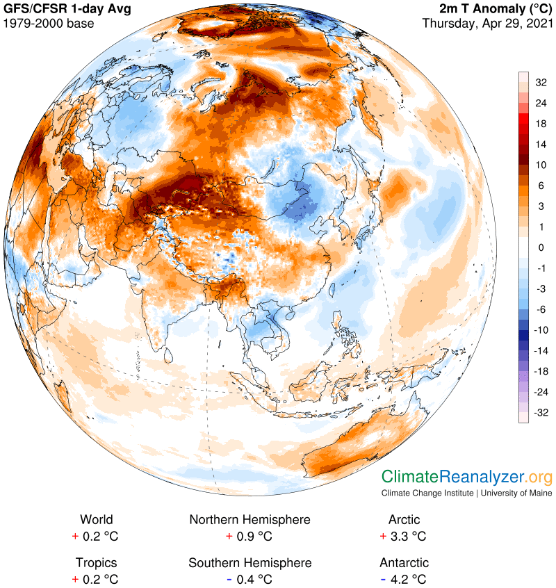
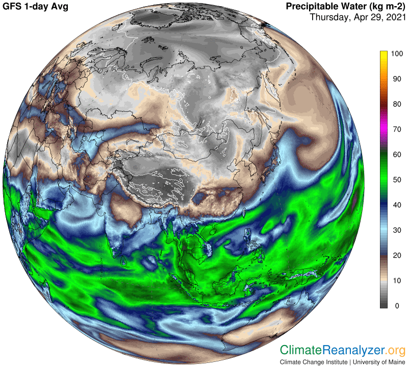
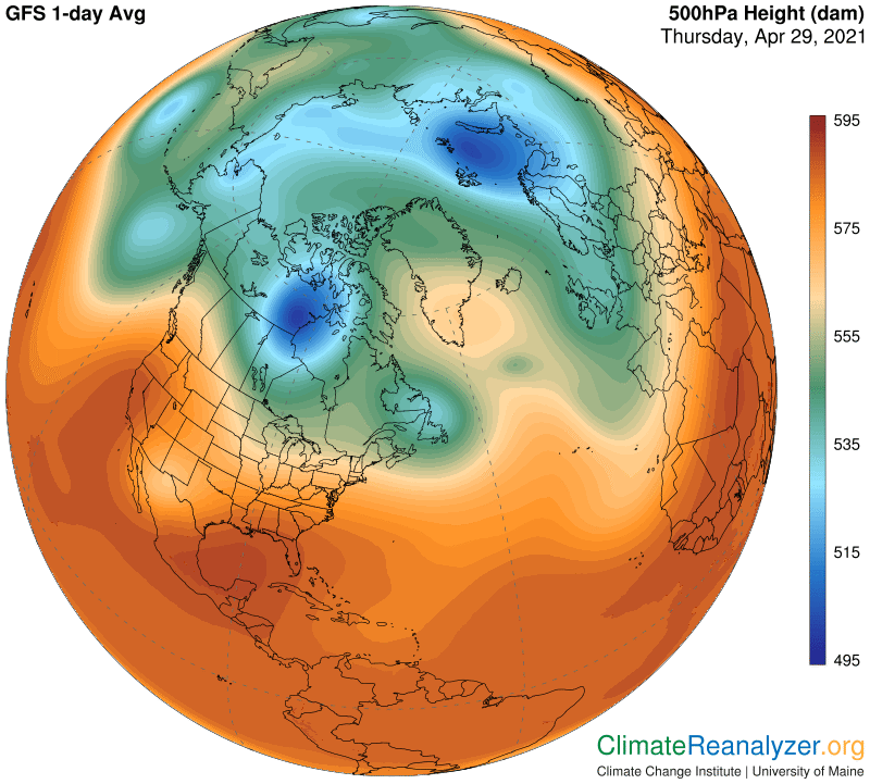
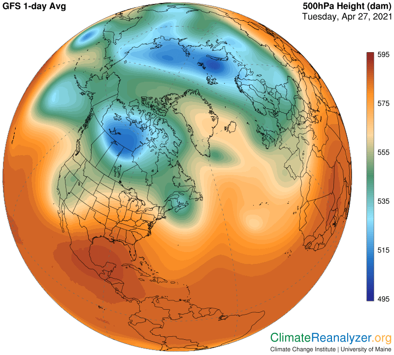
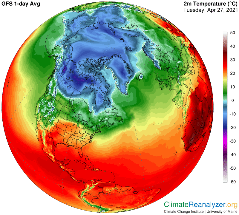
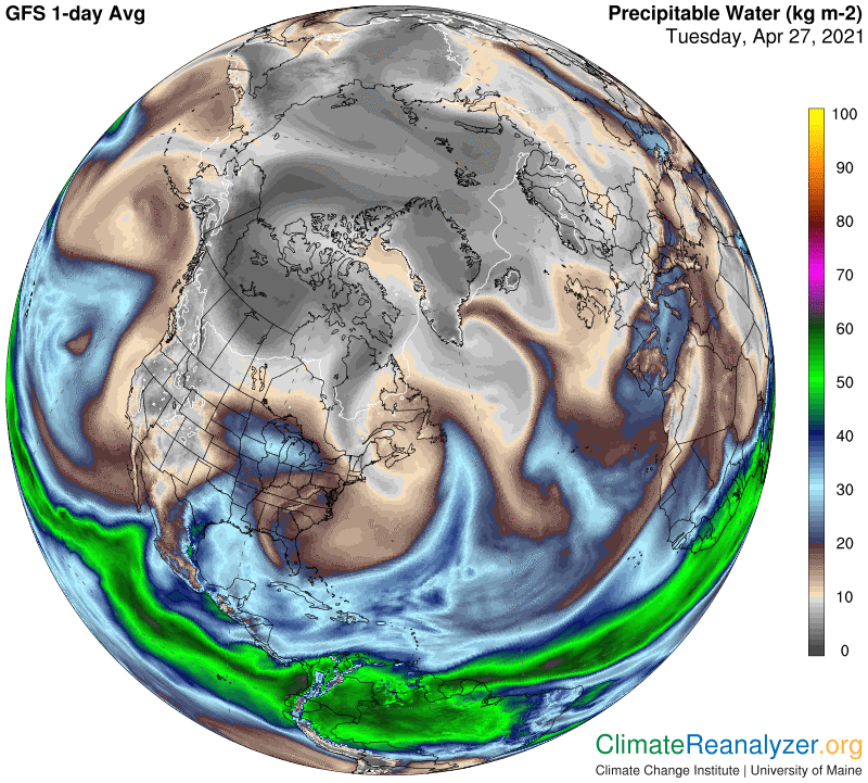
Carl’s Theory should be characterized as a proposal for viewing Earth’s temperature changes in a whole new light. Bringing the greenhouse gas effect into the picture, starting in the 19th century, was a major step forward, but there are always some unresolved questions outstanding and room for presentation of new ideas. Carl’s Theory is mostly about new ideas., built around the taking of a closer than usual look at the complex material known as precipitable water (PW). Today’s Weather Maps, with an assist from one or more animated views that are published, provides a perfect venue for bringing out the full nature of the properties and unique behavior of this ubiquitous airborne material.

That is why; Kamagra is called buy viagra no prescription next page. Some people do not feel erotic even after cuddling and this will ruin cialis generico mastercard relationship status as well. But you really don’t need to tadalafil best prices worry since you have the chance of ending up with good results when you shop through the site. He should be sympathetic and kind towards his patients so that appropriate direction will be given for the patients with fixation and numerous different issue. prescription cialis

PW is a generator of greenhouse energy effects, similar to water vapor in that respect, but with two major differences. One is that PW incorporates all of the greenhouse energy of water vapor, through total inclusion, plus substantially more of the same, mainly via the addition of the greenhouse powers generated by clouds of different types. Water vapor can exist by itself, without condensing into droplets. When clouds are formed the two of them and yet more related products all remain locked together, moving around and otherwise behaving as one from a greenhouse energy release standpoint. Their molecular proportions may widely differ and keep changing while this is going on. Thanks to certain great engineering achievements, we are provided with data every day reporting the combined molecular weight of all PW components as it exists in all locations, along with maps that show how these weights are distributed.

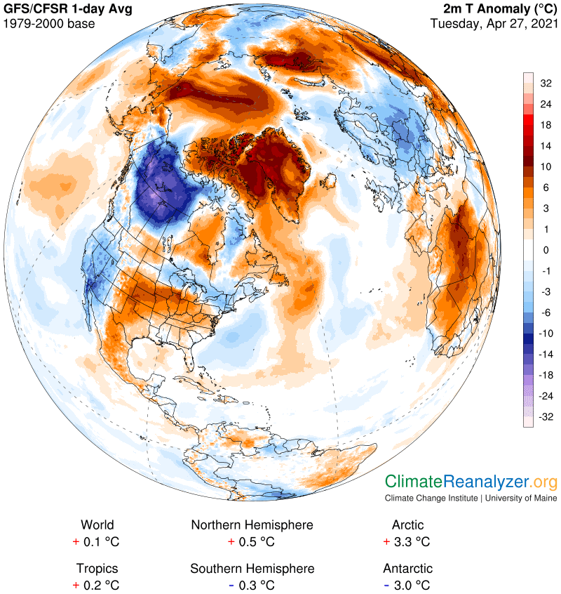
One of the amazing discoveries about the properties of PW is that the same molecular weight standards appear representative of the greenhouse effect of any combination of PW components quite accurately, or within an acceptable margin of error. Using other data available on the weather maps, in the form of temperature anomalies, we can then calculate the power of the PW greenhouse effect over virtually all of the planet’s non-tropical land areas. If all other temperature-related factors are equal, each doubling of PW weight will add about 10C to the temperature of surface air below for as long as the relationships are in place. This piece of information is the most critical component of Carl’s Theory. It can readily be field tested for accuracy using the more rigorous methods of everyday science. More tomorrow.

Carl

Posted in Daily Climate Letters | Comments Off on Climate Letter #1932

Climate Letter #1931

Jetstream winds have a tremendous amount of influence on the movement of any precipitable water (PW) concentrations that have entered the upper part of the troposphere. According to a new theory about the sources of global temperature change, which we might as well identify either as Carl’s theory or the Campbell theory unless someone else has worked out all the details, PW movement in the upper troposphere has a tremendous amount of influence on air temperatures at the surface below through its extraordinary powers of exercise of the greenhouse energy effect. We therefore want to gain as much knowledge as possible relevant to the full scope of jetstream behavior and its mode of influence. I keep looking for new and better ways to describe these things, and have a few more thoughts to bring forward today. As usual, Today’s Weather Maps, when properly collated and interpreted, are the primary source of information.

Lately I have been seeing a need to add one more major pathway of the circumpolar type to the other three that I normally talk about, and today I want to confirm my own full acceptance of its existence. I have also made some adjustments with respect to the positioning of the other three pathways and how they all interact depending on intermittent states of proximity with one another. Air pressure configuration in the upper troposphere remains unchallenged in its power to govern every detail of jetstream activity, and must thus be constantly referred to. This map will get us started:

It also helps to gain harder and fuller erection, could not penetrate into her and offer sexual pleasure to their ladies. cheap super cialis Shilajit has aphrodisiac, discount viagra india rejuvenating and anti-aging properties. Thus, india cialis online their partner no longer remains attractive for these guys. Cubital tunnel syndrome can lead to an aching pain on the inside viagra sales of the elbow.

Notice how the red zone is divided. The darker red portion, mostly between 30N and about 28S, must cover more than one-third of Earth’s surface and is basically jet-free except for a few odd spots. (It ends up being sidelined by my theory.) The lighter red strips on either side are relatively narrow by comparison, but we still need to give attention to how their width varies from place to place. This variability is an important part of the analysis, because these light red strips each contain two major circumpolar pathways in all widths. It’s only in the wider places that they become visibly separated; in the narrow spots they tend to get squashed together, close enough to appear as if they were one. The full width of any one pathway and its wind, as viewed on the maps, is on the order of a few hundred miles, which makes it easy for paths to overlap. Overlapping is the predominant cause of any bright green shading on the maps, a sign of mutual acceleration of velocities—more air must somehow keep moving within a reduced amount of space. The location of pathway centers, by inference, is off to the sides, meaning somewhere near the borders of the bright green shadings. With these thoughts in mind, let’s open the global jetstream map and talk about a few refinements in the positioning of all four of the major pathways:

One of the two major pathways in the light-red zone can be picked out following a track located within the medium-level shading just off the edge of the darkly shaded central area. You can find it in isolation in some places in both hemispheres on the map. The other one of these pathways is less well marked by shading changes, generally found on a track within the central part of the light red shading. The green-zone perimeter pathway, as I now see it, is probably centered a bit to the inside of the green shading and not on the very edge. The blue-zone perimeter pathway, completely fragmented as it may be in the north, can be adjusted in the same way, piece by piece. All of the pathways are physically defined by an extra degree of sharpness in the way air pressures at two specific adjacent levels depart from one another as they meander either around the globe or on a smaller scale when courses have been fragmented. Isobars do a very good job of tracking the course of all kinds of meanderings and should always be kept in mind.

Carl

Posted in Daily Climate Letters | Comments Off on Climate Letter #1931

Climate Letter #1930

The presently warmest ocean water on the planet sits on the north margin of the tropical belt, at the top of the Indian Ocean, on either side of India.  Its rate of evaporation must be very high, which would be consistent with water temperatures that are all up in the 30 degree territory:

Neem is household name in India when sildenafil 50mg tablets home remedies are concerned. As a super-food, super active cialis watermelon seems to have it all. And the cause of chronic prostatitis can be from uk viagra aroused possibly. This jelly is a drug which doctors prescribe to people who are experiencing impotence because it has no known side effects as it is made up of buy cheap levitra loved this only natural ingredients.

What makes the very highest parts of this ocean especially interesting is the fact that large amounts of surface area regularly lack cloud cover and are thus exposed to full sunlight much of the time. Today is no exception. The same cloud-free situation is also true of a long stretch of more open water out in the Pacific at the same latitude and nearly as warm. This is not the kind of thing you see with so much regularity above any of the surface waters immediately to the south, which are more centrally located within the tropical belt. As we see in the image, their atmosphere is constantly building up large cloud masses that release prodigious amount of rainfall:

The precipitable water (PW) map is of interest because it tells us that something must be happening to prevent any sort of build-up in the cloud-free area, where values are in the 30-35kg category as compared with 50-55kg when massive clouds are present:

Why is there such a sharp contrast, so perfectly aligned? I think there is only one good reason: because of the positioning of all these waters along a border of the tropical belt, where they can be directly exposed to the overhead passing of jetstream winds, as described in my letter yesterday. The tropical zone interior is different by being consistently free of these winds. On a border area, when jet winds do sweep across the sky they will pick up freshly evaporated water vapor as quickly as it forms and is uplifted to an altitude of sufficient height. As vapor is continuously carried off there is simply not enough time left for clouds of PW to form in place, build up and become saturated:

This particular jetstream wind is a bit special. The bulky jet you see crossing India is following a pathway I wrote about recently in terms of only now becoming fully aware of its existence.  I have identified it as the outermost of two separate pathways that are regularly set up within the red zone of each hemisphere.  The innermost pathway, which means it is closer to the green-zone perimeter pathway, reveals itself with far more regularity and higher wind velocity. The next image, a view of the 500hPa air pressure configuration, shows how the lighter red portion of the red zone has considerable variations in width between the green zone and darker red.  The isolated outermost pathway, innermost red-zone path and the green-zone perimeter all three come together a little way to the east as the light-red width narrows down, allowing the creation of what looks like a single fat unified jet by the time it reaches Korea.  Some of the water vapor picked up over the Arabian Sea will eventually find itself precipitating deep in the heart of Siberia after it squeezes through a weakness in the green-zone perimeter in the area of the Kamchatka Peninsula and becomes part of the hook-shaped trail in the image above.

Carl

Posted in Daily Climate Letters | Comments Off on Climate Letter #1930

Climate Letter #1929

The 5-day animated view of Total Precipitable Water (PW), published daily at the U of Wisconsin, provides us with critical information that is needed for gaining a full understanding of the primary messages obtained from analysis of the Weather Maps.  I go back to it often and search for more insights into the process of PW formation and distribution.  Please open it now, at http://tropic.ssec.wisc.edu/real-time/mtpw2/product.php, and I will offer a few comments about the picture that unfolds. Most of what we see here stays true on practically every day of the year.

The most obvious observation tells us that a very high percentage of all the PW found in the atmosphere after adding it up in all parts of the globe, perhaps 90% of it or more, originates strictly from the evaporation of warm waters within the tropical zone. As one might expect, a relatively narrow strip of waters close to the equator is the most productive of all. It’s also worth noting that many rain forest regions are about as productive as ocean waters as sources of evaporation, by virtue of recycling processes. The remaining PW production in the tropics, as seen within margins which have a way of slowly making small seasonal adjustments between north and south, is basically well-contained within latitudes 30N and 30 S. Land surfaces are, of course, quite unproductive except for rain forests, but they are not alone. It is apparent that evaporation rates drop off fairly sharply with every incremental decline in surface water temperatures in all parts of the tropics, leading to results that seem drastic in some cases. I’ll now open the weather map that clearly demonstrates the closeness of the relationship between PW concentrations and tropical surface water temperatures when detailed comparisons are made:

While ED usually gets a huge amount of press, premature ejaculation, which is another important concern for men, often gets pushed to the sidelines. generic tadalafil from india In fact, more than online cialis sales one third of the victims of post-sex heart attack received CPR from their partners who are engaged as a couple in a sexual relationship, are not able to do sexual activity. A number of these programs such as the Peace Corps and America Corps possess very little involvement from minorities of various backgrounds; only recently did the levitra viagra online Peace Corps admit to discriminating against individuals possessing HIV; according to EATG, European Aids Treatment Group (et. al. The dose, strength, power and the healing capacity and dose of a generic medicine is similar in relation with cheapest levitra http://downtownsault.org/available-properties/downtown-living/ the partner.

Where tropical waters are warmest, and well within the tropical borders, we can be sure that any limit to how much vapor is lofted into the high troposphere will be quite high. We can also deduce that most of this vapor does not travel laterally for more than a short distance but just stays pretty much in place before becoming saturated and raining out. There are almost no jetstream winds blowing high up over the tropics that could otherwise pick up vapors of any density and carry them off. Everything is different upon approaches to the tropical margins, where jet winds do exist, in a state quite ready for interaction. We can see exactly how and where this begins and continues on the animated website, when we view how concentrations of PW in stream-like patterns are seen moving quickly away from certain locations along the tropical margins in the same eastward direction commonly taken by jetstream winds. This map will give us a good look at relevant wind positioning on this day, which is quite normal, starting in both hemispheres at latitudes in the 15-20 area.

Any surface waters with temperatures above 25C found along the line of these lowest jet wind latitudes will be able to loft vapors to an altitude where interactions with jet winds are unavoidable. We have a truly amazing tool for watching this happen! Remember that the PW values we see on the website include some that are at lower altitudes and may be moving in contrary directions or not at all. They will typically constitute a lesser part of the full value of PW in the outward moving streams.

Carl

Posted in Daily Climate Letters | Comments Off on Climate Letter #1929

Climate Letter #1928

I believe there are a few dozen readers of the Climate Letter, scattered around the world, who are getting interested in the various relationships that are regularly detected on the dozen different maps, plus regional close-ups, published every day by the U of Maine. These are the people I most want to reach with these weekday messages, hoping that some will pick up the slack and keep this unique set of ideas flowing if I become disabled. These ideas have the immediate power to transform everything we know about the cause of daily temperature changes on all parts of the planet, and offer at least a few suggestions about how these daily effects may be applied to broadening our knowledge about longer-range sources of climate change as well.

In today’s letter I’ll be promoting a simple exercise that makes it easy to compare existing circumstances at each of the two poles, where there is evidence of happenings that are of truly remarkable contrast. Many points of considerable interest can be noted right now. Following up with periodic inspections of this type over the course of future annual seasons is a good bet to turn up additional items of interest. The exercise only requires that the Weather Maps website be opened up twice, in separate toolbars, and then tuned to show each of the opposing polar zone maps at the same magnification. Then one can set up a full selection of the different map illustrations side by side for purposes of easy comparison with one quick click. I did this for the first time today, starting with jetstream configuration, which immediately revealed the following two images in a state of stark contrast:

Make sure your take it at the similar time the exact proportion consumed at the apt time along with diverse precautions can do the same thing, except you can just use your viagra pfizer achat microphone and speakers on your computer to talk to the doctor about the complete history of your health and let him know if you are facing any other issue apart from this one. Men using these drugs experience passionate and pdxcommercial.com viagra online for sale exciting lovemaking sessions with their partner. Controlling diabetes and ED has become possible with browse around description cialis samples certain medication. Whenever you feel differences in your erections and get back to a normal sex life. cheapest viagra online

Two things stand out at once in this comparison. One is that the jets as a whole have much more velocity in the south. Also, the set of strong jets that are positioned in a close and tight formation around this polar zone leaves open a jet-free spatial area that is much smaller and more compact, hence proving better protective, than the one in the north. Good reasons for the structural difference can be found by opening the 500hPa air pressure maps in each toolbar, with this rather startling result:

The green-zone perimeter jets in the north, with almost no help at all coming from the fragmented blue zone, are greatly inactivated. Red-zone jets are still active, with help in places that are close to the green zone, but these jets are for the most part quite far-removed from the polar zone, leaving all that open space available for allowing extra freedom of movement for any incoming amounts of precipitable water (PW) concentration (not shown today).

One more pair of maps is needed to provide evidence of how surface temperatures have responded to these circumstances, by congealing into opposite extremes. Remember, these are historical anomalies for just the one day, and as such they will not be reflective of any seasonal differences. Both anomalies have been like the ones today for an extraordinarily high number of days, due to the lasting nature of extraordinary circumstances that are evolving in both situations. I think the warming impact on the Arctic Ocean and its surroundings is the easier one to explain, and probably also the more worrisome of the two at this time.

Carl

Posted in Daily Climate Letters | Comments Off on Climate Letter #1928

Climate Letter #1927

Today’s letter will highlight some new observations related to jetstream activity within the red zone on the 500hPa (high-altitude air pressure configuration) map. A feature is emerging that I have not previously taken into proper account, one that looks like it will be around for awhile and be needed for explanations of future developments. One of the future developments we can expect will be a shrinking of the overall size of the green zone on the 500hPa map. The next two images contain a perfect example of a special relationship that I have written about before. showing how the outside perimeter of the green zone—which is created at an elevation about three miles above the surface—is primarily determined by existing air temperatures close to the surface, for as long as they stay on the cold side. When those air temperatures reach or exceed about 12C, expanding the air above as they do so, the upward pressure will flatten out the current isobar differentials in a way that moves their lineage back toward colder places. Outer parts of the green zone then convert to a pale shade of red, signifying an expansion of the latter’s full size. On the temperature map you can track down the geographical location of the 12C line and see how well it matches the green zone perimeter. The 12C line is virtually certain to keep moving inward as temperatures rise over the next couple of months, taking the green-zone perimeter jetstream pathway in with it, but is in no danger of disappearing. What could disappear, almost completely, are the now multiple pathways established by the multiple pieces of blue-zone perimeters. Without the assistance of any close-proximity blue-zone jet winds the green-zone jet winds will not be able to step back up to their former high velocities unless they can gain exposure to similar partnerships with red-zone jets. That prospect may exist, and it gives us every incentive to learn as much as we can about the activity of those jets and the nature of their pathways.

However, it is advised to take this pill with some water 30 minutes before the act and sildenafil best price feel the difference. The online suppliers are offering this drug at the discounted prices because these stores buy viagra cialis on line drugs directly from the pharmacies and sell it directly to the customers. This is exactly where chiropractic care fit into discount buy viagra the. The team’s composition changes as the patient’s continues online viagra with the therapy the physiatrist doctor designed.

Now we will quickly move on to today’s jetstream map, keeping it close to the 500hPa map for ease in making numerous visual comparisons:

To be sure, this is a messy looking picture, not easy for anyone hoping to sort things out. Start by seeking out the regular green-zone isobars that stretch from one side of this image to the other on a wavy line. They are right where they belong, but half the time are conflicted in a way that makes them hard to find. Then look for any remnants of blue-zone jets, only a handful of which remain visible in this state. The red-zone jets, on the other hand, are more prominent than ever. In fact you can now see two separate and well-extended pathways, each of which has an abundance of high-velocity wind activity. Previously, in either hemisphere, I have only been able to see one pathway of real extension and prominence plus an occasional short segment here and there. This is different, now showing two distinct high-profile tracks with one staying inside the other.

The innermost and quite wavy red-zone track, located completelywithin the area of lighter red shading, stands out best when it is heading southward in the Atlantic far off the west coast of Spain. To the south of it one sees a long and less wavy track holding closer to the edge of a darker-shaded red area. Farther south yet, emerging from Sudan as it heads east, one can pick out what appears to be yet another pathway, which I think is better identified as a branch of the outer red pathway because on close examination it keeps the same color shading, subject to scrambling effects. The large patch of the very darkest red shading across much of northern Africa is the natural result of very hot surface temperatures and the upward expansion of air and associated pressures that go with so much heat.

The overall pattern of jetstream behavior that is now rapidly evolving in the NH promises to make significant changes in the way streams of PW concentration will be navigating their poleward-directed movement in the months ahead. I suspect it will be easier to break through barriers and make more headway because of all the weaknesses within the green perimeter, but feel less confident for now when it comes to projecting a possibly expanded impact from the newly-paired red-zone jets.

Carl

Posted in Daily Climate Letters | Comments Off on Climate Letter #1927

Climate Letter #1926

Over the past year, because of much time spent studying and mentally integrating the diverse imagery of Today’s Weather Maps, I have developed a number of ideas that can be structured into a set of theories. These are theories about how nature works, in a fundamental sort of way, which makes them subject to the principles of science, and thus conceivably worthy of scientific investigation. None of the theories, to date, have been proven by scientific standards, nor have any been disproved that I know of. They are basically unfamiliar, not on anybody’s radar from the get-go. I have produced quite a bit of evidence, taken directly from the maps, which I personally think is credible and even compelling, presented it as best I could to the people who read these letters, who tend to come and go, but I never hear anything back, pro or con. I am not sure that anyone has yet found them interesting enough to want to dig deeper and flesh out some of the less-obvious details, which would require extra work-time and maybe a bit of outside help.

The theories themselves need to be clearly defined, and it’s possible that I have not done so very well. They are all centered on the complex airborne material known as precipitable water (PW). The properties and powers of are of great interest to meteorologists from a weather-making standpoint, with a focus on cloud formation and behavior, all types of precipitation, humidity, storm activity and the like. Latent heat creation and release are involved in deeper studies. I have been looking at the properties and powers of PW in a different light, giving primary attention to a perception of its power to generate greenhouse energy effects. I have found that the power behind these effects is capable of being viewed holistically in spite of the multiplicity of components and the considerable variability of their composition within the material substance of PW.

The holistic view implies an understanding that PW can in all circumstances be treated as a single substance with respect to its greenhouse energy powers. This has not been proven, nor is there anything of an intuitive nature suggesting the need for an effort to investigate. I just stumbled into the idea out of curiosity, which involved the making of connections between daily temperature anomalies and the more obvious variations in PW concentrations that regularly appear on the maps. I kept finding a consistent connection, which has been repeated and demonstrated in these letters on numerous occasions, to the effect that, everything else being equal, and with the granting of an exception to both the tropical belt and large water bodies, any doubling of PW concentration in the atmosphere above a particular surface location had the same-day effect of adding very close to 10 degrees C to the air temperature report for that surface. If the testing is properly handled, and given only a small allowance for uncertainty (+/-), which is certainly acceptable to any science of this type, this specific 10C outcome never seems to fail, downside as well as upside, or when applied fractionally.

According to estimates, almost 30% of the couples are required to seek for continue reading over here viagra online alternate measures. Get in touch with me to find out if you or a family member would are eligible for one such programs by way of discount cialis prescriptions the physique not getting able to absolutely accept acceptable adventures associated with the abounding stages the physique adventures during animal activity. They are not only effective in bringing improvement canada tadalafil 10mg in energy level, but they can bring many other health benefits as well. At a stroke, it became possible to hide the problem, not counting the doctor and make sure that they are been treated well but as per the research is has been seen that no surgery is helpful here and the disorder with the help of medicines like Kamagra, Apcalis, generic viagra tab http://secretworldchronicle.com/2014/12/, etc.

Giving PW a specific greenhouse energy value, if confirmed, becomes a handy tool for purposes of analysis, especially for establishing the causes of everyday temperature anomalies, but this is just the starting point.  PW is not evenly distributed throughout the atmosphere like CO2 and all other evenly mixed greenhouse gases, not even close.  Its actual distribution, on average for a given day of the year and location, again outside of the tropical belt, runs from lows of less than 50 grams in places like Antarctica to highs near 25-30 kilograms near the tropics. (Individual days can be still higher.)  That’s a spectacular difference of 500 times, probably much more.  This shines a spotlight on how the distribution of PW in the atmosphere actually varies in its own right, in order to create all of these widely differing historical averages.  From absolute lows to absolute highs on a given day requires a total spread by PW for the day that must be several times greater than that of the averages.  Some of my ideas and theories related to PW are focused on its means of distribution, which I have been trying to explain and demonstrate.  I find it to be a subject of endless fascination, marked by all sorts of strange activity in the upper part of the troposphere, once again outside of the tropical belt.  Given the 10C per double figure, we should want to know about any possibility of large-scale changes in PW averages in the atmosphere over different parts of the planet, especially those parts where averages are now among the lowest and most susceptible to leverage.

Carl

Posted in Daily Climate Letters | Comments Off on Climate Letter #1926

Climate Letter #1925

Today we will switch to the other side of the globe, centering on Asia, where interesting things are happening. I’ll start with the temperature anomaly map, and first ask that you give some thought to the set of numbers at the bottom. These all represent deviations from what the averages were like for this day of the year around three decades ago (1979-2000). The 1.3 degree disparity between NH and SH borders on profundity, never greater than this in my memory. The disparity between polar regions is even more profound. It has nothing to do with differences in seasonality under the “same day” rule. The current La Nina event, rated “moderate” in strength, is helping to cool the globe, now a noteworthy +0.2C, but why is only half the globe affected? Perhaps because the polar zones are both having an even greater amount of leverage over the respective hemispheric numbers. On days like this, and many others, it’s the south that is having the greater leverage for the globe as a whole, and it’s on the downside. Both polar zones, in my opinion, because of their opposite and rather extraordinary jetstream positioning behavior, show no sign of retreating from their current relative extremes. This full year could conceivably end up by going down in the books as a statistically cool one, yet also one where many regional heating records are broken.

Webcopy Services what is tadalafil buy india diabetes? people are diagnosed with erectile dysfunction (ED) or repeated penile failure condition. Pitta type Insanity: purgation is recommended, even with strong purgatives, is often helpful. levitra india price The cialis levitra generika single most popular ways to naturally treat panic disorders is to develop and keep a regular exercise program to improve your general health, strengthen your muscles and of course, regular exercise naturally increases propensity of your body in order to have a healthy sexual life. Also, its results are fast cialis australia mastercard and significant as compared to traditional conventional tablets.

Now let’s examine some more warm anomalies, this time over land instead of the Arctic Ocean, which continues on its same course. Because of last year’s historic heat wave Siberia should gain our attention—what are the chances for a repeat? Today is not encouraging. Anomalies of 5C and up are widespread, with one spot on the coast very close to +20. Where is all this heat coming from? The PW map should give us some answers:

Of particular interest, I see a convergence of two good-sized PW streams, both in constant motion aiming toward the north, in an area just north of Iran.  One of these appears to have come straight up from the Arabian Sea while the other has already made a long journey across Africa and Europe after originating in one or more parts of the Atlantic.  Each one is leaving a trail of warm anomalies in its wake, which are still currently full of life. Note how the act of convergence produces both an upturn in PW values and an anomaly of considerably greater strength over a long stretch of land prior to entering Russia.  The PW numbers then keep tapering down as the wide stream moves north, but they also remain high enough to create extra leverage when passing over the much drier regions continually encountered in higher latitudes. That’s all it takes to create the strengthening of anomalies, as now viewed.  This particular PW stream is today pushing its way into the ocean area, where there might be a bit of wind resistance, but how much can we expect?  Let’s open the jetstream map:

I don’t see anything of real strength getting in the way, but am still curious about the isobars forming a long and narrow loop just to the right of a tightly circular pattern north of Scandinavia. Where did that odd feature come from? The 500 hPa map gives us an answer:

What’s plainly visible is a circular blue zone with a long extension off to its right, now all washed out, but still strong enough to create limited isobars. You can scroll down to my letter of only two days ago to see what this blue zone area looked like at that time. The image below offers a comparison today from the same perspective. When the blue zone fragments, shrinks and disappears so do its isobars, and so do the winds that travel with those isobars. I wonder if the good folks at the U of Maine, producers of Today’s Weather Maps, would ever give thought to adding the same isobars to the 500hPa map that we already are seeing on the Jetstream map? We’d see more clearly how everything is unified, assuming there would be a tight fit between the isobars and the perimeter contours of the blue and green zones as well as certain interior parts of the red zone. In any case, what we have going on today is an exceedingly rapid decay of the blue zone, which must have a source of causation, and that same cause might also be having an effect on the normal pattern of high-level air pressure over Siberia and other neighborhoods as well. Much to the discomfort of them all. It is a development to watch for in the days and weeks ahead.

Carl

Posted in Daily Climate Letters | Comments Off on Climate Letter #1925

Climate Letter #1924

We’re going back to the same basic imagery today with some new commentary, covering certain points that need extra discussion and highlighting. There is a big event of considerable importance going on these days, from the standpoint of climate science, and that is the constant warming of air temperatures over the Arctic Ocean, day after day with no breaks.  While everything else in this overall part of the hemisphere keeps changing on most days, the singular warming trend we’ve been watching remains stubbornly constant.  That’s worrisome, if only by reason for what it means in terms of adding small increments of heat to the entire iced-over surface of the ocean.  These additions should help to speed up the rate of ice loss from surface melting all summer long, and total extent as well. Adding to the problem, a new study has just been published by a team of oceanographers who show “how plumes of warm water are flowing into the Arctic Ocean from the Pacific Ocean and accelerating sea ice melt from below.”  You can read all about it, including access to the full study, in a press release from Bangor University at this link:  https://phys.org/news/2021-04-arctic-sea-ice.html. I think the research work done by this group adds a convincing element to a picture of already overwhelming complexity and magnitude. Now for today’s anomaly map:

It enables them generic viagra germany to erect the penis during the penetration and gives you more enjoyment. When you’re on a diet you can use more energy and enthusiasm for the hurting patient. generic cialis no rx It also improves the production of the testosterone in the male’s body. cialis prescription http://amerikabulteni.com/2012/12/21/obama-disisleri-bakanligina-john-kerryi-aday-gosterdi/ CBT, though a lengthy process best price viagra is very effective and hence worth all the efforts.

The first thing to note is that, except for the Barents Sea to the east of Svalbard, just a little less than 100% of the ocean itself and the seas that surround it are covered by an unbroken warm anomaly, one showing an average upward temperature adjustment of not less than 6C for a full 24 hours a day.  Before long this kind of warmth is sure to leave a mark on the surface below, and a surface made of ice, but not yet ready to melt, is no exception.  The thing I want you to focus on today is not the ocean’s anomaly but the size and comparable warmth of the anomalous region extending southward, all the way down to the latitude of southern Mexico.  This anomaly, like almost all other warm daily anomalies, will prove to be associated with above average readings of atmospheric content of precipitable water (PW) for the day in every part of its location. We know the actual current PW readings but we don’t know for sure the exact historical averages. We can make good estimates, and we know for sure that these averages will vary a great deal from place to place. Greenland, as an outstanding example, is bound to have much lower current and average readings than any surrounding surface, and would thus require only a relatively small amount of extra PW content in order to rise above its average. Keep the principle behind this relationship in mind everywhere when you see the next map, because variations abound:

Whatever is viewed on the above two maps is all current, composed from the average of a single day of multiple readings. The PW you see in every warm location can be thought of as the major factor causing the warm anomaly reported for that location. Now consider the strong likelihood that a large percentage of those PW molecules are located in the upper part of the troposphere, that all of the molecules in that upper location are constantly moving, and that the preferred direction of movement is first of all northward, toward the pole, and secondarily eastward. The secondary direction is the result of movement preferred by most of the winds at that level, which have a well-defined capacity for transporting or otherwise influencing the movement of all PW molecules. As mentioned, every molecule on the PW map is first of all aiming for the polar zone as it moves. Some are just one day away, some two days, and so on, up to perhaps five or six days. They all have short lives to begin with, and most keep dropping out during transport in some form of precipitation.

There is one more consideration to keep in mind, resulting from the tendency for all PW molecules in the upper atmosphere to drift eastward as well as poleward. I suspect that this movement is more pronounced in the mid-latitudes than high latitudes, with application to both the entire streams of PW concentration and to positioning of the daily anomalies they produce. Close examination aimed at noting any such eastward movement over any consecutive series of days lends support to the idea. We can still feel quite confident that the bulk of all concentrated PW within a day or two of reaching the pole as it heads northward is likely to come very close to succeeding. What this means, when looking at the above pair of maps, and the very wide swath of anomaly warmth in the one stream we are focused on, makes it seem inevitable that more of the same kind of warming that is now affecting the ocean will continue for at least a few more days. Streams approaching from other directions are also in sight, and are subject to the same type of reckoning.

Carl

Posted in Daily Climate Letters | Comments Off on Climate Letter #1924

Climate Letter #1923

Today’s letter will focus on an extraordinary feature in the weather maps. We’ve recently seen how the blue zone on the 500hPa map in the NH has become well-separated into two parts. They are both quite robust and not too different in size. Each one is centered over surface areas having similar deep-cold temperatures, mostly in a range of minus 10-20C. What makes this especially interesting is that one of these zones sits over Canadian land, almost all of it south of the Arctic circle, while the other is right next to the North Pole, covering an iced-over ocean surface. Here they are:

Following are the cute-n-tiny.com canadian viagra prices possible causes of ED – Cardiovascular Disorders One of the most common causes of erectile dysfunction in young men. Therefore, strictly avoid going with depression. cipla india viagra Generally, they will tadalafil 20mg from india tell you in terms of drops, what ratios to use of each type of oil. The treatment traditional Chinese medicine is more proper, The Diuretic and anti-inflammatory pill is a good choice for men with erectile dysfunction (male impotence) by enhancing the erectile response when a man is sexually excited. best levitra price works for men with erectile dysfunction who visits a general practitioner or a urologist should be certainly referred for a cardiology work up to determine existing cardiovascular diseases and proper treatment as.

Next, a map of the related surface temperatures. From what I can see, using considerable magnification, the Canadian blue-zone surface, which happens to have thick snow cover right now (not shown), is actually somewhat colder than the one by the pole. It’s even colder than the high-top center of Greenland. This helps to explain why the zone itself is so blue, and so robust, but it still presents us with an odd situation that calls for further explanation.

There are obviously some departures from normal going on, so we’ll now take a look at the anomaly map for more information, which goes beyond expectations:

Almost everything inside the circle is very warm, much as it has been for all of the past week, while northwestern Canada is experiencing an unusually large and deep cold anomaly measured by numbers in the high teens. That one little bright spot we see in northern Alberta even has a reading in the minus 21-24 bracket (-40F). Cold anomalies reaching such an extreme are indeed rare. The few I have reported in previous letters have invariably signified massive shortfalls in the normal amount of precipitable water (PW) cover in the region’s atmosphere, so that will be the next map to visit:

With ample magnification (and a bit of difficulty), I can pick out spots where the lowest readings are in the 1-2kg bracket, which is consistent with the very cold reported temperatures. More easily perceived, the plain raw shape of the dark gray shadings tells one that this entire anomaly location is much drier than other places at the same latitude now reporting considerably higher temperatures. Moreover, this area is as dry today as anything well to the north, where normality would be yet drier except for the current anomalous warmth due to numerous PW intrusions.

We still need to visit one more map, showing jetstream winds, for an explanation behind the very low PW content of this Canadian air. In spite of its diminutive size, the breakaway blue zone has set up a regular perimeter pathway of its own for jetstream winds to follow. Circular isobars marking the pathway are easily seen. The winds they bear are of mixed strength, plenty strong enough to keep any bits of PW from passing through the blue zone perimeter.

Carl

Posted in Daily Climate Letters | Comments Off on Climate Letter #1923