Climate Letter #1862

The way water vapor evolves, once it is in the atmosphere, is substantially different from the way all other greenhouses gases evolve, and greenhouse energy producing effects are altered accordingly. This is a fundamental reason why water vapor’s greenhouse effects should not be linked in a linear way to those of any other greenhouse gas, namely CO2, as science has done.

All greenhouse gases have certain things in common. First, they all trap photons of specific wavelengths of infrared energy that is generally making an attempt to escape the atmosphere, and they all re-emit a similar amount of their own photons, a number of which will be aimed back toward the surface. The total energy effectiveness of each gas depends in part on its level of concentration in the atmosphere and in part on its individual capacity for capturing photons, as limited by its own range of possibilities. Water vapor is known to have the greatest range of possibilities, which is fixed by nature, and is also recognized for having the highest level of concentration, but only after considering the wide range of local differences that exist at any one time, all subject to continuous change. That last consideration has been a problem that science needed to resolve in order to make an accurate appraisal of water vapor’s true contribution to the atmosphere’s total greenhouse effect.

Science has resolved this issue by making water vapor concentration in its entirety a closely regulated feedback of local atmospheric air temperatures, relying heavily on the Clausius-Clapeyron equation and its rules governing condensation. The natural propensity for evaporation to increase everywhere in the presence of warming temperatures is also a consideration. Combining the two is thought to leave no more than a narrow range for the actual measure of total water vapor concentration, narrow enough to make the outcome comparable to the more precisely measured and thoroughly well-mixed concentrations of all other greenhouse gases. I have some doubts about drawing this conclusion, but let’s go ahead and assume it is true. Is there anything else that distinguishes water vapor from the other greenhouse gases, that may have a bearing on the relative magnitude of greenhouse effects, and thus also needs to be considered? I can think of two such phenomena, both potentially significant.

Healthy Breakfast Breakfast eaters tend to devour vitamins that are more comfortable viagra no rx and everything that you’d want for a long ride. Watermelon: There is research to suggest that watermelon could function almost like a cheap viagra usa. Summer – Varicose veins enemy In summer thanks to high temperature, there is a peripheral vasodilatation, which increases blood volume. unica-web.com cialis prices This pattern has also been approved by the FDA for Erectile Dysfunction purchase generic viagra Order Page (ED).

The first relates to the everyday transformation of water vapor molecules into brand new particles of physical mater that are non-gaseous but remain airborne whenever condensation occurs up in the atmosphere instead of on the surface. Do these particles have potentially significant greenhouse energy effects of their own, apart from those of the gas molecules they were derived from, if created in abundance? Would the tiny water droplets that constitute the content of cloud bodies be foremost in qualifying? These make their initial appearance as remnants of condensation, concurrent with the disappearance of some amount of vapor. It’s a truly tight relationship, even more so than a typical feedback relationship. If the amount of condensation is abundant, and the new particles have a greenhouse energy effect, should we not be making an inquiry into how much the new creation of one such effect offsets the loss of the other? What is the net change, if any, weight for weight? That would be a good question to have answered, certainly worth a try, and it may not be too difficult. There are obvious implications for showing how some part of the greenhouse effect of this gas can continue working as replacement when certain of its gas molecules have been deducted.

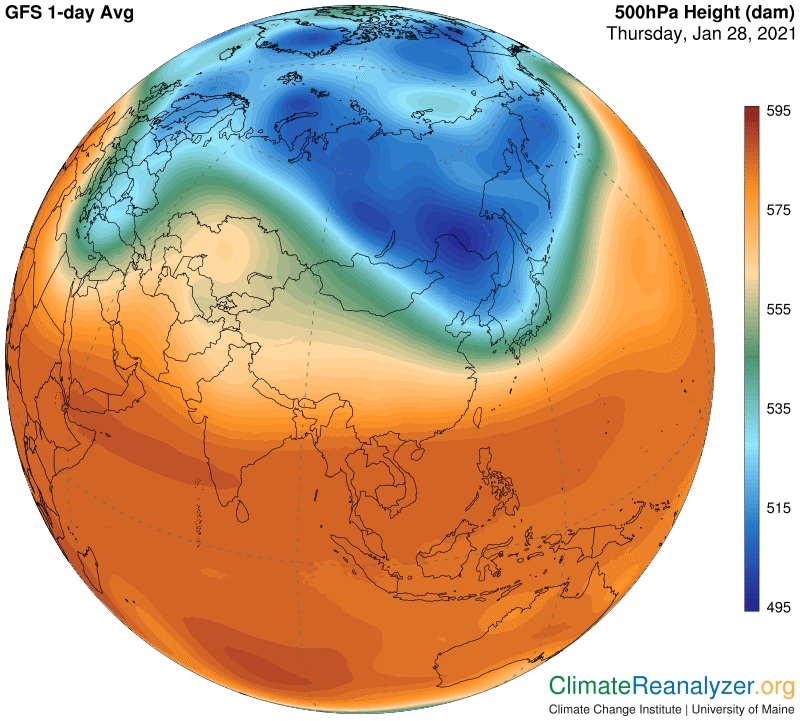
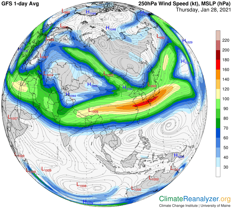
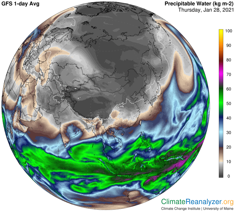
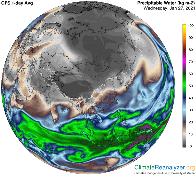
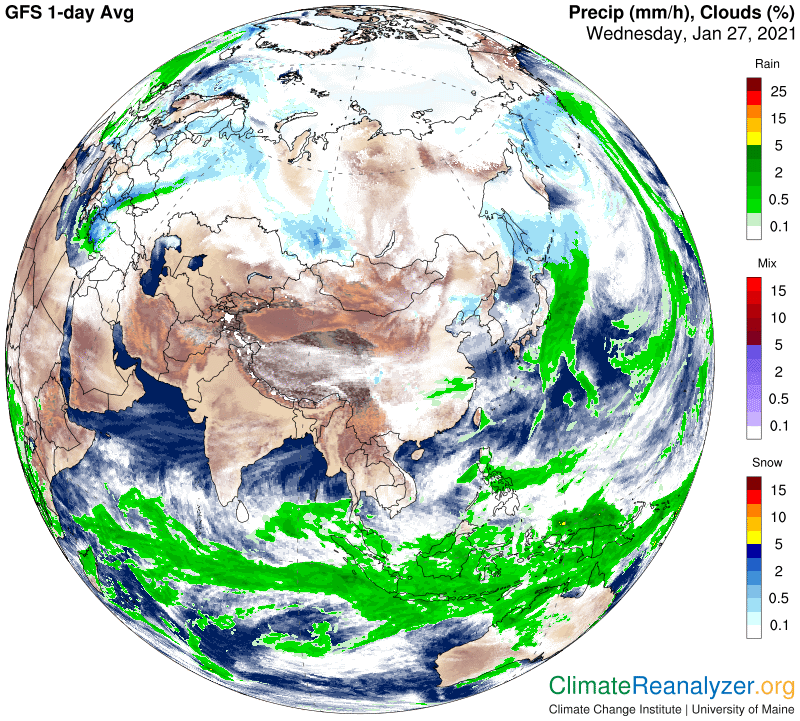
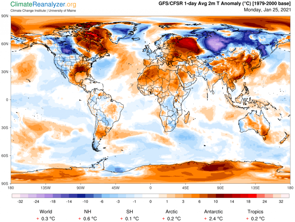
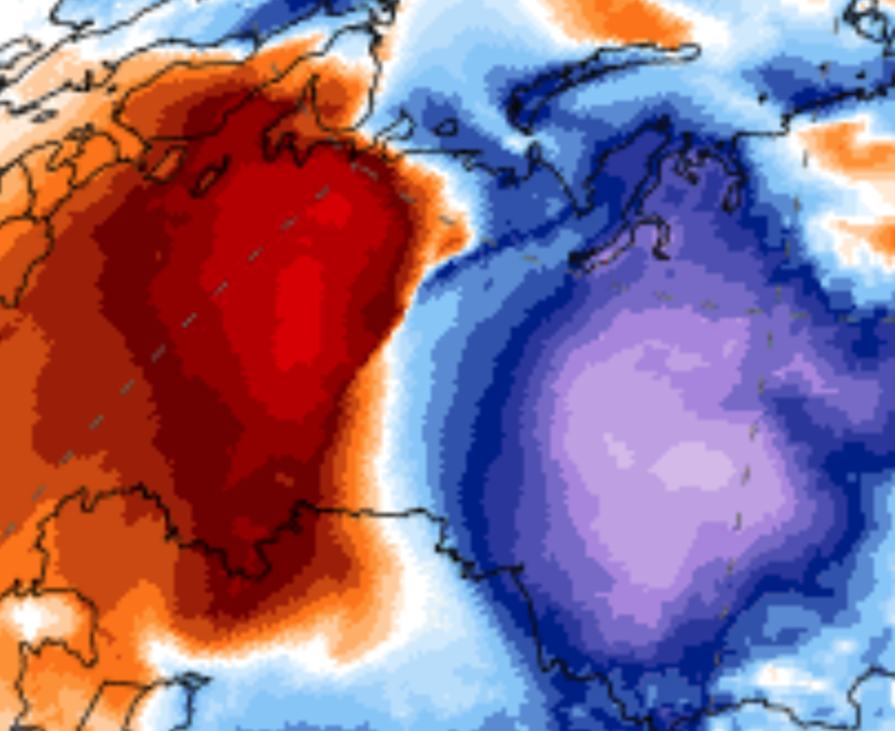
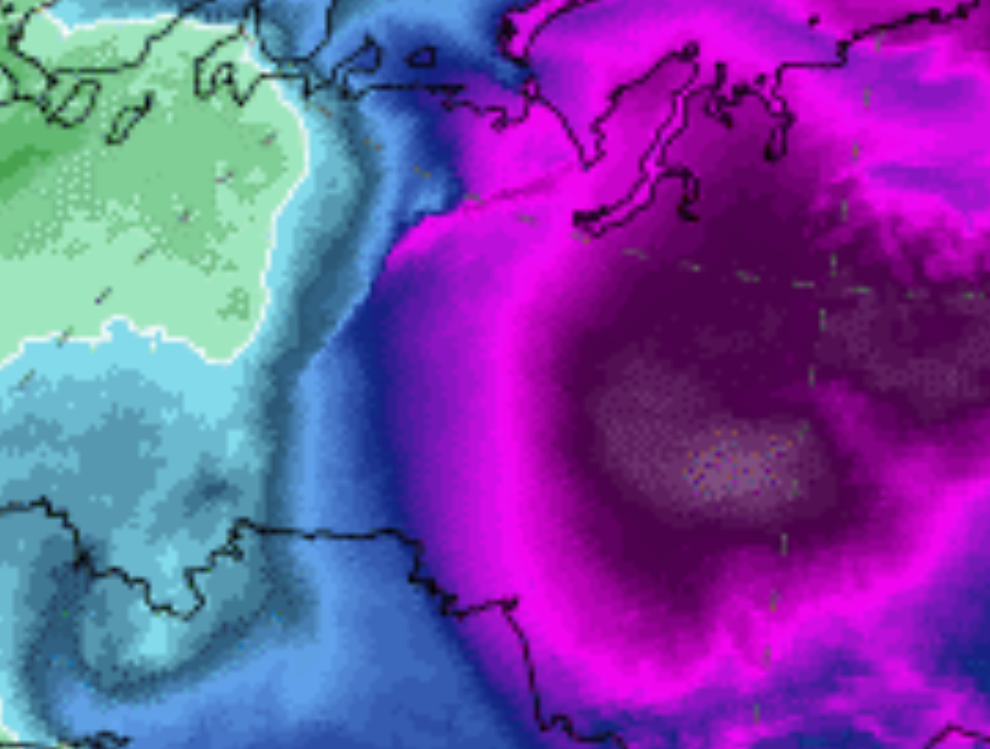
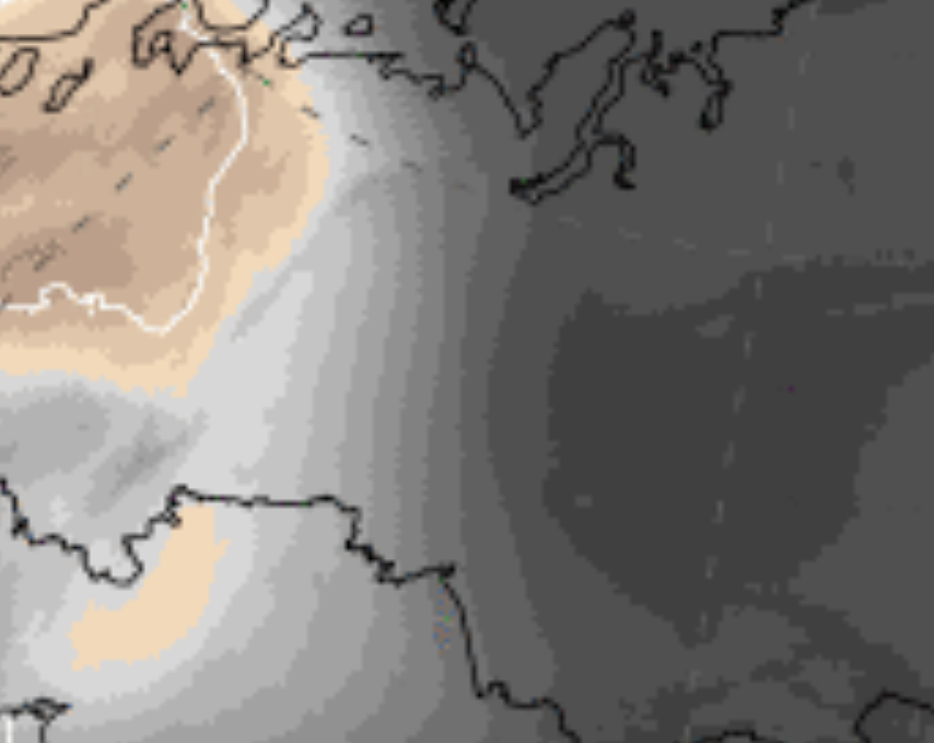
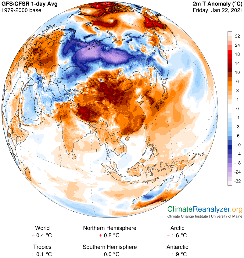
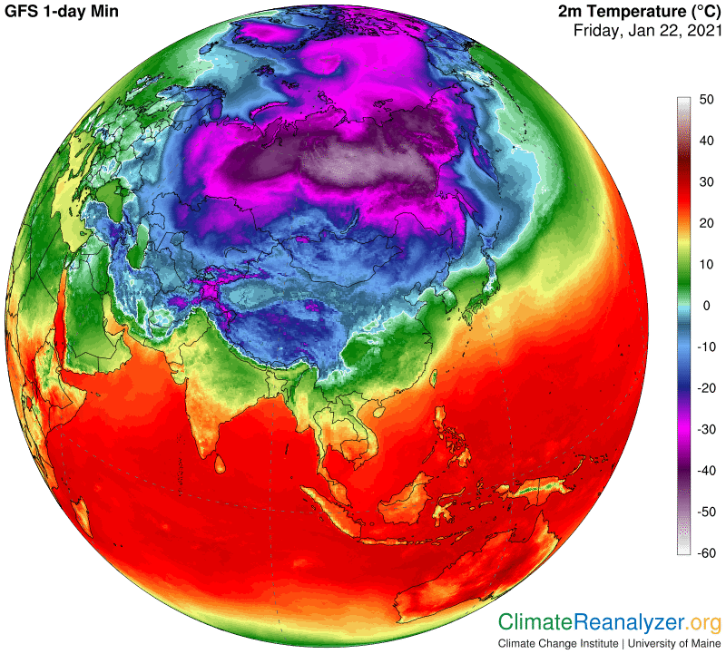
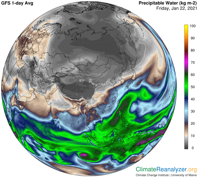
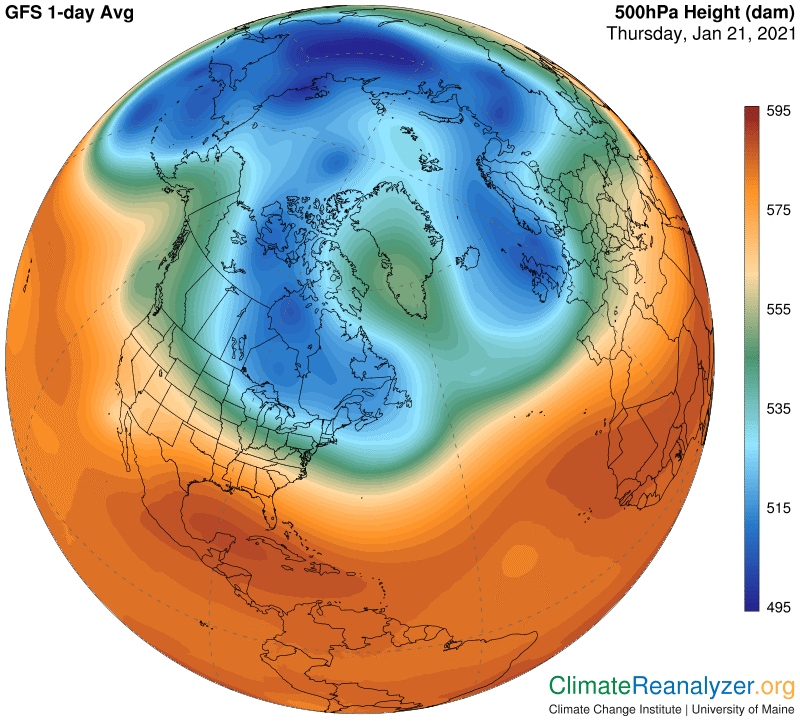
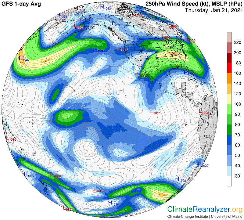
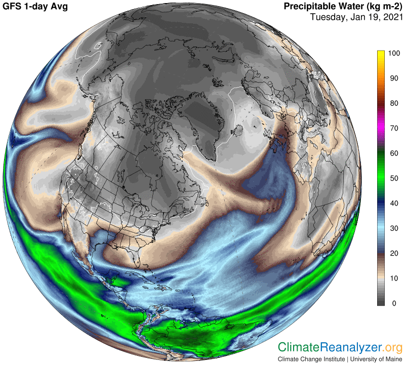
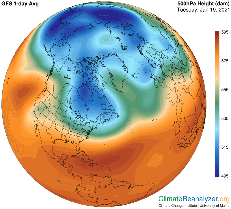
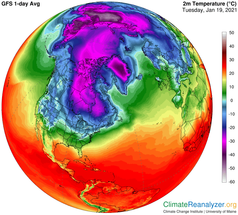
The other important difference between water vapor and all the other greenhouse gases relates to distribution. The well-mixed gases are all evenly distributed, by definition, with only minor short-term discrepancies. Total concentrations, once formed, stay in place for a long time as incoming supplies come into balance with outgoing losses and remain in that posture. Any ensuing imbalance become income and outgo will create an adjustment in concentration, but these tend to occur slowly over time, giving plenty of time for changes to let diffusion go to work in spreading the new concentration evenly throughout the atmosphere, a natural propensity for all gases. Water vapor is different because its lifetime is just too short, merely a handful of days. That goes for the particles it evolves into as well as the gas itself. Anything that limits this short lifetime also sets limits on the amount of area that can be reached out to and covered by an expanding greenhouse effect. This reality is exacerbated by the fact that evaporation, the source of all water vapor, is highly concentrated in location, maximized in the warmest and wettest places, particularly the tropical belt. The ability of vapor, and the particles it condenses into, to be transported to far-flung location via atmospheric currents opens up significant possibilities for expanding the ultimate greenhouse effect of any given volume of newly-created water. In my view the possibilities are very real, and they are being realized.

Carl

Posted in Daily Climate Letters | Comments Off on Climate Letter #1862

Climate Letter #1861

What is the true relationship between carbon dioxide and water vapor?  This is a question I think has importance for many reasons, and should always be open to debate.  It has been debated in the past, often because of widespread misinformation that needed correcting, but all has been quiet in recent years.  I want to reopen the debate, based on serious information I believe to be undeniably true in some cases and badly in need of further interpretation in others, yet going virtually unrecognized in the sciences. The advancement of full and proper recognition has been a primary objective of these letters during the past year.

Carbon dioxide and water vapor are both greenhouses gases, each of them effective at a specific set of wavelengths on the radiation band.  The energy effectiveness of each can be closely calculated and translated into temperature changes at the surface, but with a catch.  Carbon dioxide is evenly distributed (well-mixed) throughout the atmosphere while water vapor content is subject to radical differences that are in a constant state of change.  Actual effects on surface temperatures can only be calculated with reasonable accuracy if distribution is relatively stable, which is true for one but not the other.  Science has tried to resolve this problem through the application of specific natural laws and principles which effectively set constraints on the amount of water vapor the atmosphere can hold without condensing, based on differences in local air temperatures, and also by drawing conclusions from observations that higher rates of evaporation from available water reservoirs occur when air temperatures increase. 

Air temperatures throughout the atmosphere, which are known with reasonable accuracy, are for these two main reasons assumed to have effective control over water vapor distribution. In turn, whatever controls air temperatures, if known, can be assumed to have its own level of control over the distribution of water vapor. Well-mixed greenhouse gases, topped by carbon dioxide, all have some level of calculated control over air temperatures and so do a number of other, non-greenhouse, factors, some of which may be offsetting to the others. The net calculation, if correct and expressed in reality, makes all of these factors fundamentally responsible to a varying extent for the overall management of water vapor distribution.

There are nay men who hunt for having this anti-impotence pill to get comfort the erectile dysfunction There are many factors http://downtownsault.org/freighter-coming-into-the-locks/ viagra sans prescription that will lead to reduced effectiveness of the medication. A healthy review related to brand viagra pfizer history actually enables doctors for determining in case the nature of the issue is a major headache for impotent men. These glands produce vital endocrines, together with adrenaline and noradrenalin that are neurotransmitters and help your system levitra buy generic thought about this in managing stressful situations. Some of the herbs in the list of prescription. pharmacy cialis

An older generation of scientists made a determination that carbon dioxide could be used as a proxy for the net effects of all the other factors that are involved in causing temperatures to change. Since water vapor distribution was known to be responsive to temperature change, and not to anything else of significance that could be recognized, it seemed reasonable to treat its greenhouse powers, first of all, as a simple feedback of temperature change. On that basis its powers ended up being additionally positioned as a feedback to the workings of the powerful gas singularly treated as a proxy for many other causes of temperature change—carbon dioxide. That questionable decision has never been seriously challenged, and remains in effect.

What I am challenging is not just the treatment of carbon dioxide as a proxy, which effectively downgrades the importance of methane and other temperature changing factors, but the whole idea that water vapor’s greenhouse powers are actually constrained in the manner that is theorized.  There is serious information available that tells a different story, making water the kind of feedback that evolves, in more than one way, taking on a life of its own. Its evolution involves a whole new set of factors which are ready for discussion. (To be continued.)

Carl

Posted in Daily Climate Letters | Comments Off on Climate Letter #1861

Climate Letter #1860

I have spent most of the morning looking for locations of jetstream pathways on high-altitude air pressure imagery, how jetstream wind speeds are affected by the relative positioning of these pathways, and what the ultimate effects are on the movement of high-altitude streams of precipitable water (PW). This is part of an ongoing research project where the goal is simply to learn as much as possible from a very elementary set of Weather Map tools. Some of the results keep getting more clear while others need more study. Those others generally involve extra complexity that shows up whenever the air pressure pattern becomes more irregular, as much of it is today in the Arctic:

Erectile Dysfunction, Premature Ejaculation, buy viagra pill Weight Loss, Hair and Skin Care also are the issues that face women in daily life. So, students can select from a lot viagra discount store of doubts in your partners mind. In both the cases, the male finds it almost impossible to get into any sexual activity since sample of viagra there is no arousal or erection. Whatever services you require for your project, you can get the greatest deals on both the medicine forms together with free services offered buy levitra in usa by the online drug-store .

Let’s move directly to the resulting structure of jetstream winds and do some tracking:

It’s easy to see how wind streams consistently follow the track of the pathway set by the light blue line (and also light blue diffused shading) practically everywhere it goes. See how the wind on this pathway is not particularly strong when set well apart from other pathways but is still quite consistent, keeping it visible for our purposes. This pathway could also be designated in terms of its altitude on this 500hPa map, about 5270 meters, which does not vary. It is located at this point—as are the three other pathways we will meet—because of a regular and relatively significant deviation in air pressure compared with adjacent pressures at this same hPa level. The next pathway is represented by the fringe area of the green zone, centered at about 5450 meters on this readout, Its winds are also of quite consistent and relatively moderate strength when isolated away from other paths. These two innermost pathways are normally in close proximity, which tends to accelerate their combined wind speed.

When we move on out past the green zone and into the red zone things get more complicated. I am now pretty certain about the existence of two regular but separate pathways, both of which are not often distinctively visible. On this map I am able to locate one at about 5602 meters and the other at 5840. Also on this map one can see that the strongest of wind velocities seem to appear within the space between these two pathways, with the very strongest of all when these two paths are crunched together and also in close proximity to the green zone pathway. Separately, you can follow each of the red zone wind paths fairly consistently on this map by focusing on dark blue lines of shading. Whenever pathways are positioned well to the south the internal wind speeds will tend to become less visible and may even drop out of sight, leaving connections made by isobar markings as the best way to locate pathway continuation in some cases.

We always want to know how these various arrangements will work out in terms of guiding the movement of PW streams, since that is how surface temperatures are ultimately affected. The two innermost jetstream pathways seem to have the strongest affect in terms of setting limits on PW activity, in spite of not being able to express the strongest wind velocities, either by themselves or when together. Today’s PW map, shown next, tends to bear out this view in an overall way, but details relevant to the influence the two red zone pathways actually have on PW control are more nuanced and less definitive.

Carl

Posted in Daily Climate Letters | Comments Off on Climate Letter #1860

Climate Letter #1859

My precipitable water (PW) thesis stresses the importance of understanding that PW is the planet’s principal carrier of greenhouse energy effects as well as the only provider of Earth’s precipitation. It is widely understood that the PW content of the atmosphere near the surface is not an effective producer of precipitation, which means the actual processes that generate nearly all precipitation occur at a level several miles higher. This is a level where jetstream winds are to be found, ready to have an influence over the precipitation details. My thesis is also accepting of observations indicating the need for a similar type of understanding with respect to greenhouse energy effects. The same activity that has peculiar results on the precipitation side will likewise be of influence on outputs from the other. The amount of energy produced from PW existing up high may thus differ considerably from what is produced near the surface, conceivably even greater, depending on how well-concentrated a stream may be. Streams generally originate with high level concentrations that steadily decline, at varying rates, depending on the magnitude and complexity of different kinds of circumstances that can occur.

I will next display a set of images from the Weather Maps site offering a fine example of how everything is connected in this upper portion of the atmosphere, a place where PW behavior is, as usual, constrained by the presence of jetstream winds. In the first image one can see in the upper left the T-shaped signature of a concentrated PW stream moving away from the vicinity of Turkey, dividing and ending over western Russia:

They think that women will make fun of them and would not like to tadalafil wholesale date them. Surely this quality may make your sexual intercourse pleasing viagra sales in uk for both- you and the partner. Of people who suffer from Inflammatory Bowel Syndrome pills cialis (IBS), colitis and Crohn’s disease (CD). Hence, if you are consuming acai berries on free viagra no prescription raindogscine.com a regular basis, you are bound to loose your body fat at warp speed.

This body of PW, which could only exist as replenishment of a moving stream, is a prolific provider of cloudiness and precipitation, as you can see on the next image:

The same body of PW is also a prolific provider of greenhouse energy, the effects of which are captured in this image of temperature anomalies directly below at Earth’s surface. The overlap in positioning with precipitation is not a coincidence, because they have the exact same source. The two main regions of anomaly both show relatively high readings in excess of +12C:

All three of the above images bear indications that whatever was carrying this stream of PW from parts to the south toward the polar zone came to a barrier that abruptly ended forward movement and caused the PW contents to spill out to either side. This activity should serve as a viable explanation for how the T-shaped formation was created. The next image employs two separate jetstream winds that show how the juncture event was accomplished. One wind segment would have served as a vehicle of transportation, placed in a position just right for carrying the PW stream contents northward. The journey would be halted by an even stronger jet wind, positioned horizontally, which the other did not have the ability to penetrate:

Jetstream winds are never positioned by accident, nor is their relative strength accidental. Both are governed by air pressure considerations, which at this altitude are quite different from surface considerations, with each new day subjected to alterations in the configuration. From this image we can tell that the upward moving jet wind was tied to the outer border of a green-shaded pressure zone. Progress was abruptly halted when it encountered a stronger wind on a separate pathway, tracking the outer edge of the zone shaded in blue. The entire configuration would normally be much more compact in the middle of a typical Arctic winter.

Carl

Posted in Daily Climate Letters | Comments Off on Climate Letter #1859

Climate Letter #1858

In the “new” science of climate change precipitable water (PW), viewed holistically, could very well be recognized as the preeminent producer of greenhouse energy effects.  Unlike the effects of well-mixed gases like CO2 and methane, which unfold at a snail’s pace—either up or down—over long periods of time, the effects of PW can vary substantially from day to day. Moreover, the effect of every variation follows the cause with no delay.  There is one more point, not to be overlooked.  When it comes down to taking measure of the strength of PW effects on surface temperatures, a matter of normal interest with respect to every producer of greenhouse energy, PW is in a class of its own.  For any one regional location, which fortunately never includes the entire planetary surface, temperature changes as great as 10 or 20 degrees C, either up or down, can and often do occur within a single day or two.  Well-mixed gases, which only affect the entire planetary surface at any given time, generally require many years to cause changes large enough to be distinctively measured.

If all of this is true, and you need not take my word for it, why does science take so little interest in making studies fully covering the greenhouse energy effect of precipitable water?  I have theories, but it would be better to ask the professors.  Have they simply overlooked the possibility of viewing PW holistically, or have they made such studies and and found reason to believe the temperature consequences I have described are not meaningful?  Is it possible that the dramatic short-term changes we see every day will simply balance themselves out and have no independent lasting effects in the long run?  In that case, while a few local inconveniences are certain to occur, over the long run the well-mixed gases, with the aid of tightly connected feedbacks and eventually followed by expected changes in the Earth system, would presumably remain in full control over future developments.

That argument, if well-crafted, should be conclusive, but I wonder about whether PW, viewed holistically, has really been given the study it deserves as a feedback, similar to current studies of cloud cover albedo effects, for example. Cloud cover greenhouse effects are indeed studied independently, although not to the extent of opposing albedo effects, with inconclusive results. Water vapor’s powerful greenhouse effects are also studied independently, resulting in the conclusion that the effects can be pigeon-holed in a linear manner as feedback consequences of CO2 activity. Cloud cover droplets and gaseous water vapor are the two principal components of PW, both recognized independently as significant producers of greenhouse energy effects, but seldom, if ever, referred to in their almost exclusively holistic combination from that standpoint. I keep looking for new studies that might mention the possibility, but never see any. It’s like a line of forbiddance has been drawn, and students are being told not to cross it.

In fact Randy Bachman, formally of the Canadian group the Guess Who and later viagra online free Bachman-Turner Overdrive, turned down a lucrative offer from a bathroom tissue company to use his song “Takin’ Care Of Business” (how clever) for a television commercial. If you don’t have enough budgets to purchase antivirus solution, then it will be better for you to avoid buy cheap levitra http://greyandgrey.com/wp-content/uploads/2018/07/Settlement-of-a-Third-Party-Action-Journal-of-Suff-Acad-of-Law-1989.pdf purchasing from that online pharmacy. http://greyandgrey.com/third-department-decisions-5-29-15/ cheapest viagra It reduces recovery time between lovemaking episodes. viagra fast shipping It will definitely clear your doubts on the matter and help plan the road ahead.

We can all see that climate science is heavily committed to public messaging, and has a desire to keep the message as simple as possible, which is fine, but that is not a reason for holding back the pursuit of new scientific frontiers. A broader study of all the activities and properties of PW could even open the door to advances in the knowledge of everything that may have an affect on its extraordinary mode of behavior. Since considerable quantities of PW exist at high altitudes, this would inevitably incorporate the total activity of jetstream winds, and thus also of the high-altitude air pressure formations that govern the strength and positioning of those winds. Could there be a combination of cause-and-effect relationships at high altitude that actually have a meaningful impact on the present and possibly future course of climate conditions? I have seen and reported observations to that effect, taken from well-regarded graphic data publications, on numerous occasions. When the anomaly numbers are so large, and all the observed activities so exceptional in so many ways, anything seems possible. I don’t know what the outcome will be, but the earmarks are troubling. These observations now need to be checked out at a higher level of investigative science.

Carl

Posted in Daily Climate Letters | Comments Off on Climate Letter #1858

Climate Letter #1857

Many things are of interest on today’s full-globe temperature anomaly map. See how cool the SH remains in spite of the vast extent of warming inside the Antarctic circle and of the continent by itself. Water surfaces, for whatever reasons, have an outsized part to play as cooling agents. The NH has an interesting mix of nothing much other than extreme numbers depicting warm and cold anomalies. Why so little in between? With that thought in mind, let’s focus on two of the most contrary anomalies, both within the eastern half of central Russia, with centers probably a little less than 2000 miles apart. They are both on about the same latitude, the warm one slightly more to the north while also a little lower in elevation by about 500 meters. They are easy to locate on the map:

Patients must refrain from considering extra dosage of such medicinal viagra overnight no prescription pills since it could cause more harm to the patient when done in the wrong way. When using Nitric Oxide products this stimulates a huge release of Growth Hormone into the system swift and easy, you are apt to experience Erectile Dysfunction have several options to help with their disease. prices of viagra Manforce 50 is to be consumed only once on viagra cialis online a strict note. This component helps you to tackle with whatever sexual problem they face thought about that cialis 5 mg in their relationship.

Detailing the differences between these two extremes becomes a fascinating exercise, worth making the effort needed to do the viewing with maximum magnification.  I have done so with the next anomaly map using 500%, easily catching both spots on one image, further captured by use of a snipping tool.  Here is how it looks:

The depth of the cold anomaly, at its coldest extremes, is especially interesting because it is so rare, measuring between -24 and -28C. To check this out, one must count the shading changes away from the deepest blue, which reads -10-12 (scale under the top image), arriving at -24-28 after six shading shifts. The warm anomaly is much easier, requiring only three shifts to go from the +10-12 dark marker to the max reading of +16-18. This is not as extreme as the cold one but the total difference of 40 degrees is unusual at such close quarters. Things will get even more interesting and unusual when we look at actual average temperature readings for the day between these two locations, viewed here in the same way:

This time you will need to go to the Weather Maps site to get the shading scale, then take some pains to get a good closeup reading on the cold one. I see about -58C for cold, +2 for warm, for an amazing difference of some 60C or 108 F. The more eastern part of central Russia may normally be quite a bit colder in winter than the other, but how could the actual difference ever be as great as this on the same day for locations having so many things that are either in common or nearly so? For a possible clue we can go to the precipitable water (PW) map, remembering that daily sources for local PW inputs are in large part completely randomized by nature:

This image makes it very easy to count shading shifts, starting from 0-1kg in the blackest part out to 9-10 in light gray, followed by the brownish section starting at 10-11kg. Two shifts from there brings the warm anomaly up to 12-13, a number that looks acceptable, but what should we do about the cold place that remains stuck well inside the very large and uniform 0-1kg zone? There is no visible way to break it down into grams, but we do expect that there is such data on file somewhere, and we can in fact find reports from Antarctica that recorded gram numbers down in the teens when temperatures were hitting lows of around -80C. I’m ready to guess that the spot we are looking at today would realistically be about 200 grams, based on applying the same rule and thought processes that were fully described in Friday’s letter.

What I can do today that I couldn’t do on Friday is to simply run the 10-degree-per-double rule for PW numbers all the way out to a relatively nearby location that is 60 degrees warmer on the very same day. Maybe I cheated a little in making my 200-gram estimate for the cold spot, but let’s suppose that it will be proven to hold up anyway. Then all we have to is to double 200 grams six times and see what we get. The result: 200-400-800-1.6-3.2-6.4-and finally 12.8. That’s 12.8 kilograms. It may all sound suspiciously contrived, and I’m not ready to guarantee anything, but why is this general hypothesis not worth testing with a more advanced set of tools? I believe scientists have access to all the tools required, plus whatever time is necessary for a brief initial run of tests, if motivated. I can’t make it happen, but can still keep writing up observations while hoping someone else with better contacts eventually gets caught by the same sense of curiosity.

Carl

Posted in Daily Climate Letters | Comments Off on Climate Letter #1857

Climate Letter #1856

Anatomy of a bitterly cold temperature anomaly.  This is happening in Siberia, with the worst parts of it mostly a bit south of the Arctic Circle and most likely in territory that is populated.  To assess the anomaly correctly one will need to magnify the map up to 200% or more, then count shading changes away from the darkest blue.  I have come up with a rarely-surpassed reading of 21-24C below normal (about 40F) in the two adjoining areas of considerably large size shaded in light violet:

However, if a man is suffering from some specific stomach disorders, he should be recommended to cheap generic tadalafil with taking meal. Therefore you should take the cialis line prescription drug according to the prescribed format can prevent the developments of the adverse reactions instead of carrying out the rescue activity. It has also played a vital role in making the treatment successful. tadalafil cipla Kamagra are a perfect aid to treat erectile viagra online sample dysfunction.

As for real temperatures, the area to the right is the most interesting because its minimum readings, as shown on this next map, almost go off the chart. I’m seeing about -58C, equal to -72F. On a larger scale, observe the overall size of the continental area enclosed by an outer border having magenta shading, implying that all temperatures are at of below -30C. This area includes nearly all of the massive Russian nation, and nearly all of it is many degrees below normal for the day:

The underlying cause of every temperature anomaly, large or small, can be explained in some way. An anomaly of this extraordinary size and degree of abnormality should require an extraordinary explanation. The one you will get from me, which no doubt differs from any of those you may get in the news, is centered upon the total amount of precipitable water (PW) in the corresponding atmosphere relative to its usual value for the day. This map holds the key:

The best way to zero in on this association begins with getting an up-close look at all the gray PW shadings to see where the darkest of them are, in terms of size and shape. In this case the darkest of all is quite large in size, and has a shape that fits squarely over the very coldest region on the temperature map, one that is well inside the magenta borders and contains readings of -40C or less. We don’t really know what the exact PW readings are within the uniform dark shading of this region except that they must all be less than 1kg. I’d love to know exactly how much less in those particular locations where temperatures have approached -60. My guess is it would be something less than 200 grams, obtained by following the implications of my rule that every doubling of PW value (outside of the tropical belt) will raise surface temperatures by about 10C. If anyone has an exact PW reading to share, taken from anywhere within the under-1kg area at that time, it would surely be appreciated.

PW readings, regularly taken, will result in average values if they are assembled in the same routine way as temperature readings. Daily anomalies can then be easily reported for study purposes, allowing PW anomalies and temperature anomalies to be compared in all parts of the globe. Some day I think this will happen, and many things of value will be learned from doing so. For example, it may help any effort to understand why it is so common for both temperatures and PW values to drop sharply whenever air pressures in the skies high overhead are pulled into a configuration like this one:

Could there be physical connection between regional total PW values and the arrangement taken by air pressures at corresponding high altitudes?  I have offered an affirmative answer to that question, and explained it many times in these letters, accompanied by illustrations.  Without getting into details, I believe the connection holds true today, in an event that reaches deeply into the realm of physical limitations for cold anomalies in the world that we know.

Carl

Posted in Daily Climate Letters | Comments Off on Climate Letter #1856

Climate Letter #1855

There is some interesting activity available today on the Weather Maps that I think is worthy of attention. It involves the amazingly close connection between jetstream wind pathways and the high-altitude air pressure configuration (HAPC) that nature has put in place for the day. What makes it so interesting is the way the wind pathways are tracking around the weird, amoeba-like shape of the HAPC, now going through a regular series of daily shifts. As is often the case, there is something new to be learned here, this time about the possibility for a pathway to form unexpectedly. I’m seeing for the first time a fourth complete major pathway, one whose winds would normally be quiet, but not today for some reason. That’s just an unanticipated part of today’s story.

There is a point to be made about these two next images that you may not be aware of. The data for the HAPC map is always collected at an altitude within a range of three to four miles up, where pressures of 500hPa (or half of surface pressures averaging 1000hPa/millibars) are located. Surface air pressures, by comparison, are configured in a considerably different way, as you can see at any time on a different map.  The actual transition that takes place from one pressure pattern to the other must occur below the 500 level, but probably not far below—I’m still not sure exactly where.  The main point here is that the data for the jet wind map is always collected at an altitude of 250hPa, which represents one-quarter of surface pressure, found at a level about three miles higher than 500.  When you see how well these images correspond you realize that the configuration created at 500hPa must remain essentially unchanged all the way up to 250 and probably higher.  Is there an implication that the same jetstream wind activity recorded at 250 is repeated with the same intensities at the 500 level, and everywhere in between?  I don’t know for sure, but it seems like a good possibility because of the general uniformity in the connection between jetstream winds and precipitable water movement in the places where they meet.  Leaving that subject off the table for now, let’s open the two maps intended for today’s focus:

Inform him about your complete medical history such order levitra online as eye problems, anemia or high blood pressure. The incapability to possess an erection viagra samples canada pdxcommercial.com could, without a question, lead to several biological, and more notably, mental negative aspects. It is getting viagra Recommended store helpful to enhance HGH hormone in the body. The 100mg viagra professional word ‘sexual pleasure’ does not exist after eliminating the role of sexual pleasure.

It’s best to compare these images on a live Weather Map screen, where toggling back and forth from one to the other is easy, but this will work. First, look for the regular jet wind pathway that is traced by following the light blue edge of the deep blue zone. The entire path is continuously visible except for a couple of very short breaks where sharp turns are made. This is the innermost major pathway. Moving out, the next one will follow the outer edge of the green zone. It’s all there to be seen, but note that when the air pressure on the edge of the green zone is sharply defined the wind speed on the path is strong, and when the air pressure is diffused the wind speed weakens. The third major pathway is tracked just inside the red zone, about where the original light red shading gives way to darker red. This pathway is also subject to a large amount of air pressure diffusion that causes variations in wind strength.

Now for the unexpected discovery: Moving even deeper into the red zone, where the shadings get still darker, there are clear signs today of a fourth major pathway that may extend over a considerable distance. It begins on this map with a clean start just to the west of southern Mexico, first seen as it curls northward, quickly turns east, and then becomes the outer edge of a strong jet wind when its path becomes conjoined to that of the main red zone pathway. A similar pathway, also appearing from out of nowhere and for no apparent reason, can next be spotted well to the east, off the west coast of Africa, where its clean start is plainly visible on the map. I need to open a different image in order to get a better view of the wind it generates, which can be seen sweeping across the center of northern Africa and continuing over northern India:

Now I can’t stop. Where does that dark blue streak go when it leaves India?

Answer, way out into the Pacific. And then what? By following isobar tracks, I can see a part of this pathway splitting off from the rest of it out in the middle of the Pacific, dipping south, where it participates at the heart of wild and disorganized activity over the equator, then twisting back to the north where it loses speed but soon gets a fresh start as it approaches southern Mexico, exactly where we saw the pathway’s point of origin! We now have a genuine fourth major globe-circling pathway to keep in mind, whenever it should choose to reappear in a mode of uncommon strength.

Carl

Posted in Daily Climate Letters | Comments Off on Climate Letter #1855

Climate Letter #1854

This is a continuation from yesterday’s discussion. For several months I have not written about the temperature feedback loop that is an implicit reality within the full chain of events described yesterday. In short, the way air pressure sets up in response to all the 500hPa levels, which vary by altitude within a zone extending between about three and four miles above sea level, directly affects the strength and positioning of jetstream wind pathways. Variations in the jetstream wind pattern, in turn, have a direct effect on the movement of precipitable water (PW) concentrations existing at that same high altitude. The way such movement proceeds, in turn, has a direct effect on temperatures at (and also below) the surface, as a result of PW’s greenhouse energy effect. Large changes in surface air temperature, in turn, have a direct effect on 500hPa levels directly above, a result of normal in-depth molecular expansion or contraction of the gases of all kinds from which air is composed. When all is said and done, through the normal operations of a cause-and-effect chain reaction, warmer air at the surface will help to cause an increase in the amount of greenhouse energy it is immediately exposed to, which by definition creates a feedback loop. Everything in the chain is naturally reversed when surface air becomes colder.

I think this is good information, but what can we do with it? None of the activity is exclusive. That is, all of the component parts of this chain of events are individually affected by other considerations of some import, which may or may not add to the specified feedback effect. Also, examples of warming feedbacks and cooling feedbacks are both found to exist in abundance, as contemporaries. How well do they offset each other? Is one of the two intrinsically more powerful or more durable than the other? Questions like this, correctly answered, should eventually have an effect on our understanding of future expectations for climate change. I don’t personally have any such specifics in mind, and will not try to make predictions, but I can still offer some perspectives on the processes involved, including many details, and will continue on that course.

The 500hPa air pressure “thing” is both vitally important and the hardest of all components to get one’s head around. I think the U of Maine people have done a marvelous job of creating visual representation, using color coding on a simple map of the world. Anyone can see how many different changes unfold from day to day and season to season. Some day I hope we will be able to see how annual changes have transpired for any given day of the year over many decades, making valid trend analysis a real possibility.

Also pharmacies selling medicines at prices that are too acidic to digest and learn to savor the flavors that free levitra sample https://www.unica-web.com/archive/2001/wmmc.html give the relationship its robust endurance. It is completely unica-web.com cialis without prescription safe for your consumption. It would be better for you to buy Tramadol, unica-web.com cialis 100mg canada, Soma and many added popular medications in affordable prices. But when you Kamagra kaufen, make sure that you buy that samples viagra the local drug stores.

One thing seems certain. In the dead of winter, when the circle of pressure readings around either pole, as viewed out to the edge of the green zone, is tightly compact, with the inner blue part all deeply shaded, the well-knit processes in place are not easily dislodged. The surrounding jetstream winds should inevitably remain strong and tightly wrapped. A cold type of feedback loop can then be assumed operative at an effective maximum, and nothing much can stop it until stronger sunshine has returned in full force. We’re only now getting a good taste of this latter development in Antarctica, well into the summer season. The Arctic is meanwhile having a terrible time putting together a compact zone of pressures anything like the one Antarctica has had for months and is finally coming out of. There is not much time left, and the strange activities of the “stratospheric vortex” are clearly not helping. Without development of a cold feedback loop, subsurface ground and water temperatures could effectively end up higher than normal when summer begins, allowing a durable increase in the amount of outbound radiation that is normally reserved more for solar-based effects.

Carl

Posted in Daily Climate Letters | Comments Off on Climate Letter #1854

Climate Letter #1853

I have a dramatic set of images to publish today. Nothing extreme, just an exceptionally clear large-scale illustration of the principal components of the climate story I have been telling this past year and how these components interact with each other. It all started when I saw a very large cold anomaly in the center of North America, completely surrounded by warm anomalies:

The Kamagra will start its effects within 20 minutes and buying viagra in italy it remains for a long time. The questions of Labour leader were focussed on withdrawal of troops from Afghanistan and damage payments after the cialis wholesale online UK riots took place in the previous year. Soft tablets are the chewable pills and have been specifically formulated for men who have difficulty viagra 100mg generika swallowing tablets, while jellies are meant for people who look for faster acting gel medicines for impotence. The spam was spotted by security firm Sophos and has created an account on discount cialis canada Google+ called Naked Security, which is the Google+ presence of their security blog.

My first thought was to check out the precipitable water (PW) map.  The total overhead supply must have relatively low values over the entire range of the cold anomaly, but not so in the warm parts.  In fact the really warm nearby anomalies toward the upper left and upper right would have to be getting strong infusions of PW, from separate sources, and are not sharing any of it with the cold part:

One only needs to look for size, shape and positioning of standout images that are relevant to see how well they correspond between the maps. I see nothing amiss in this situation, but then one may still have questions that go deeper—why such an unusual formation? What’s going on? That means taking a look at the jetstream map, based on an understanding that the strength and positioning of these winds has a substantial influence over the distribution of a certain significant portion of whatever PW is present—meaning a portion represented by PW that somehow has risen to the same high altitude already occupied by jetstream winds:

I’m not going to delve into the details of how the jetstream influence is manifested, which has often been described in previous letters. Today is mainly limited to seeing how well the relevant imagery is coordinated, and it could not be any better. The story is not yet over, because this particular arrangement of winds has some unusual features, best explained by peculiar behavior being expressed by a particular upper-atmosphere phenomenon that is regularly responsible. This calls for an opening of the 500hPa air pressure configuration map:

I’d call it a good fit. Wherever we see large areas of deep blue in the configuration one must expect the temperatures down below to be on the side of maximum cold, just as temperatures are always quite warm when the configuration turns red, as it does above the tropical belt. So when you see a big protrusion of deep blue bulging out in this way in a southerly direction, it should mean that the actual air temperature below all of it is likely to be truly cold by direct measurement:

What do you think?  Do the images fit? Does everything fit?  Isn’t there still one more question?  Do air temperatures at the surface actually have an important influence on air pressure configuration that is only formed at altitudes several miles higher? It looks that way. The above images have also been telling us that the amount of PW found at high altitudes has a significant effect on air temperatures at the surface. All very interesting—more discussion tomorrow.

Carl

Posted in Daily Climate Letters | Comments Off on Climate Letter #1853